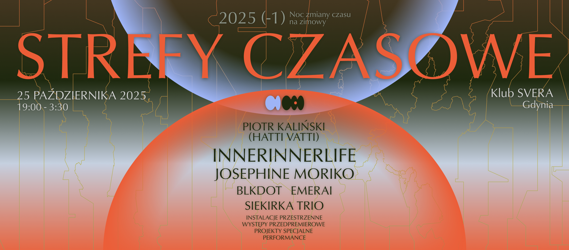
Strefy Czasowe (Time Zones) Festival
CONCEPT AND NAMING
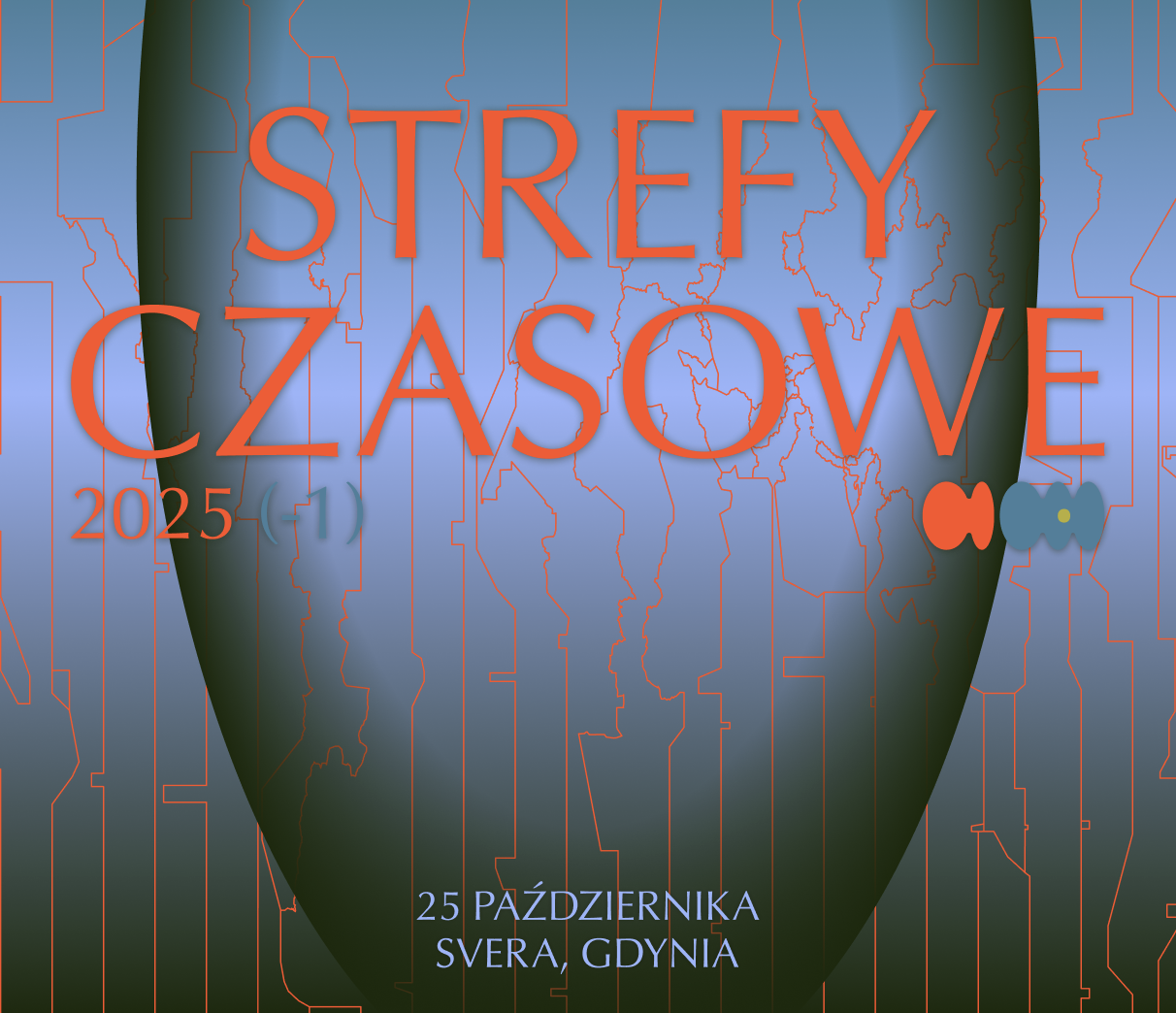
While excited by the idea, I was not convinced by the initial naming of the project—”Długa Zimowa Noc” (”Long Winter Night”). I suggested a reconsideration and together with the project team, we settled on the name “Strefy Czasowe” (“Time Zones”). The re-naming lead to further development of the festival’s concept. Since the name now referred to time zones, we decided that a perfect occassion for the cyclical events would be the nights of time change: from summer to winter time and from winter to summer time. Since the different seasons would mean a time change forward (+1) or backward (-1), the different editions are named accordingly: the winter edition of 2025 is 2025 (-1), while the summer edition of 2026 is called 2026 (+1).
LOGO
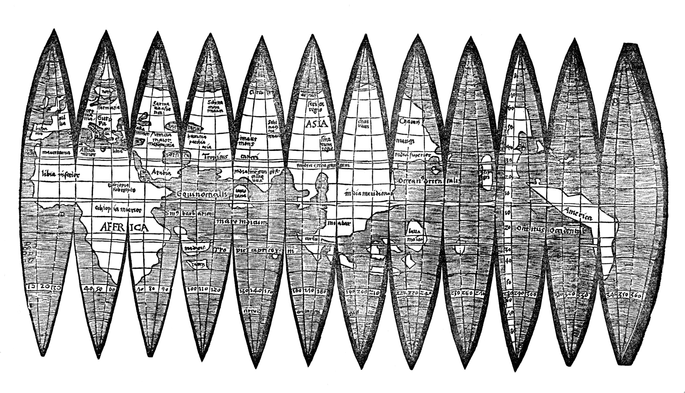
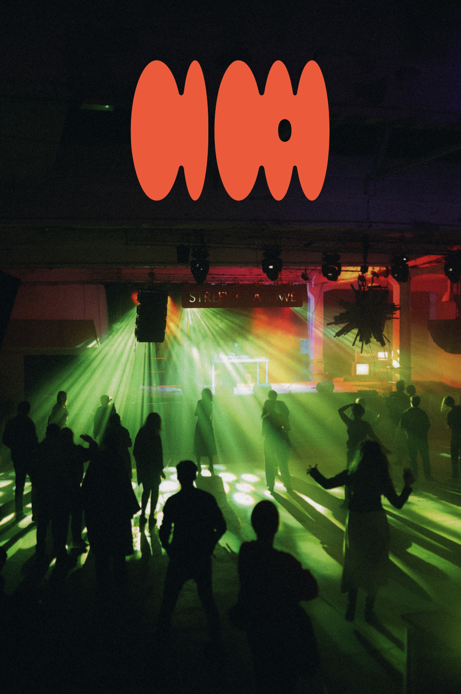
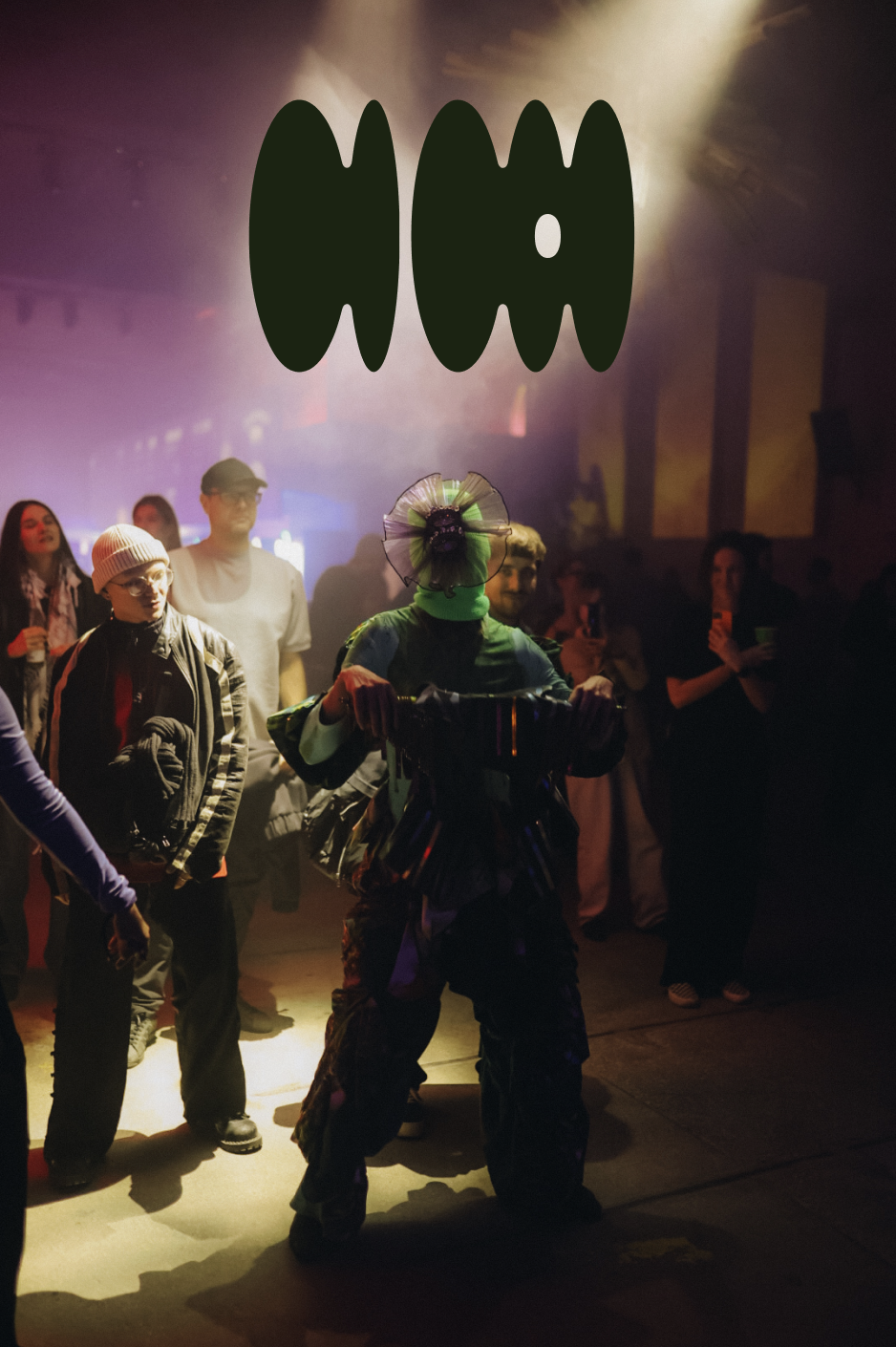
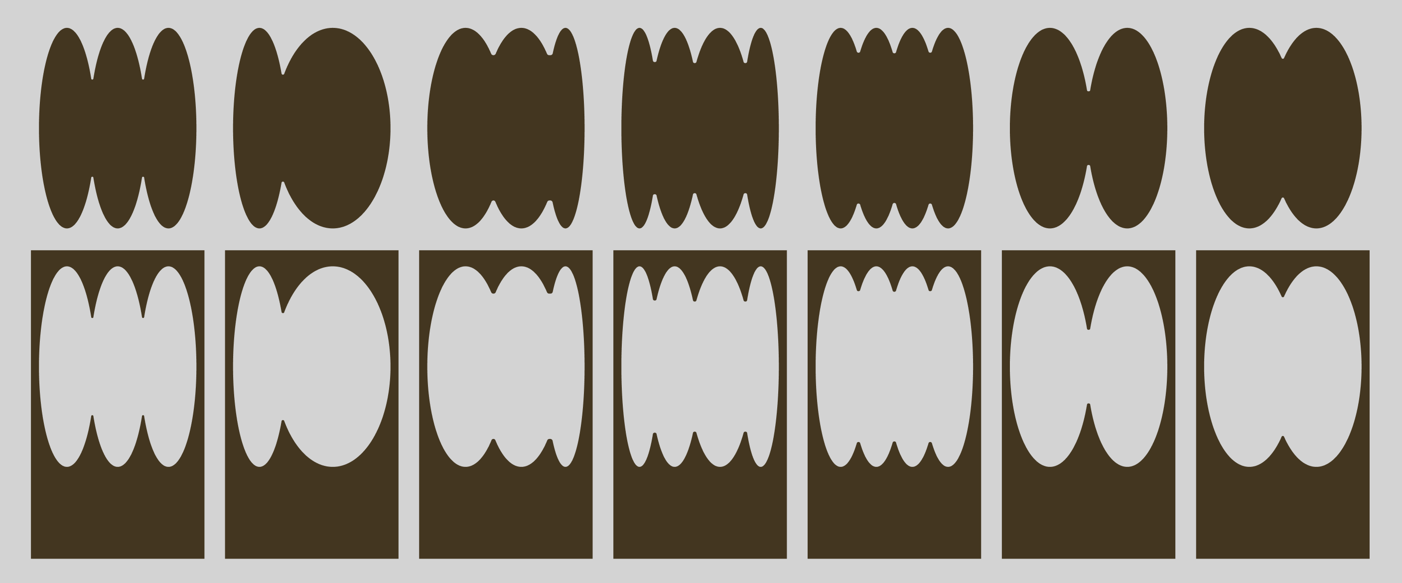
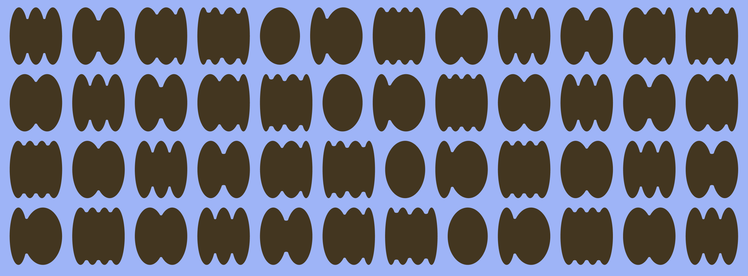
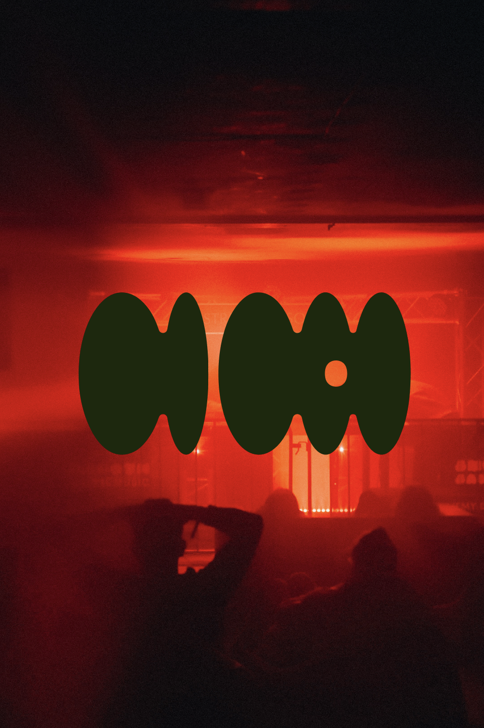
The first step was creating a recognisable, yet easily adaptable logo. Since the festival happened twice a year, I wanted to create a logo that would not rely in its recognizability on colour, but rather on form. Considering that one of the main elements of the festival’s concept is the topic of rhythm, I decided that the logo would be based on the syllabic division of the festival’s name: STRE-FY CZA-SO-WE. The logo features the outlines of the syllables, leaving the opening where the “O” letter is originally placed, in order to retain some connection between the logo shapes and the written name of the festival. The rounded elliptical shapes that build the logo are inspired by globe gores, which are a visual represantaton of the curved surface of the earth in a flat form.

COLOURS
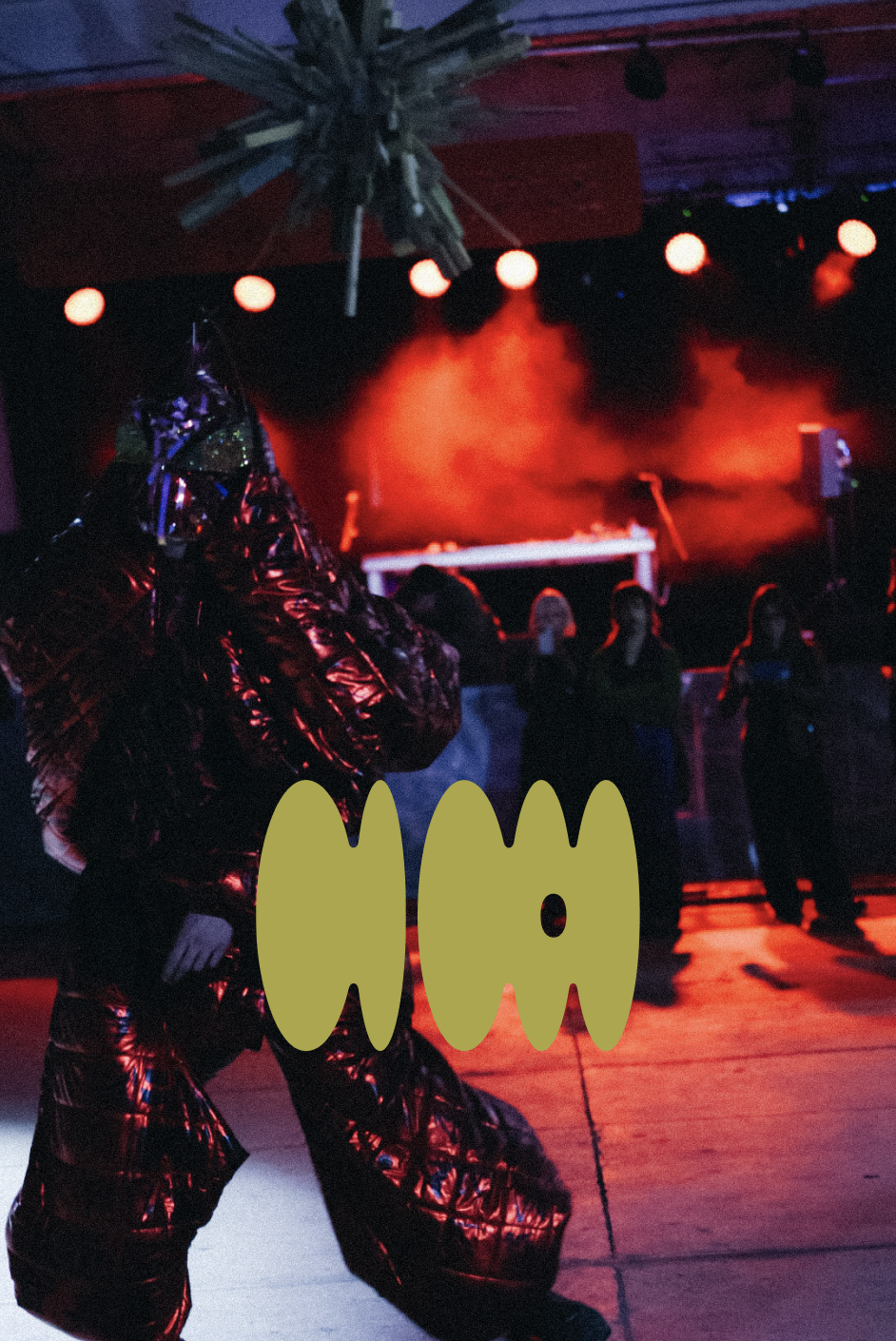
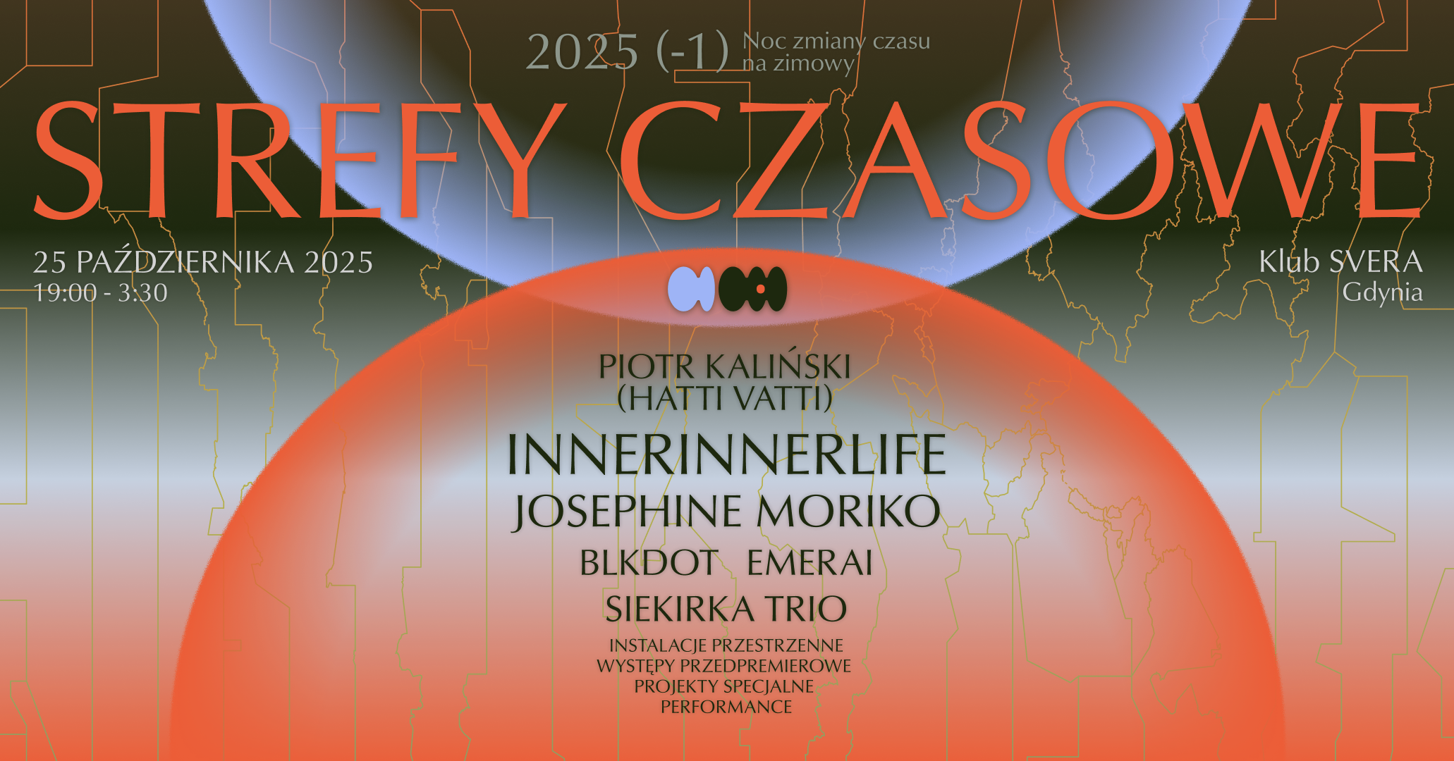
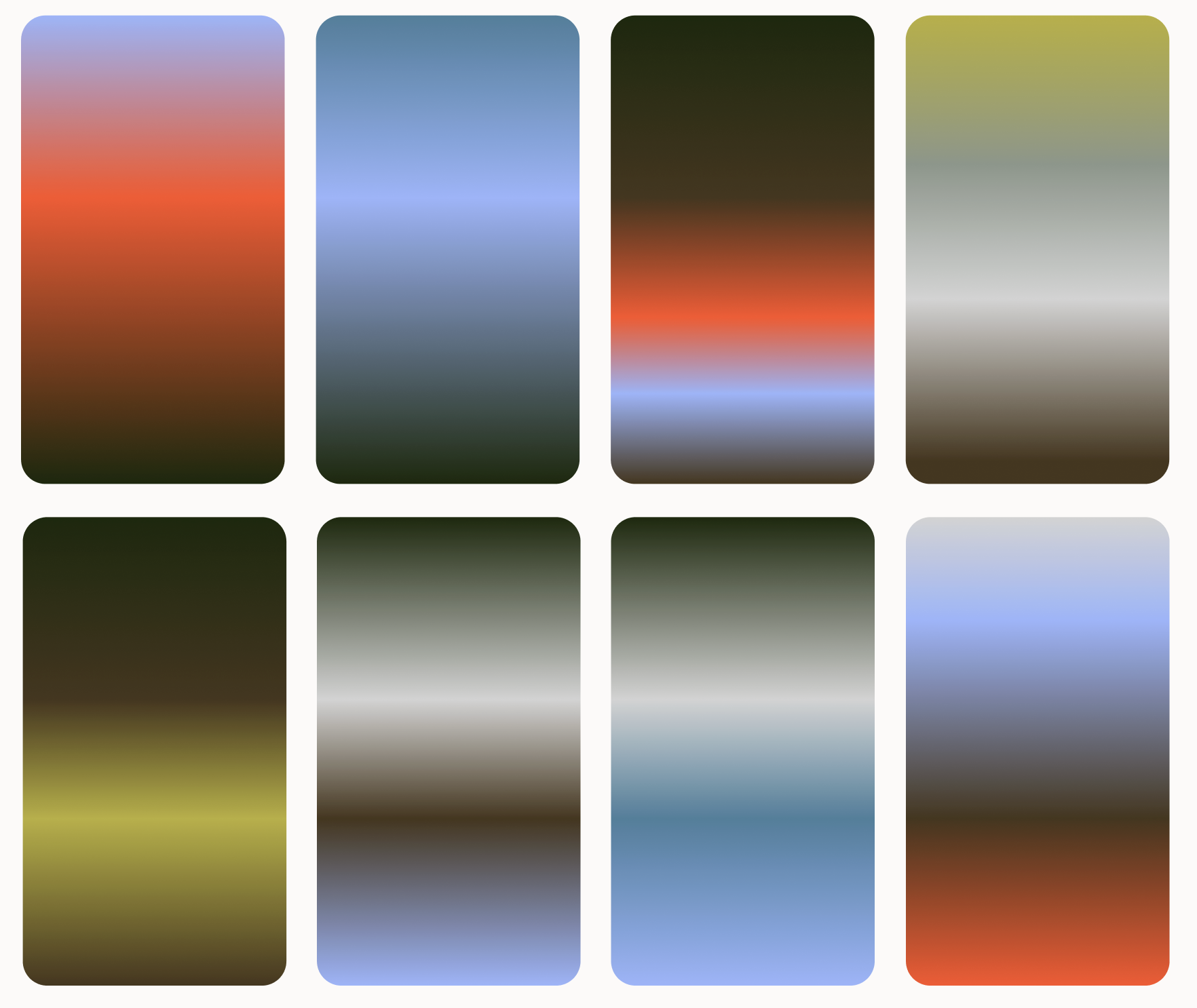
The cyclical nature of the event demanded that the two nights (summer → winter and winter → summer) would have two related, and yet distinct identities, differing in colour. The festival then features two colour modes: one for summer and one for winter. The four, more neutral, base colours always stay the same, but depending on the season, teh four supplementing colours change slightly, to signify that the night changes into a different seasonal direction. Strefy Czasowe is an ongoing project, so the winter → summer colour have not yet been defined.
TYPOGRAPHIC TREATMENT
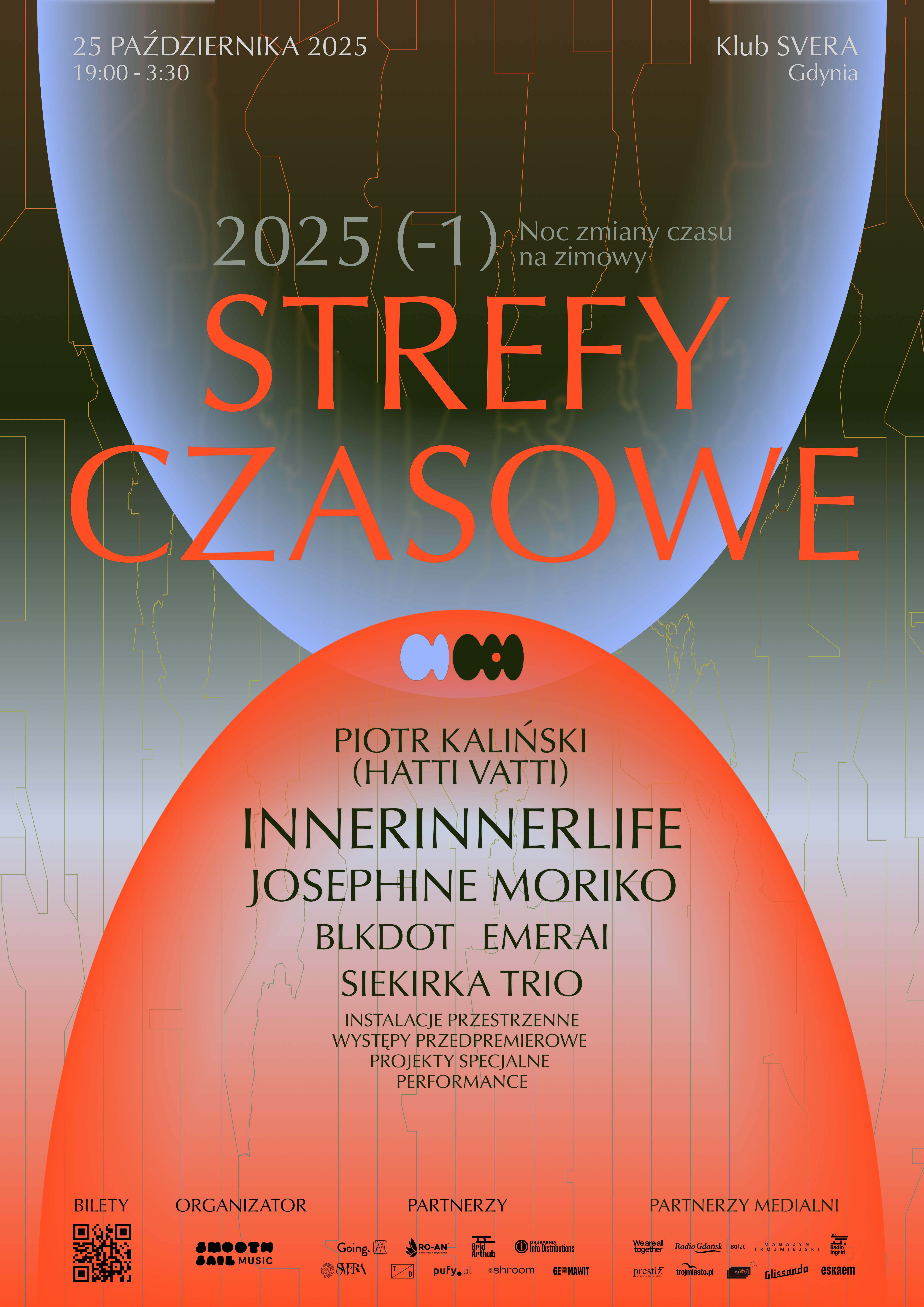
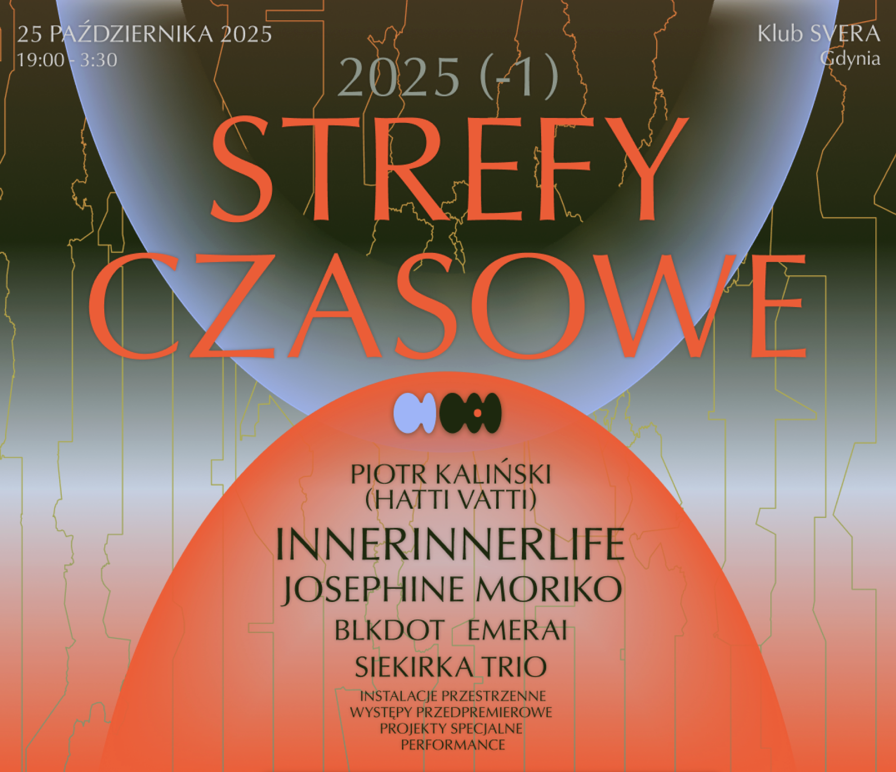
The primary font of the festival is Classico URW, selected for its mysterious elegance. The secondary font is Akzidenz-Grotesk Next selected for its high readability and possibility to be used in small print. The title of the festival “Strefy Czasowe” set in Classico URW, is prominently features in all festival visuals and, next to the logo, created a high brand recognizability.
KEY VISUAL ELEMENTS
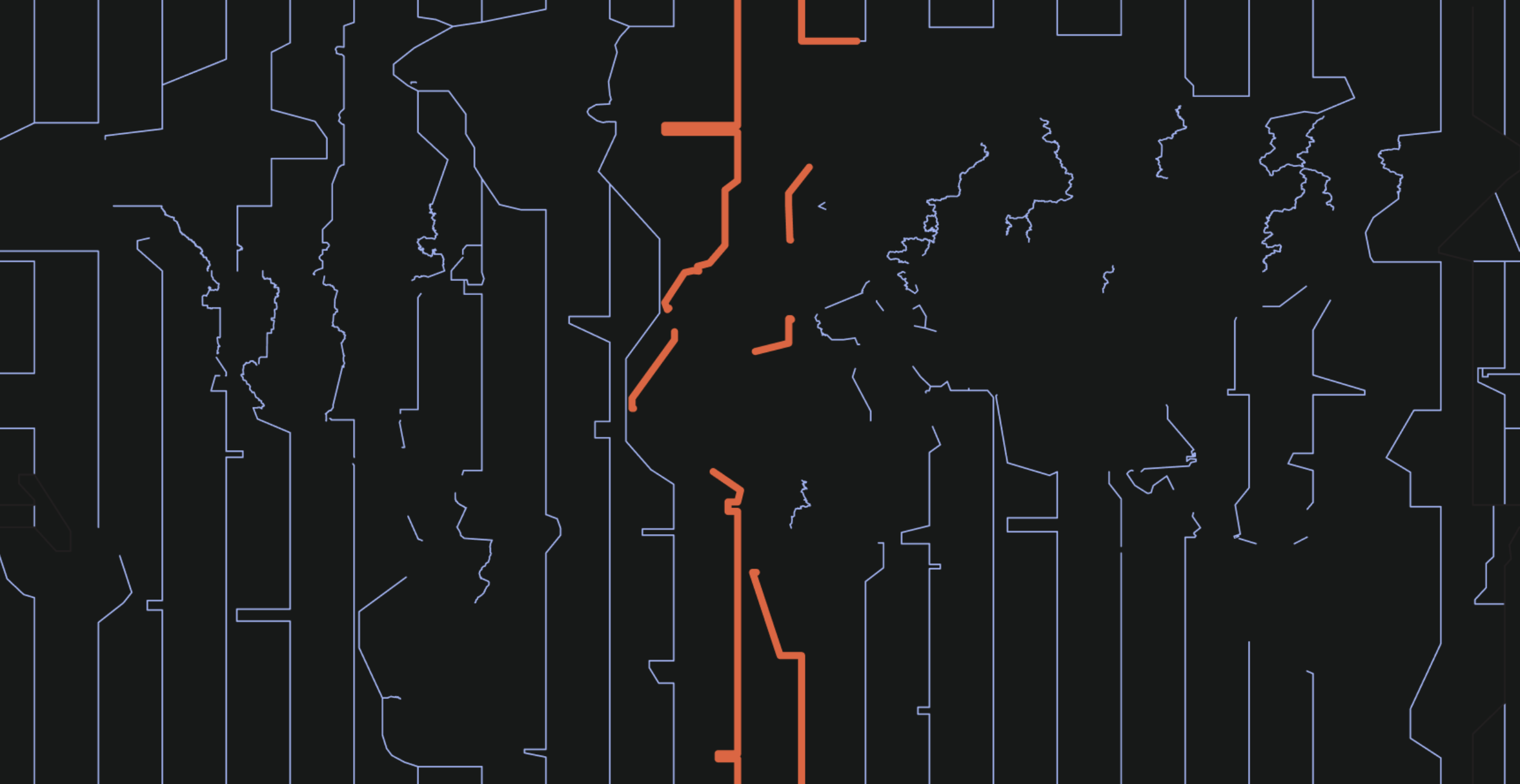
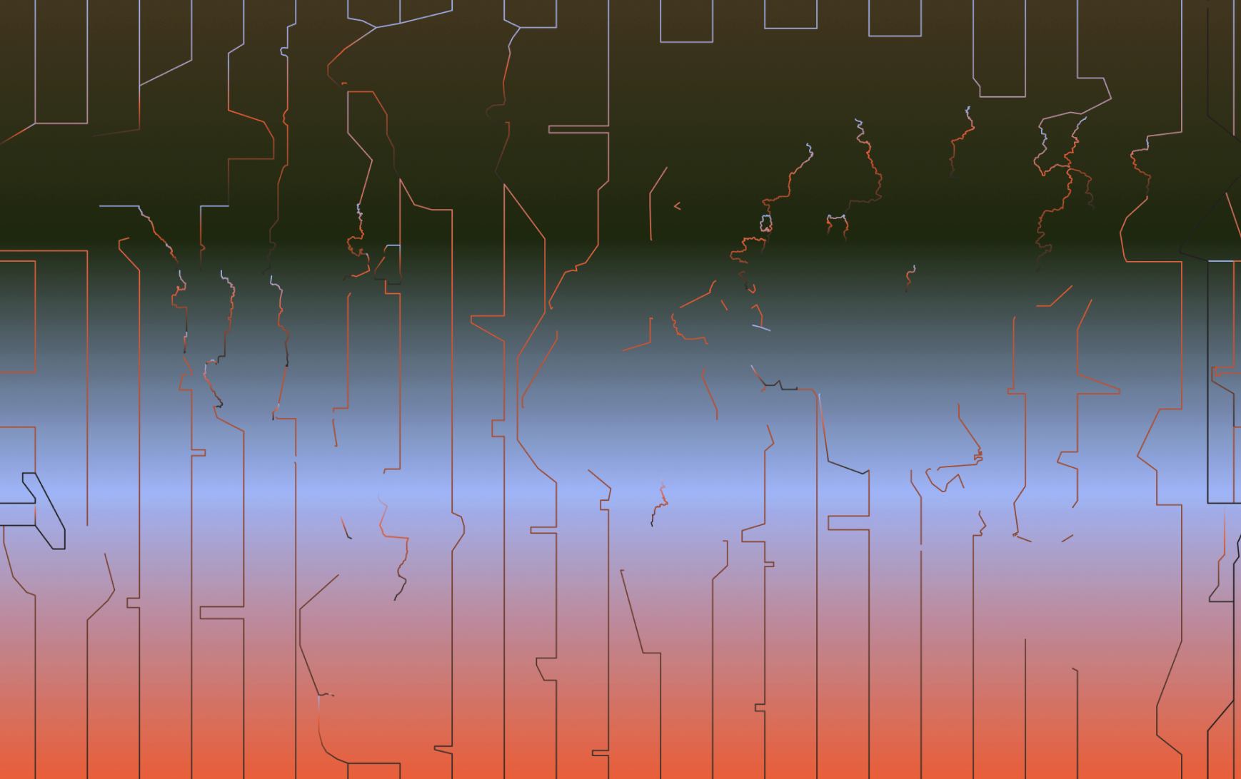
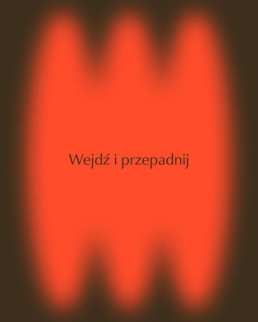
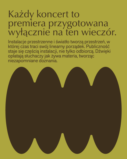
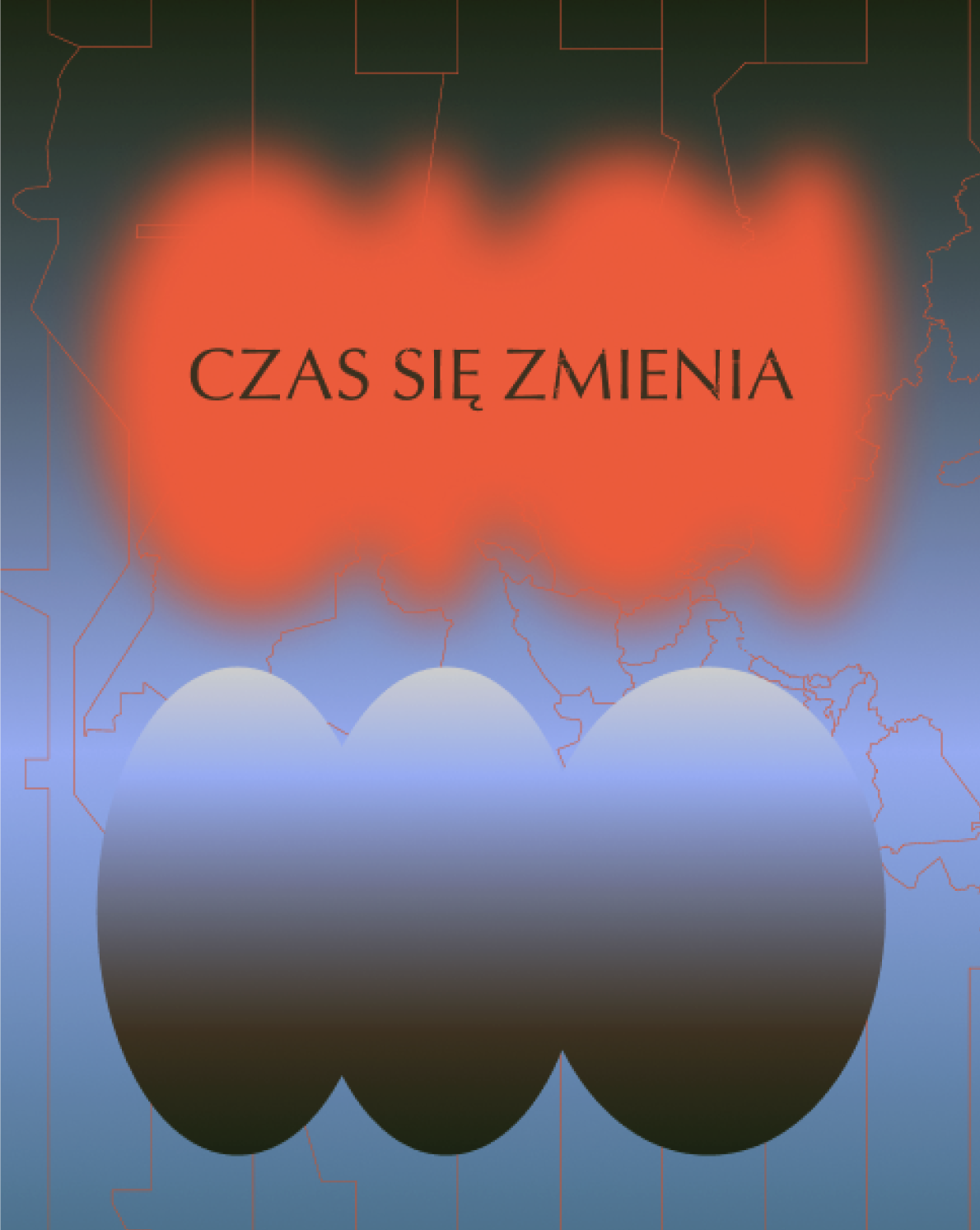
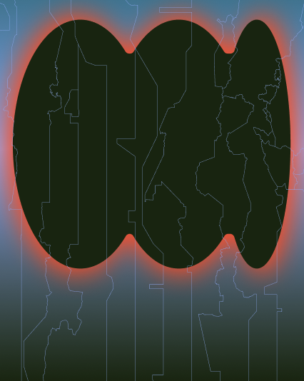
The core of the identity is built upon two elements: the intersecting eliptical shapes, inspired by globe cores and the lines of time zones on the map, which are used inconspicously in stretched or condensed forms, as a sort of easter egg for thos especially inquisitive. Aside from these two elements, since the festival is supposed to convey ideas of mystery, change and transition, gradients, fade-ins and blurs are used.

CUT-OUTS AND SOCIALS
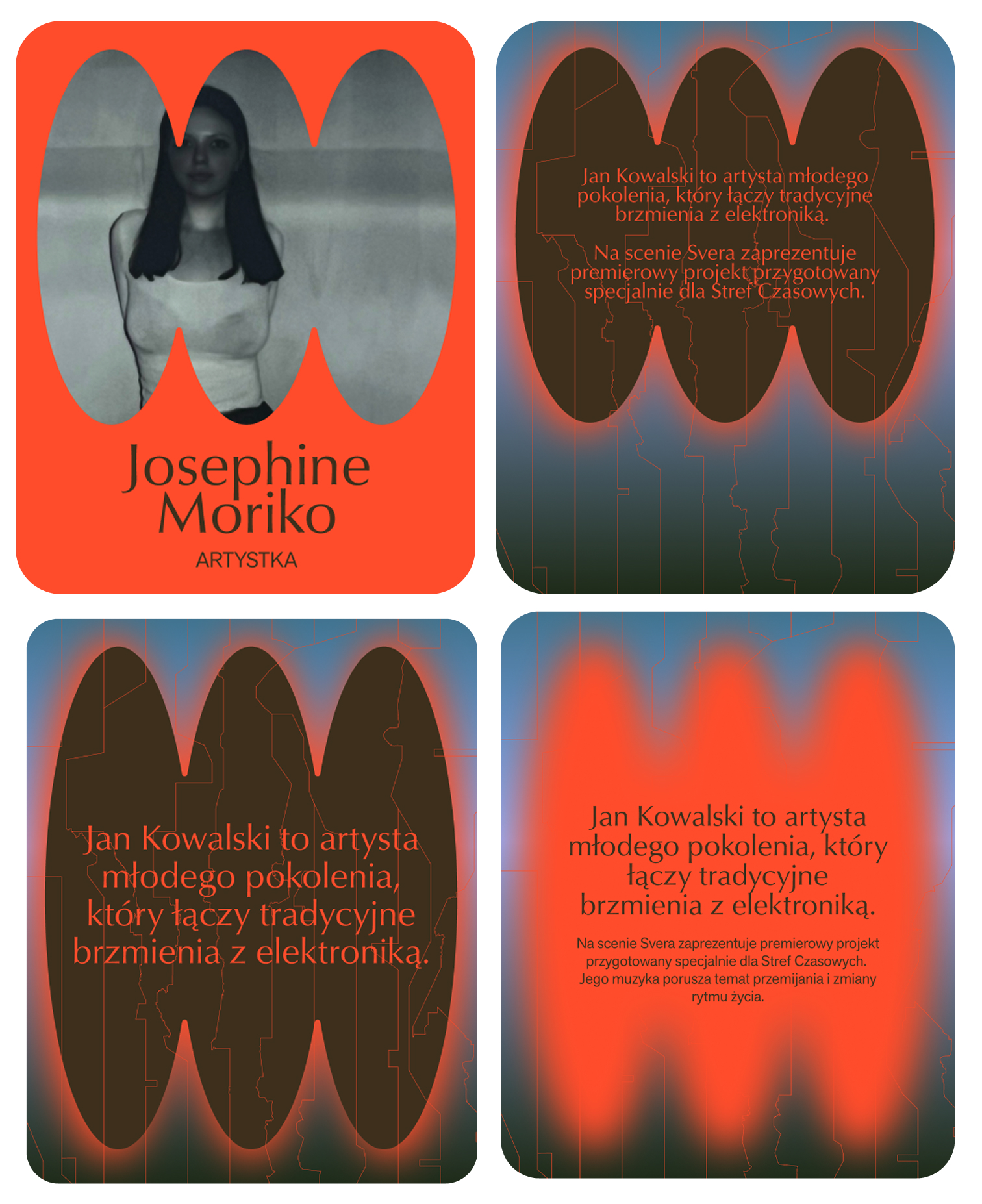
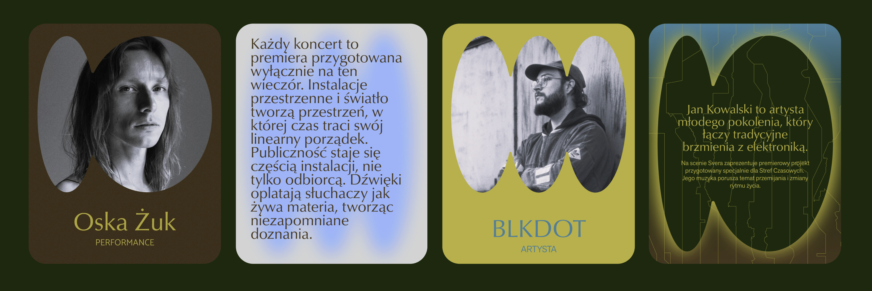
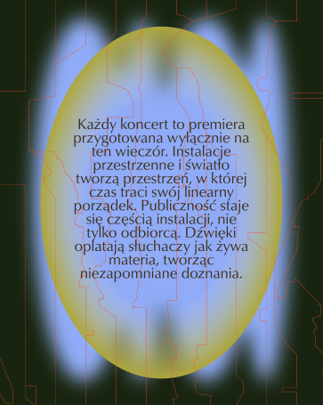
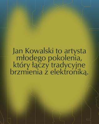
Another way in which elipses were used was in creation of social media assets. Knowing that the social media team working on the project would be graphically quite inexperienced, I decided to make a simple set of cut-out frames that could be used for reels, stories and posts, announcing the artist line-up, teasers or event updates. The easily adaptable collection of assets created a playground for the social media team, allowing them to use the simplest tool to create high quality designs with little no no intervention from my side.
WEBSITE
THE EVENT
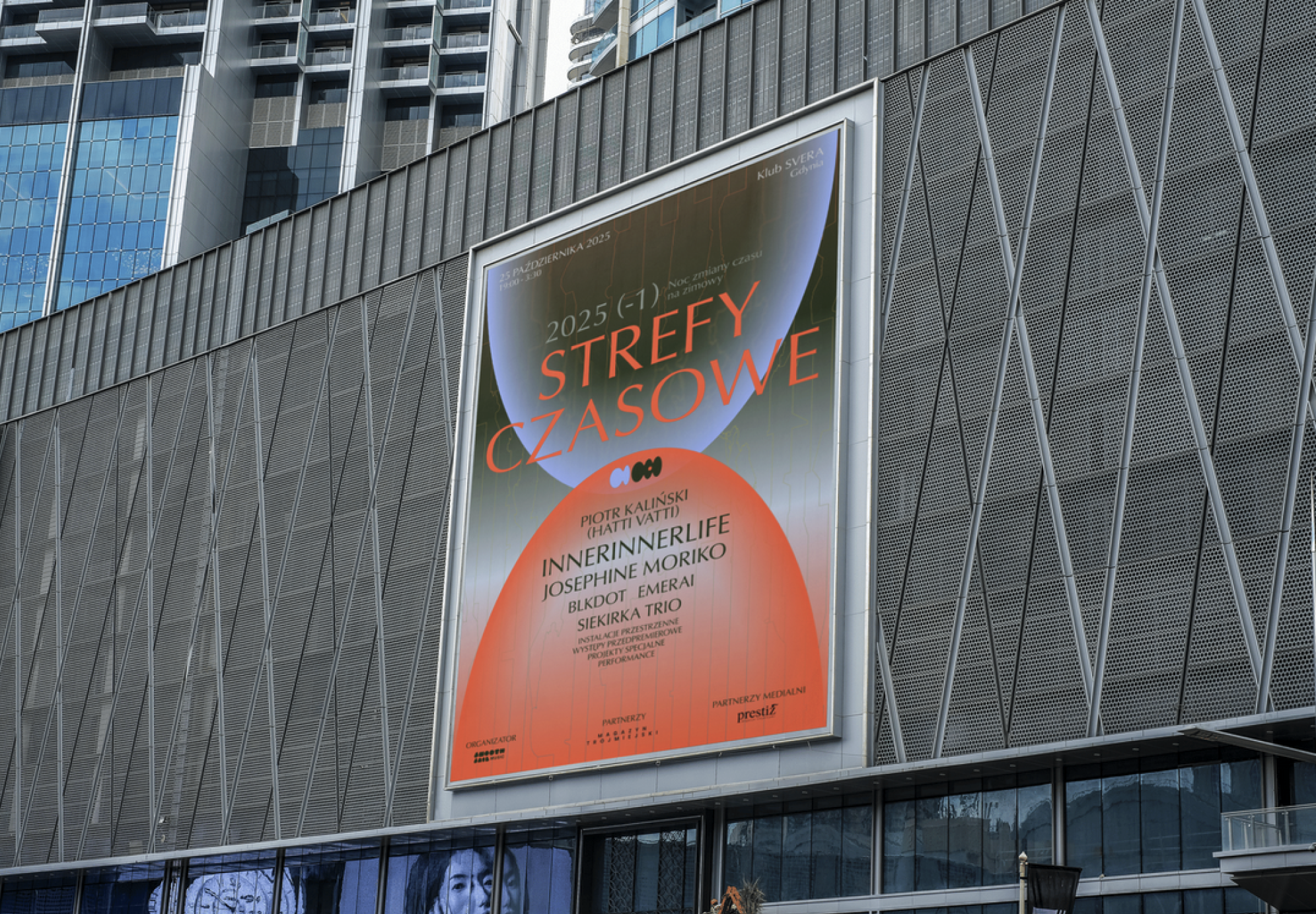
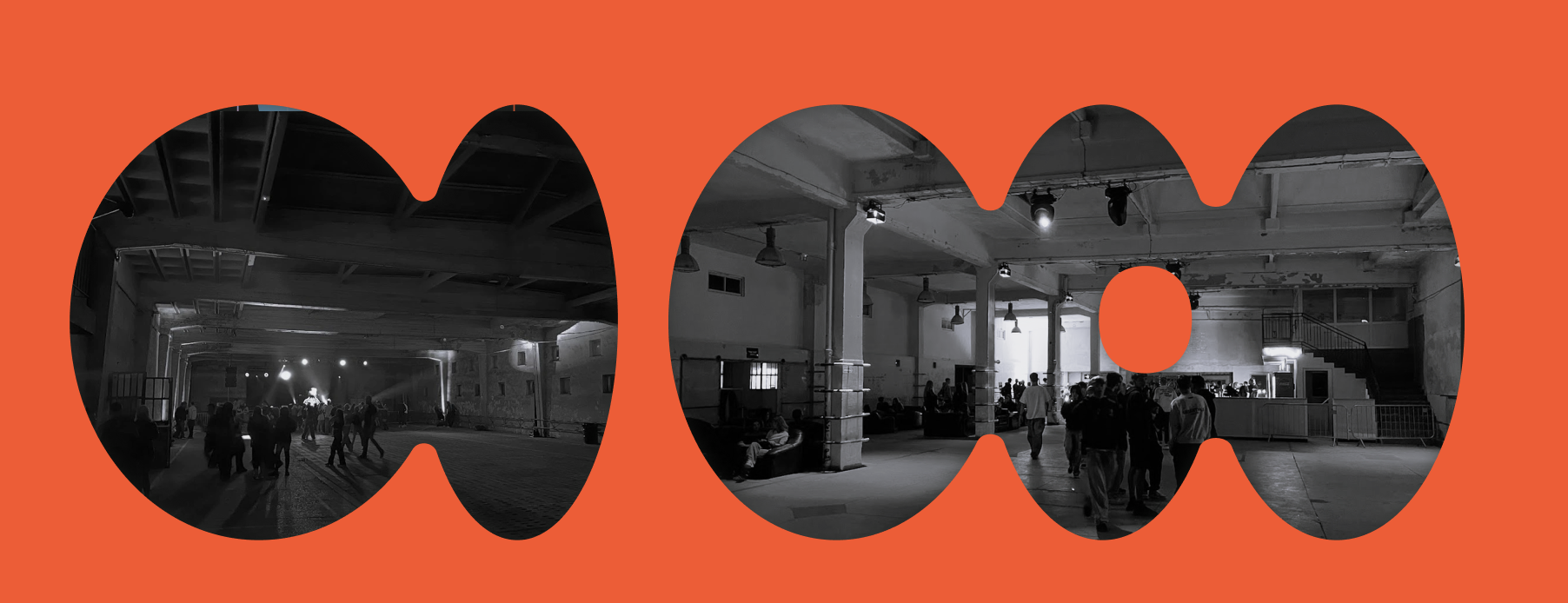
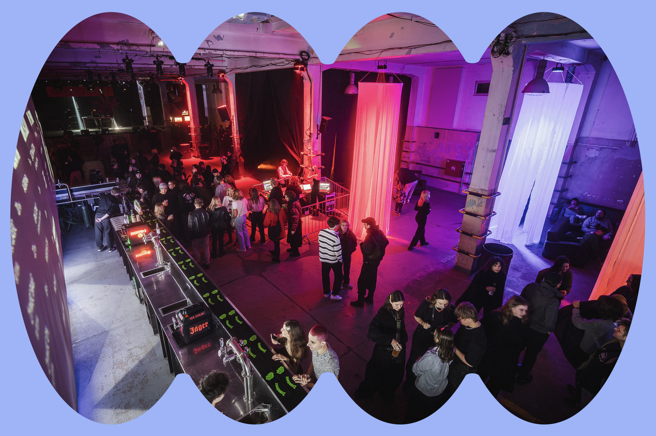
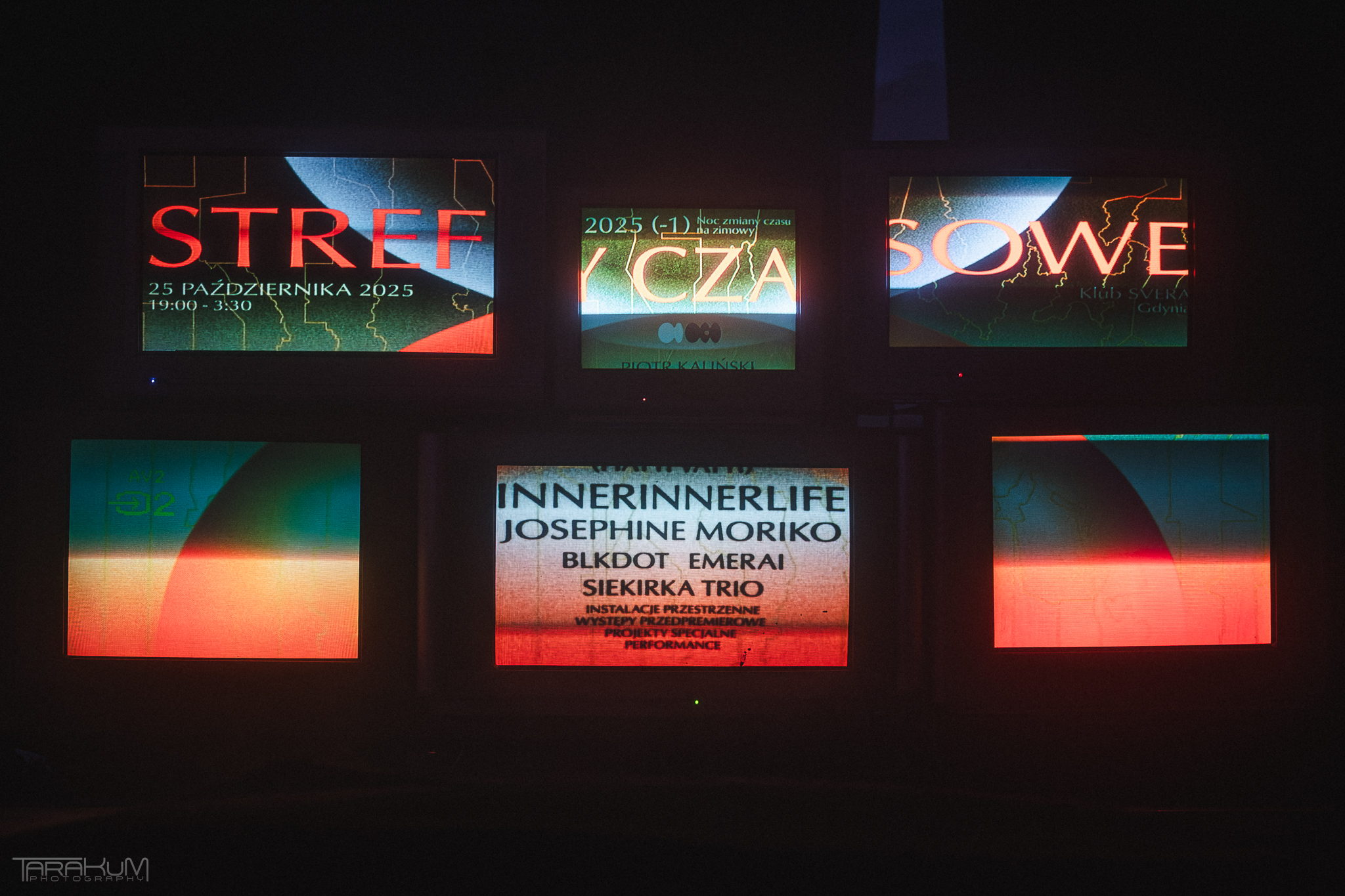
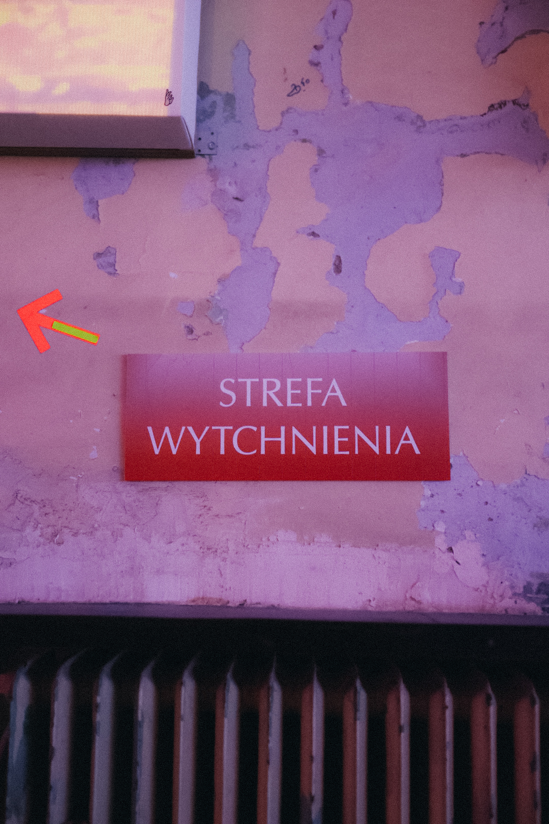
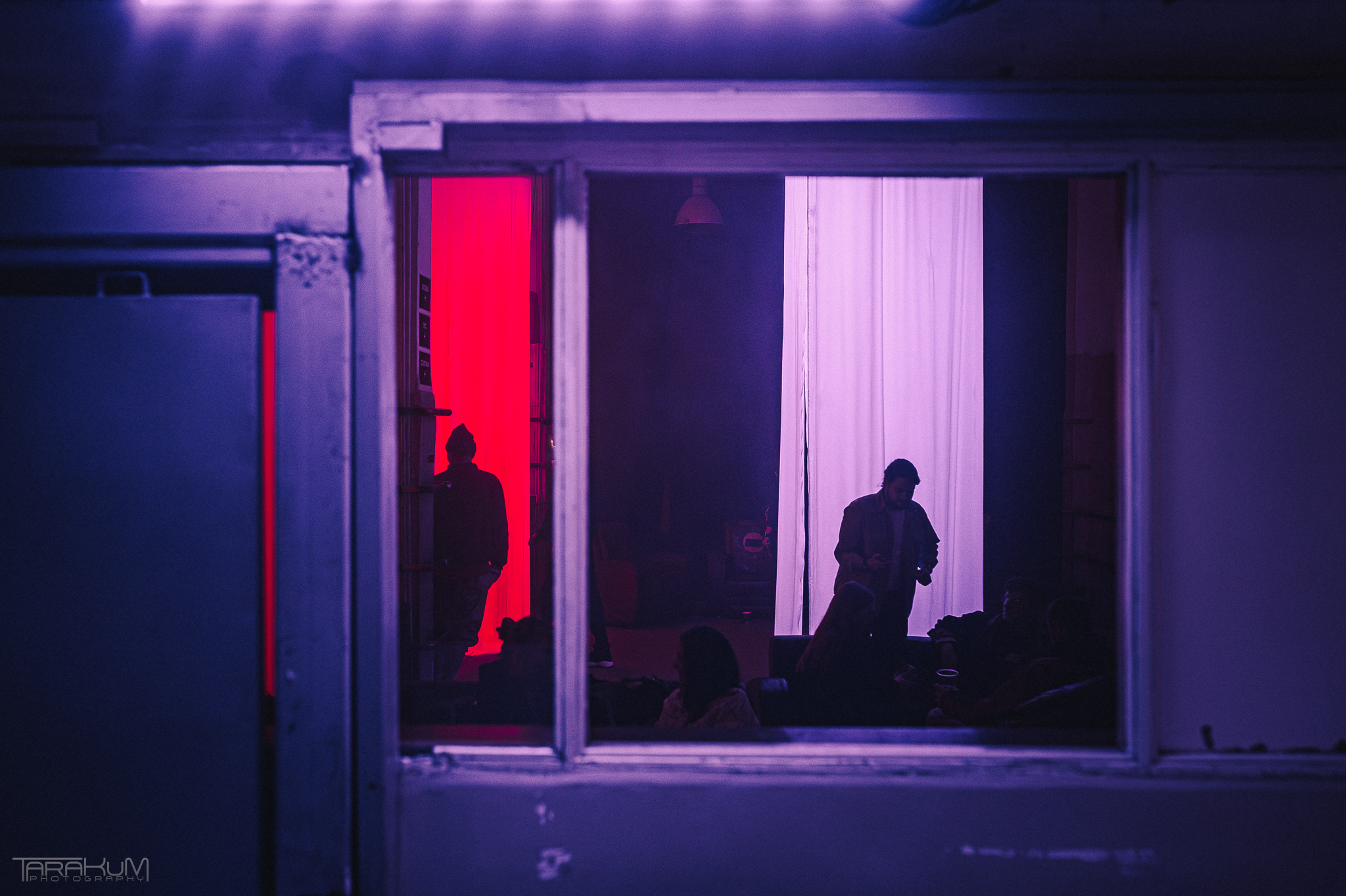
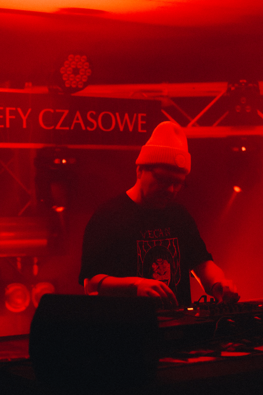
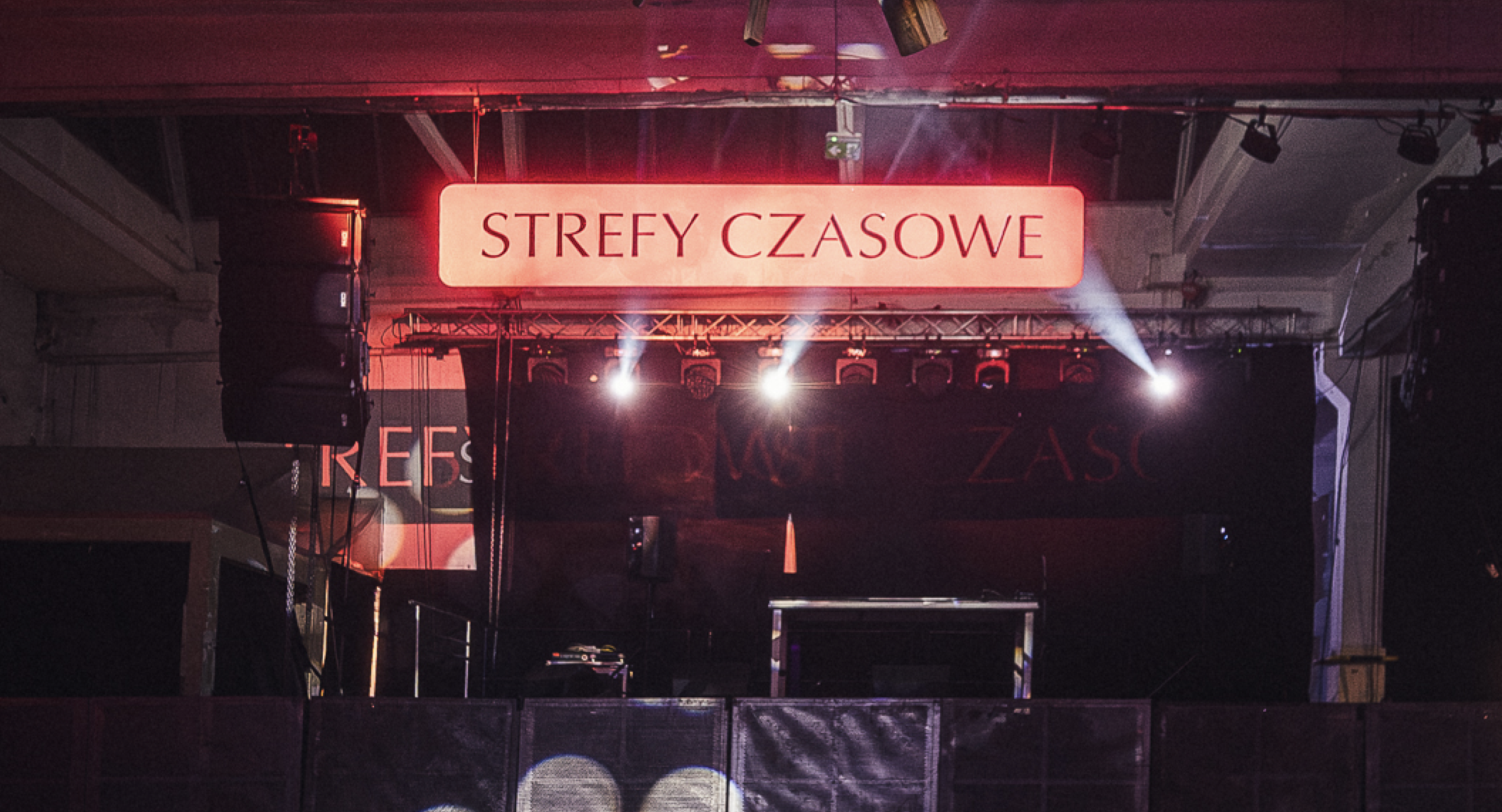
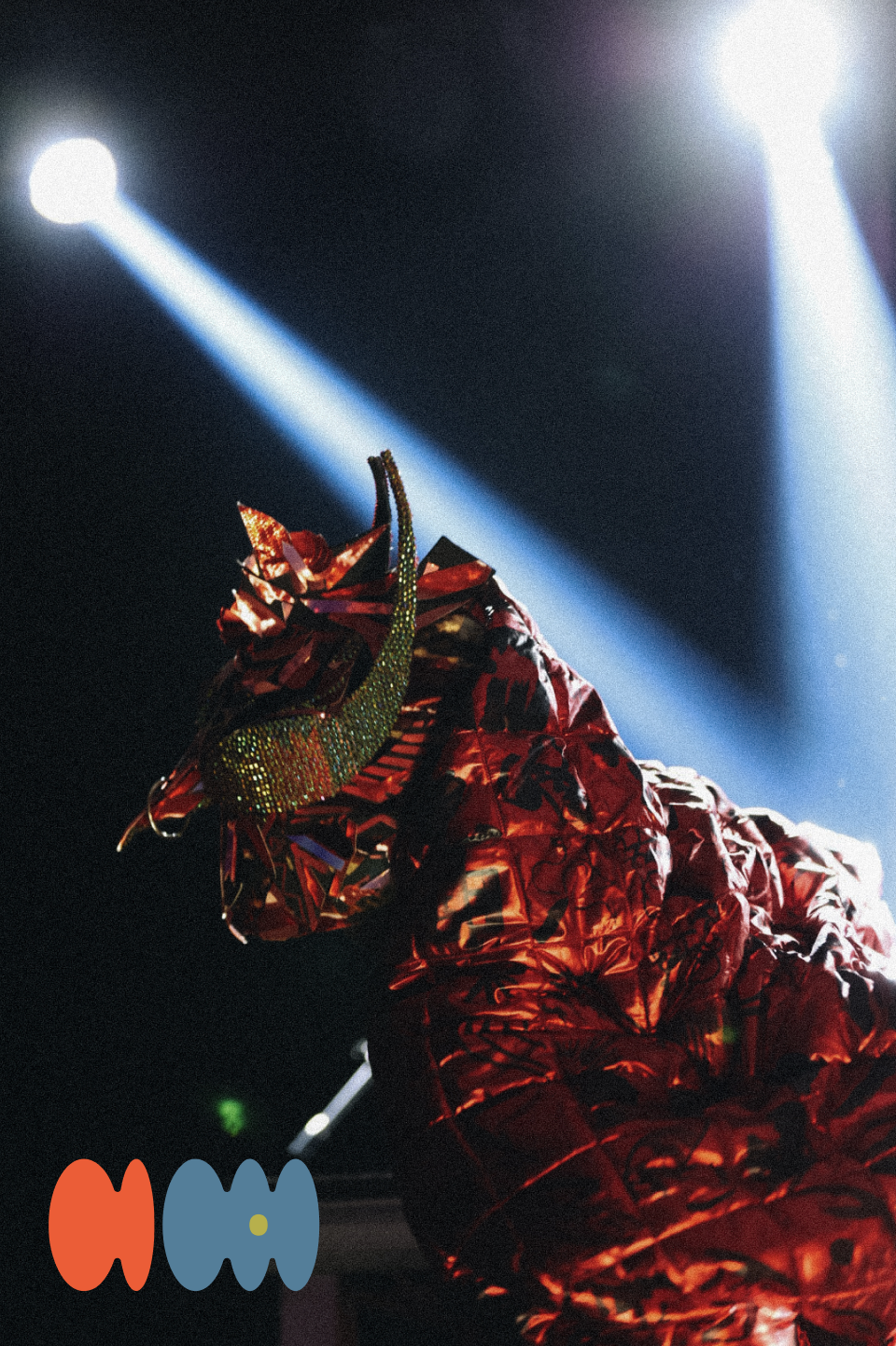
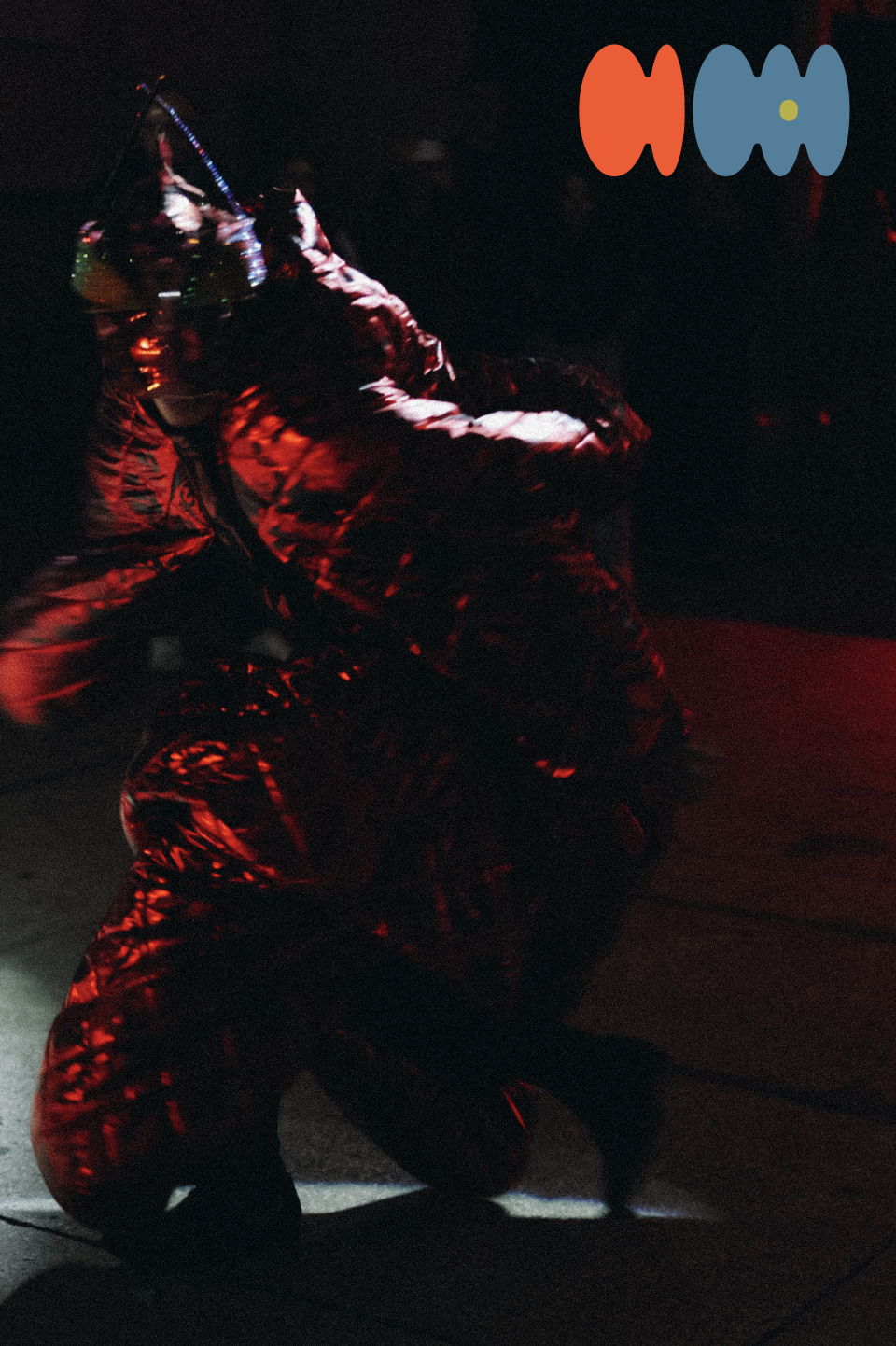
The identity was prominently featured during the night, including posters, signage and installations.
PRINTED ARTWORK
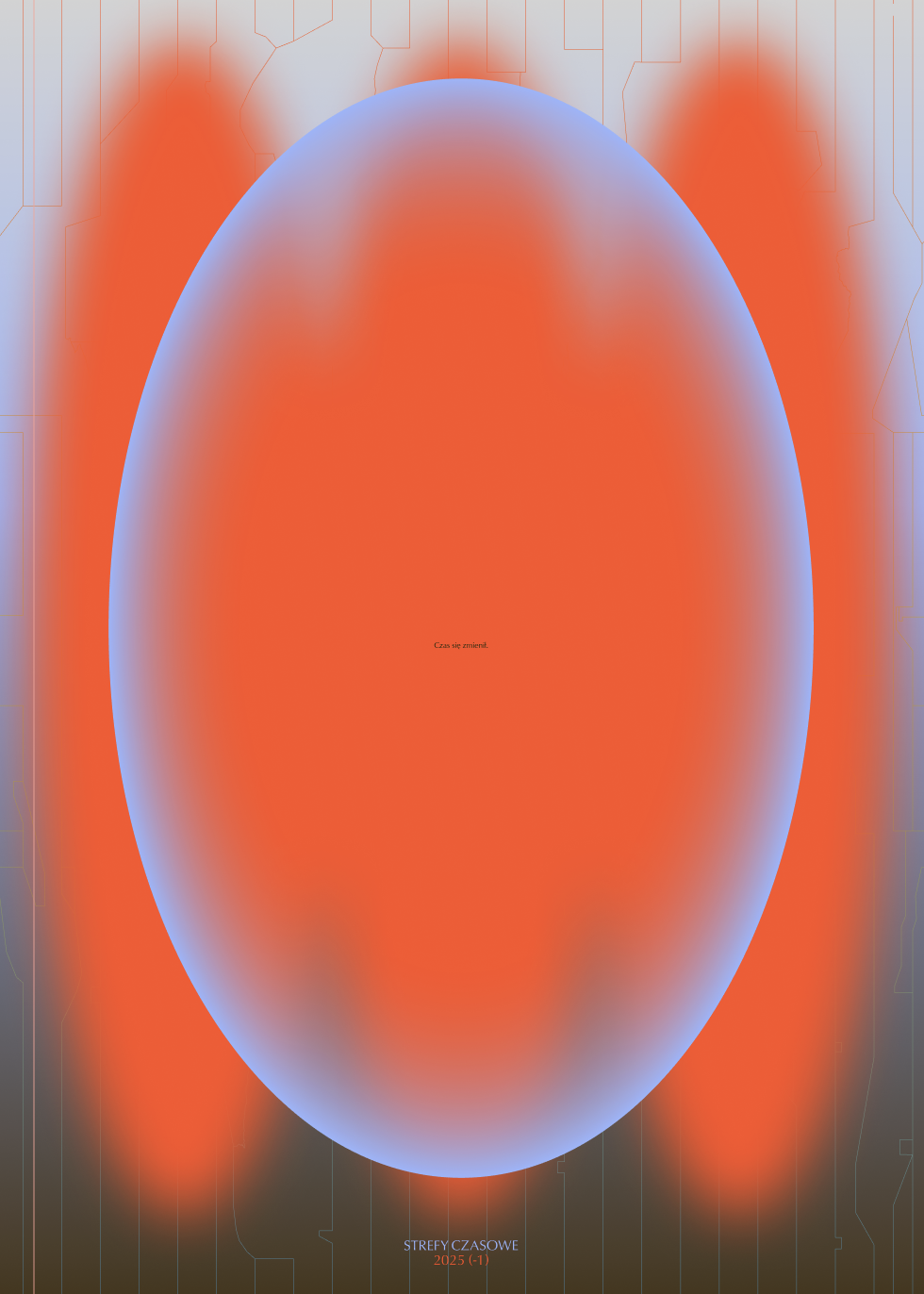
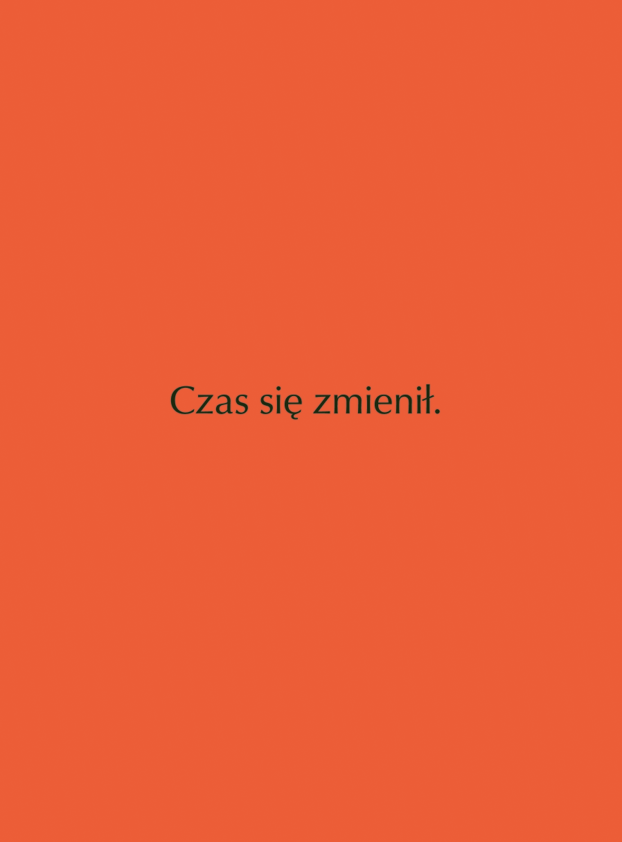
Each edition of the festival features a 50cm x 70cm high-quality printed artwork commemorating the event. In comparison the the bold, loud and busy promotional materials, the print features a calmer, more minimal form, featuring the words “Czas się zmienił.” (“Time has changed.”). The poster is supposed to be a memory of the experience, especially its final part: the calmness, a long breath after a night of intensity.
OTHER PROJECTS ↓

Strefy Czasowe
Full branding and art direction for a festival in the night of time change

ARIAS
Brand new look for research through arts & sciences in Amsterdam

Eye of Jeronimo
Branding for an independent kaleidoscope producer
Basketology
A philosophy for alternative storytelling
Lectorate: Touching
Visual campaign for a publication about research by touch

Anyone Want That?
A digital research into exchange of materials between art academy students
Building Second Brain
Moving poster for a lecture about memory outsourcing

Field App
Designing interfaces and interactions for the future of knowledge exploration

