
Basketology
RESEARCH & CONCEPT
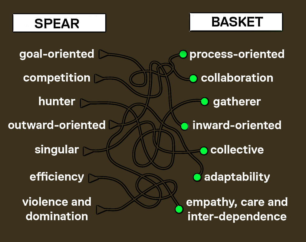
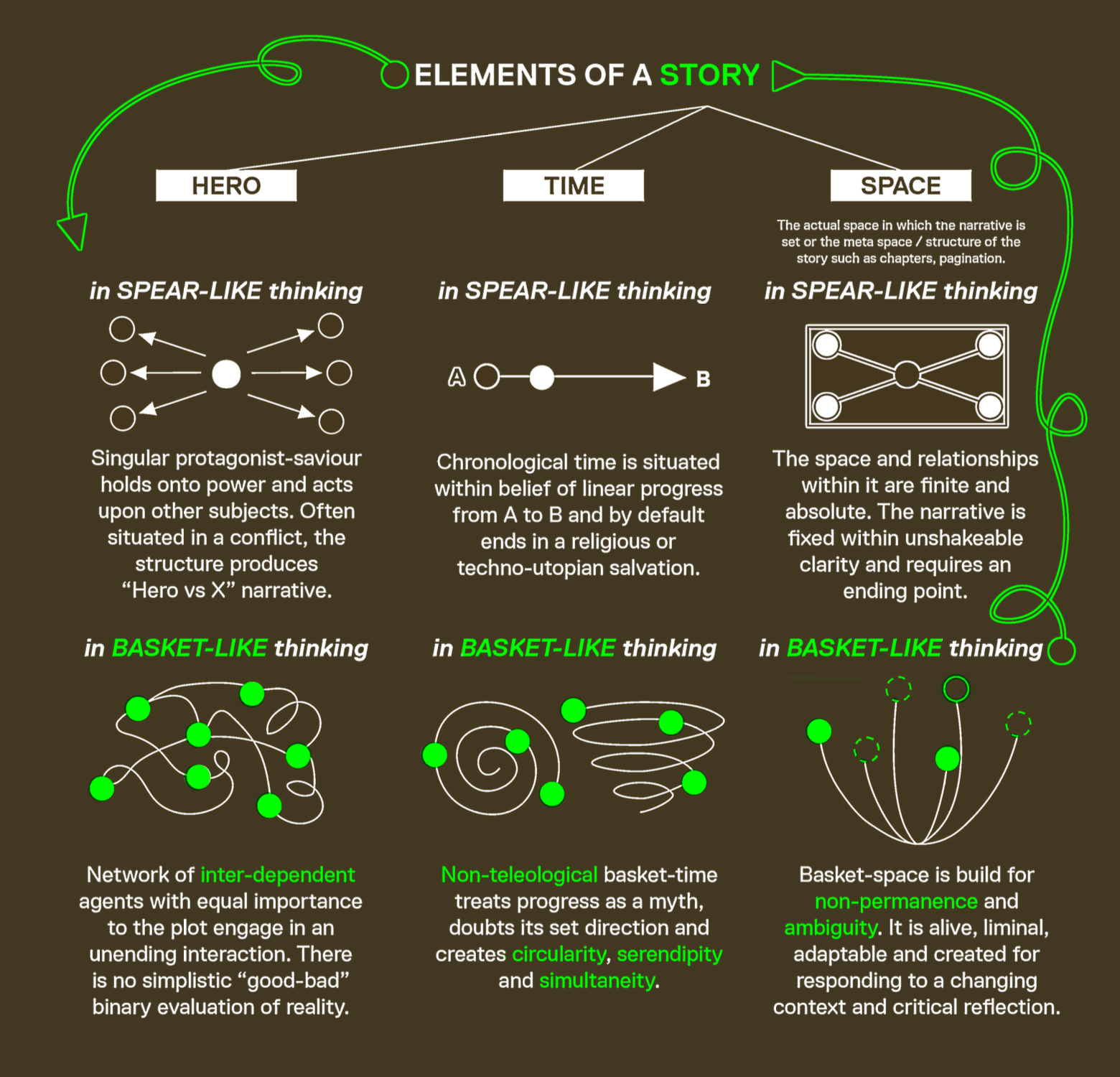
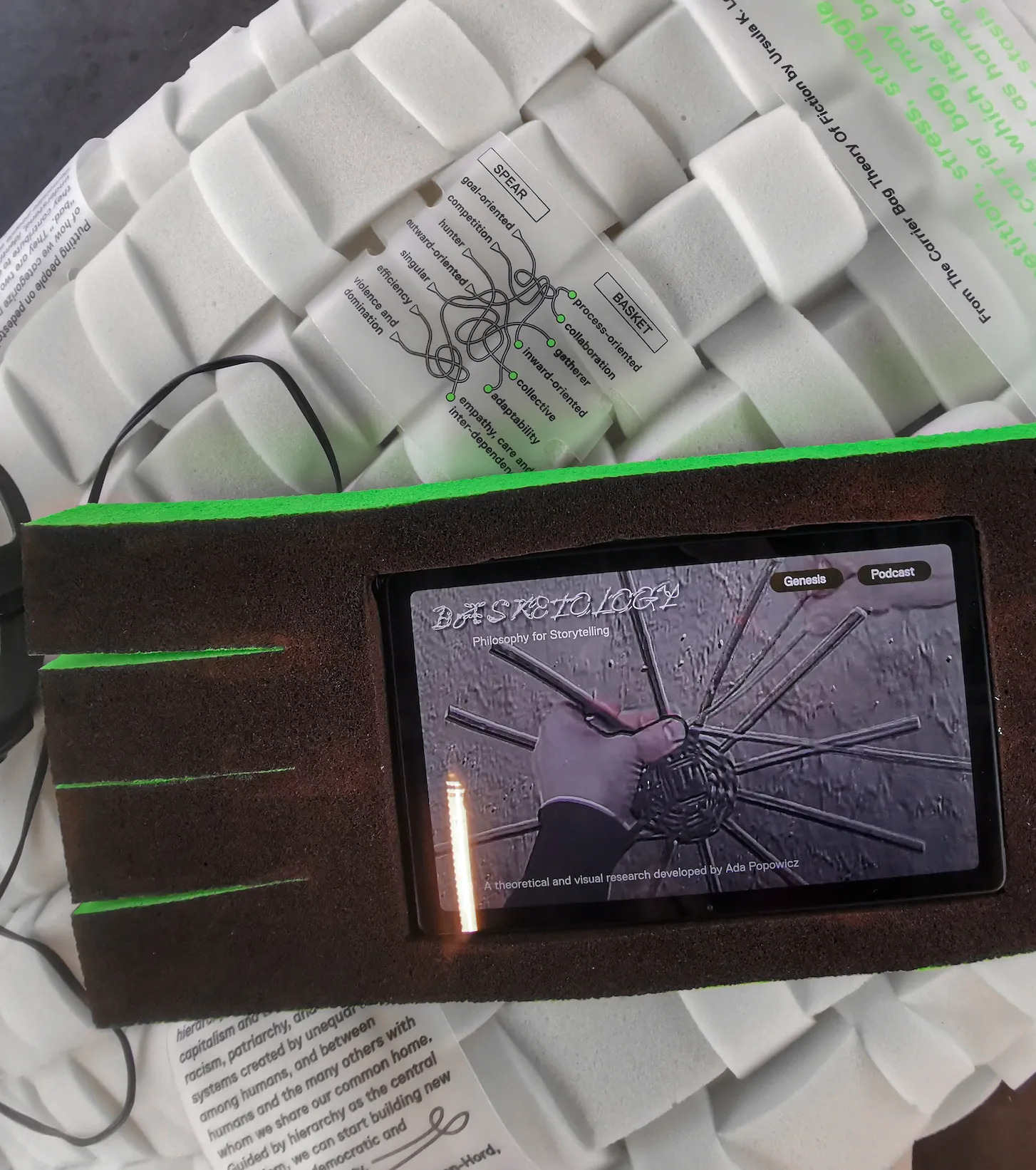
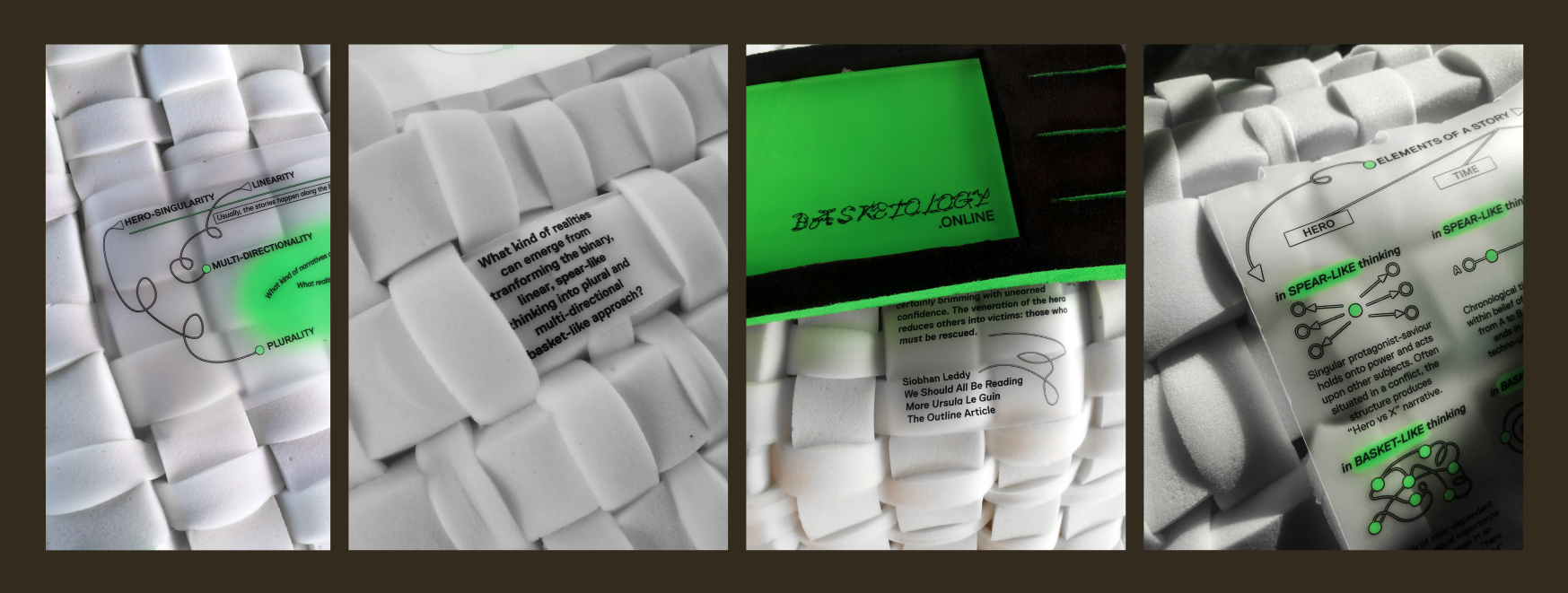
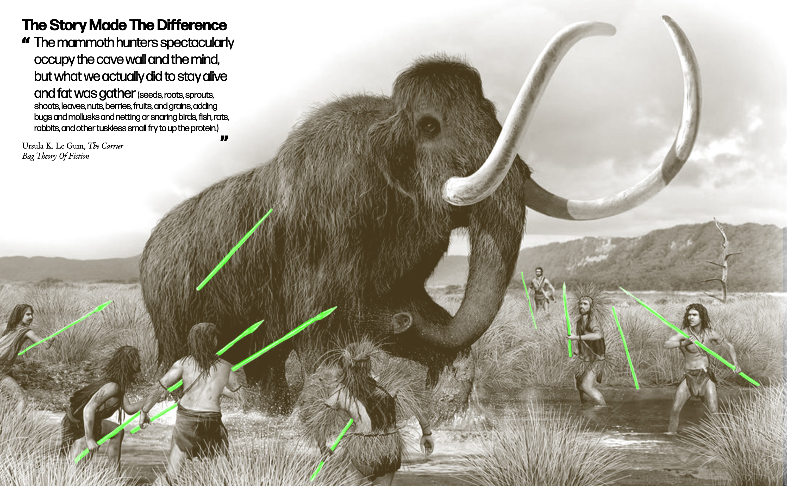
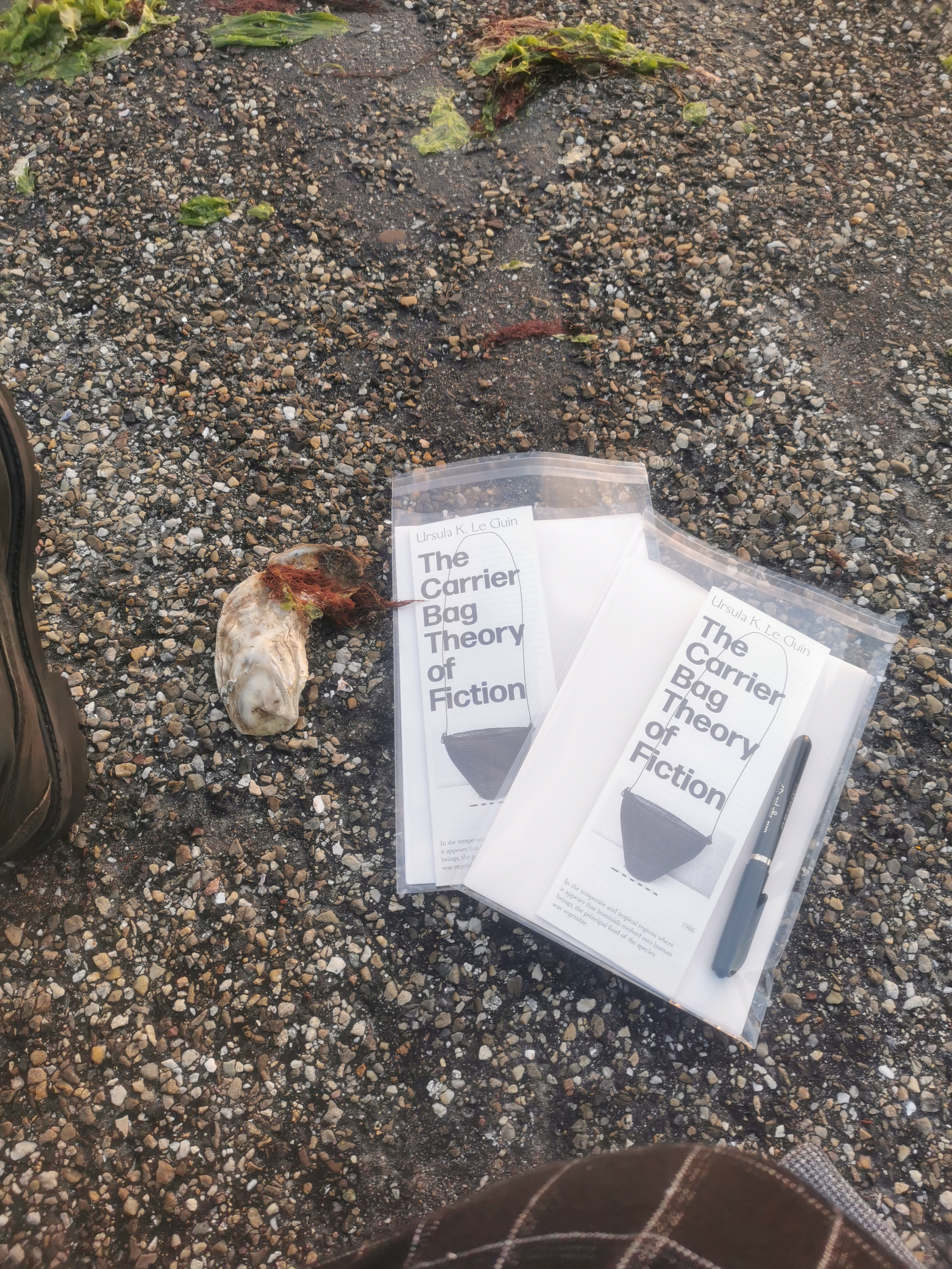
In The Carrier Bag Theory of Fiction (1986), Ursula K. Le Guin proposes that humanity’s first cultural tool was not the spear, a symbol of violence and dominance, but the basket, a vessel for gathering and sustaining life. The spear, however, became the central figure in cultural storytelling, as the narratives of heroic individualism—like killing a mammoth—are easier to convey than the collective, nurturing efforts of activities like fruit-picking, gathering or weaving.
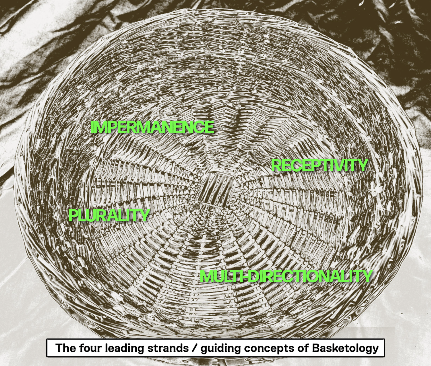
Inspired by Le Guin’s essay I started looking into frameworks of storytelling and researched how they can be mapped and defined in the basket-spear terms introduced by the author. Through Basketology, I wanted to challenge the dominant, binary, and patriarchal narratives. In order to do so, I used the physical and cultural symbolism of the basket as a metaphorical guide for re-examining the ways in which we tell stories and socio-political structures that emerge from them. The project explores how the basket’s associations with care, collaboration, and resourcefulness can inspire new ways of defining identity and community within our existing cultural landscape.
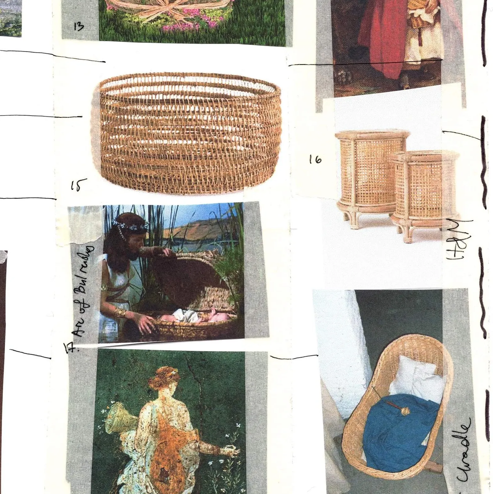
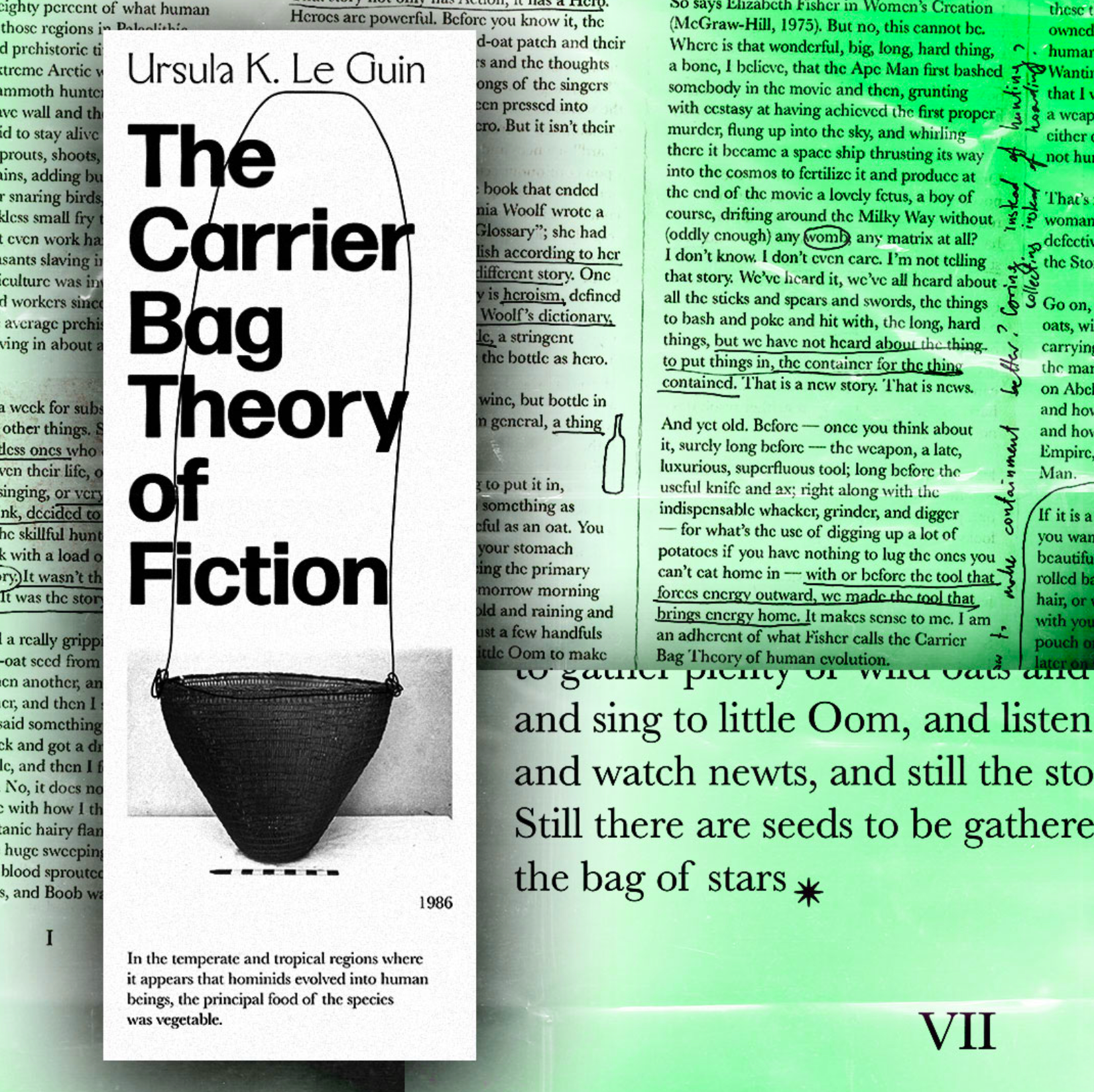
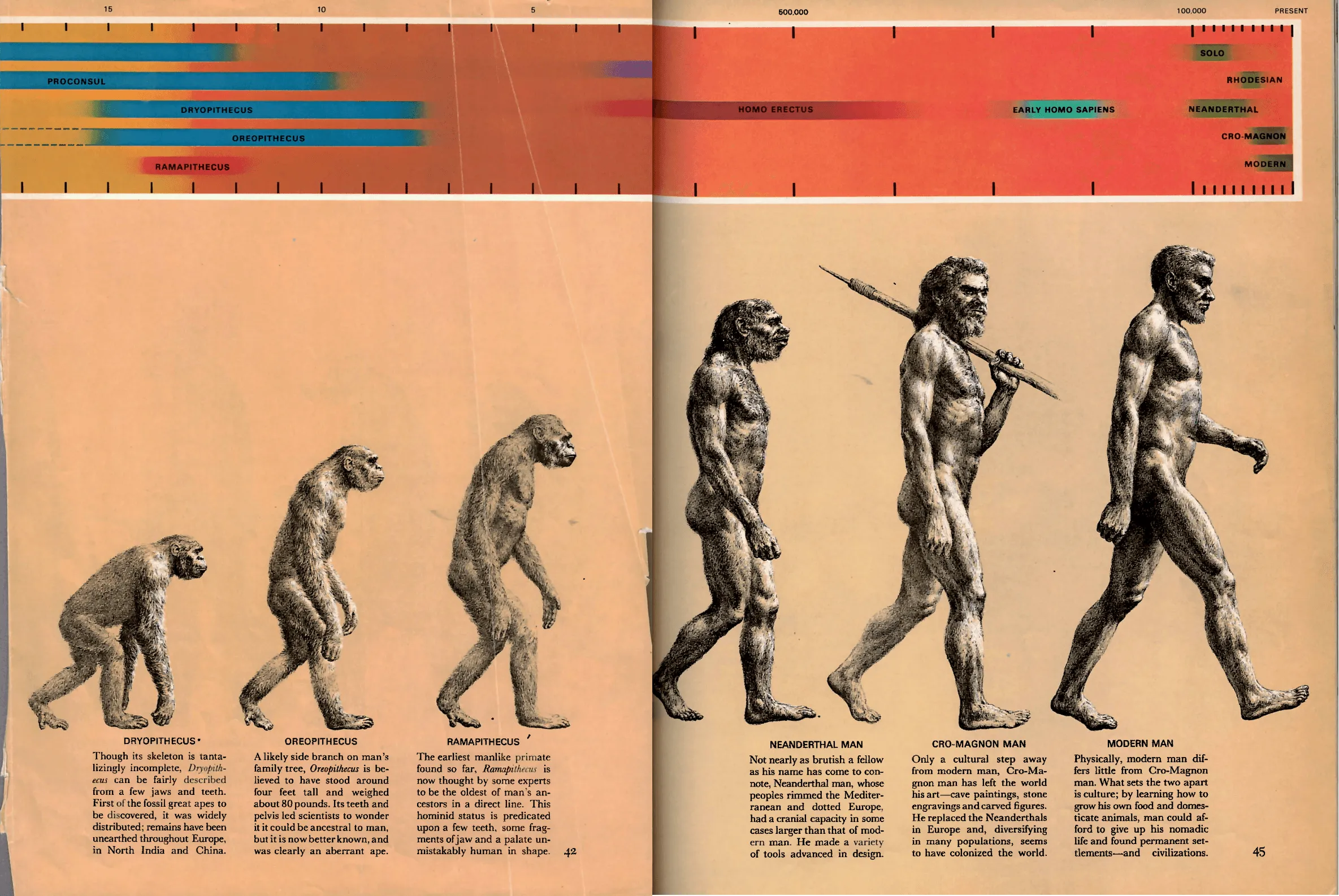
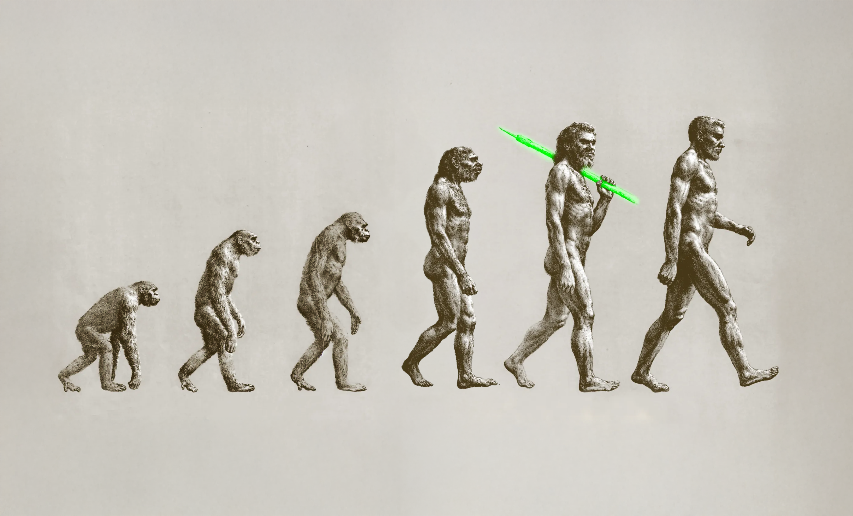
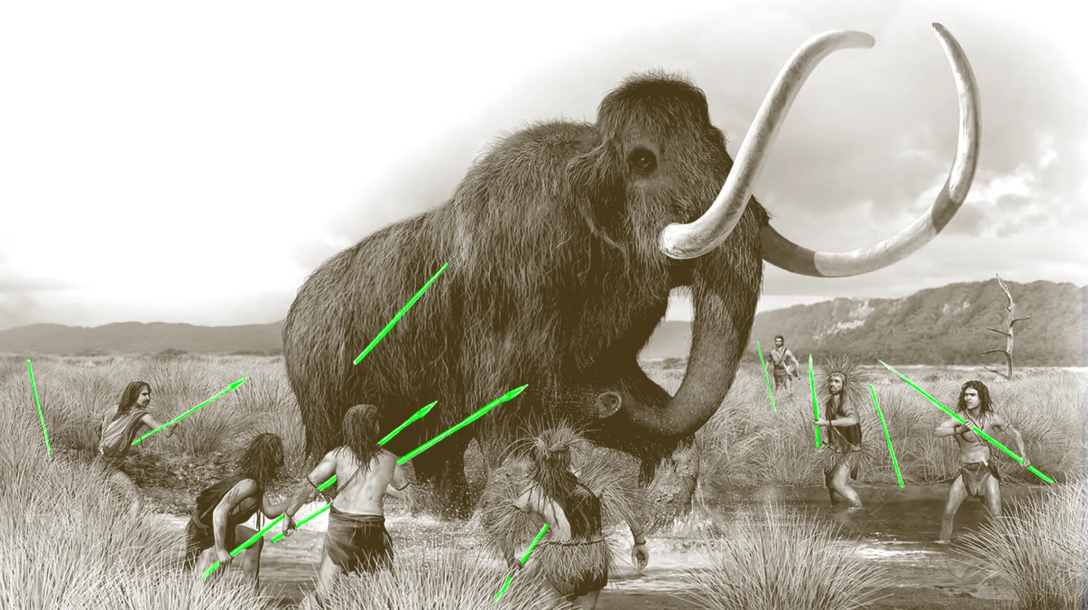
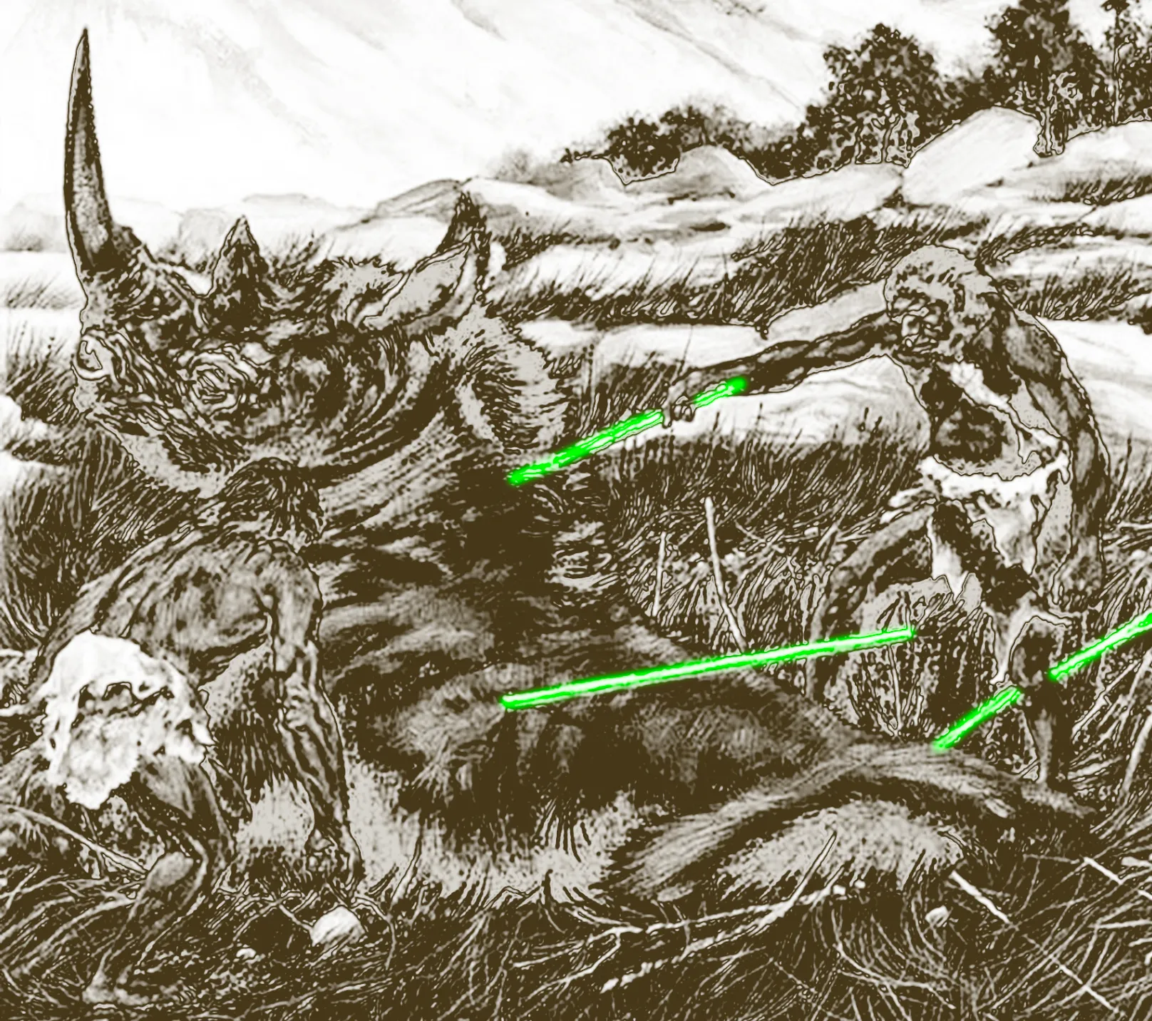
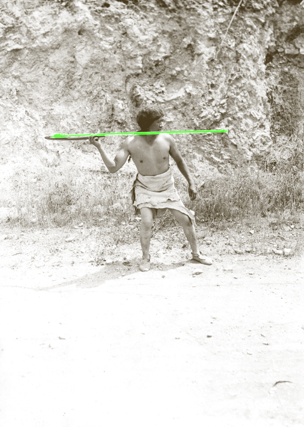
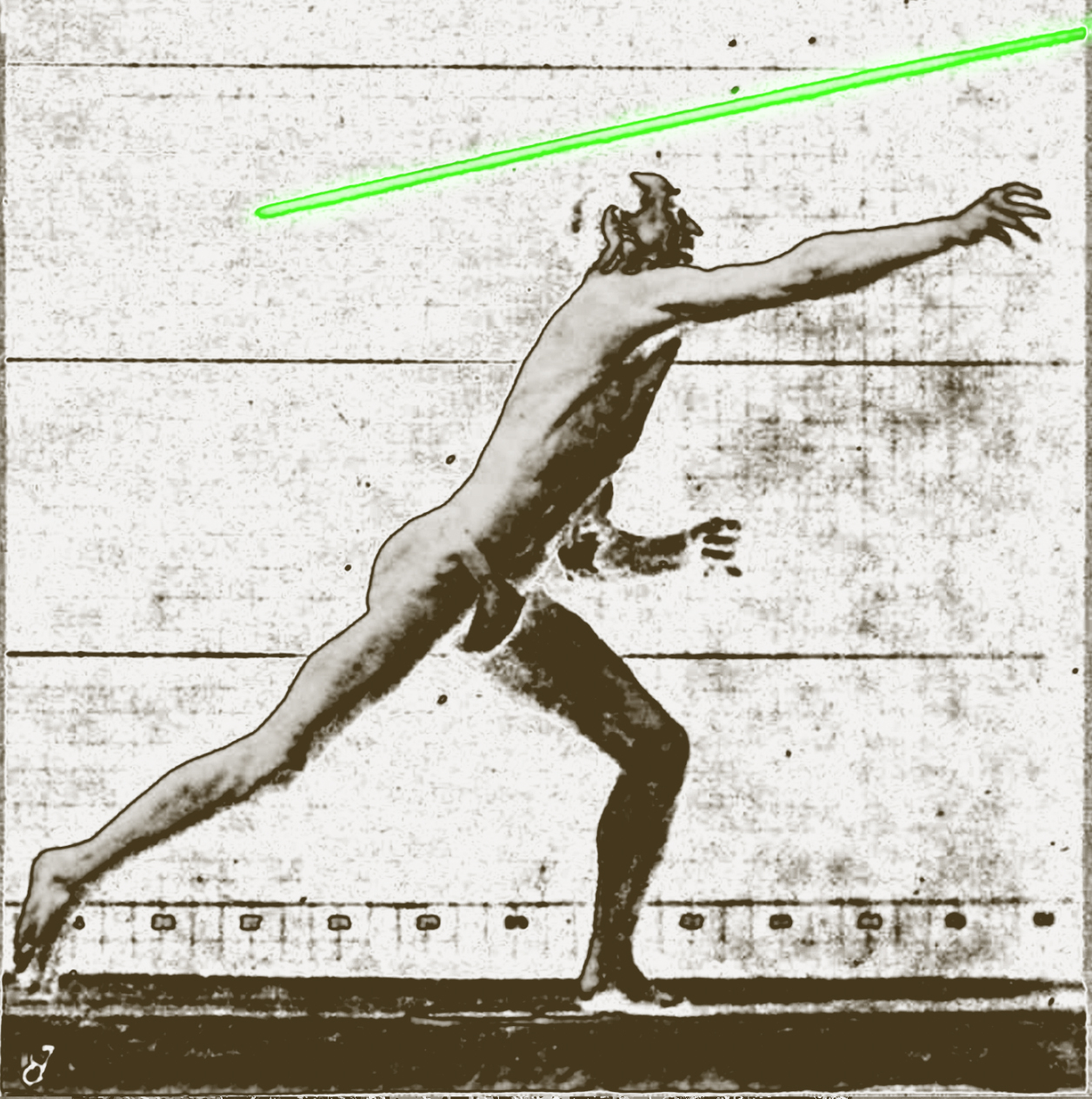
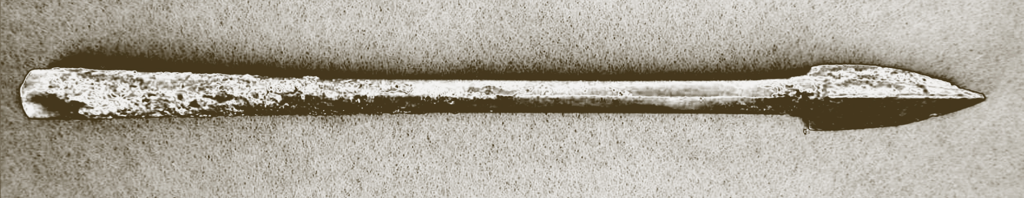
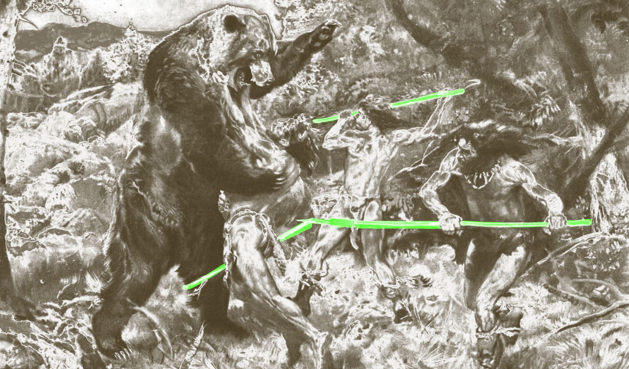
The whole project was built on two key sources. The primary source, Le Guin’s essay, has been redesigned into an easy to reproduce format, allowing for simple and cost effective distribution, giving many people access to the text. The second key source was teh March of Progress illustration—an iconic cultural image showing the linear transition from a primate to a modern man. The element that I found fascinating about teh image was the fact that the only presence, outside of the marching figures, is a spear, carried by the Cro-magnon Man—the last position between the Modern Man. Of course, the spear is shown to emphasise the importance of tool use in human development. However, it is interesting that as a tool to represent all other tools, a spear is chosen. What does that tell us about what humans are if the tool that seems to have allowed us to transition fully into our modern selves is a tool of aggression, hunt and conquer? Why is it a man in the image and not a woman? Why do we speak of hunter-gatherers and not gatherer-hunters? And what do all these decisions tell us about humanity’s self-perception?
PODCAST SERIES
While archival readings and digital research formed the core of my practice in the early stages of the project, I found it essential to speak with some experts that could give me some further insights into my slowly forming philosophy. I reached out to over 20 experts from the areas such as academia, design, basket-making, archival practices or co-op organisation. In my home-made recording studio I managed to record 8 interviews with people such as Mindy Seu, Aggie Toppins, Esme Hofman or Louise Sandhaus.
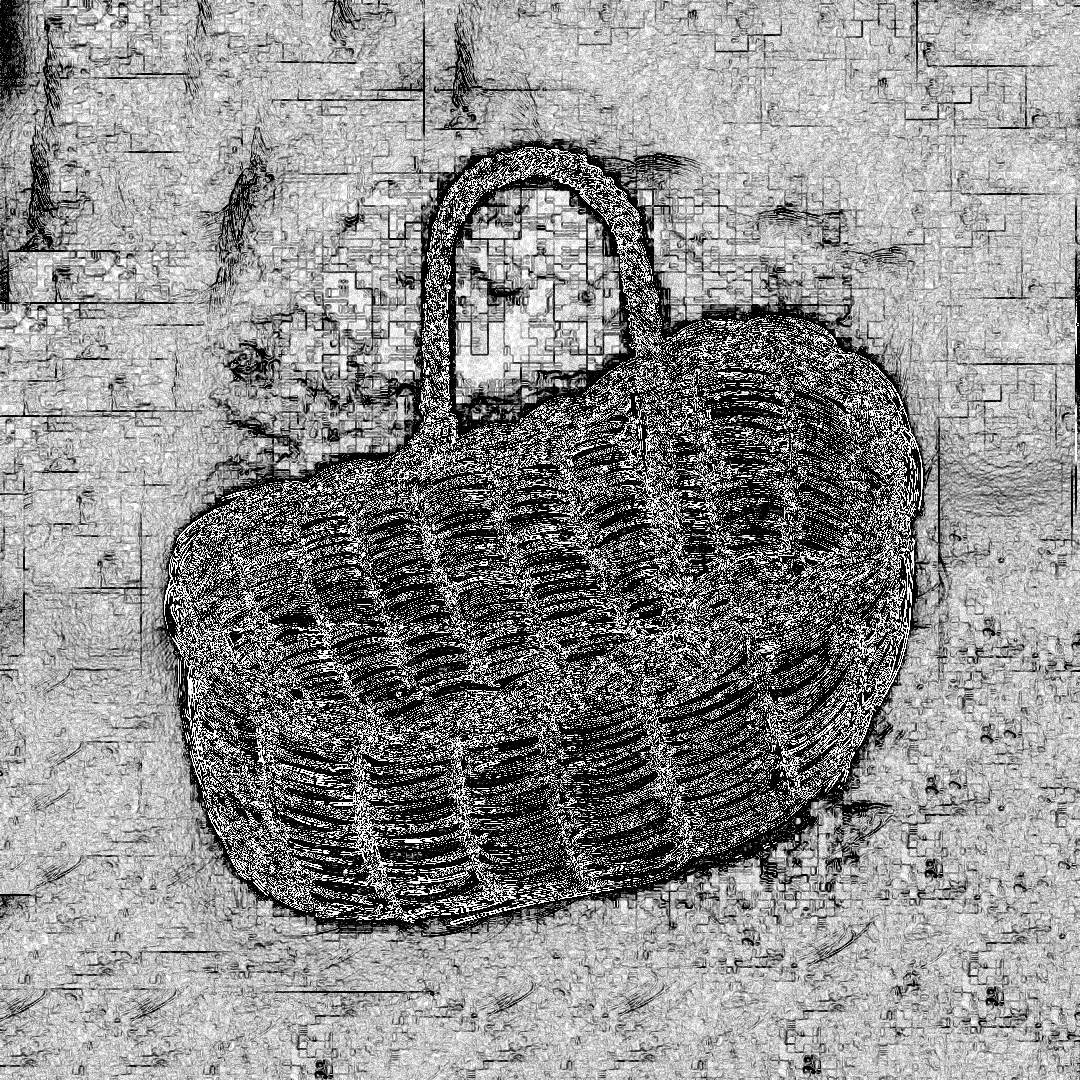
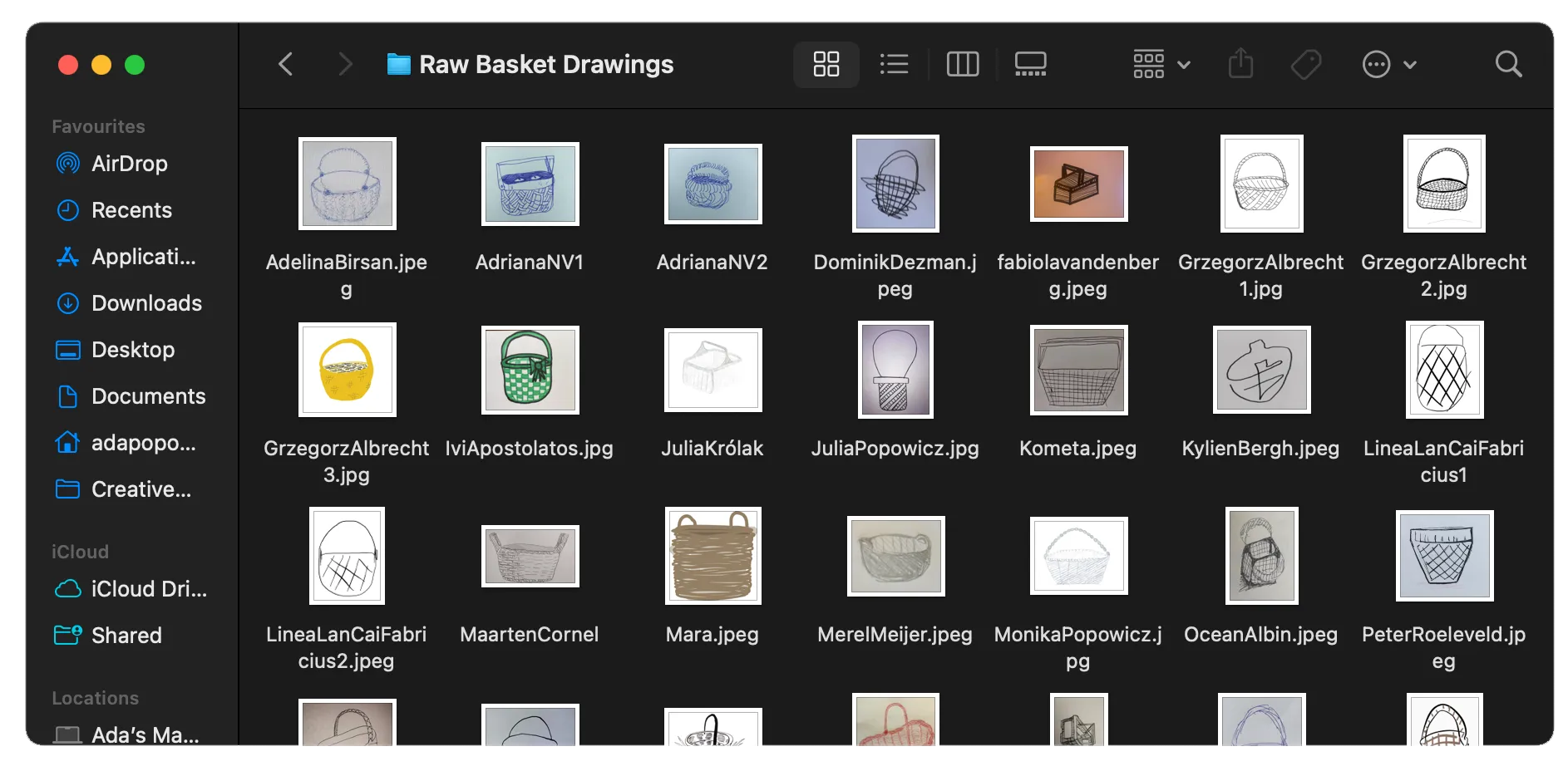
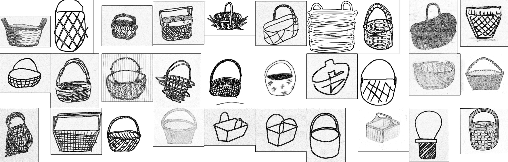
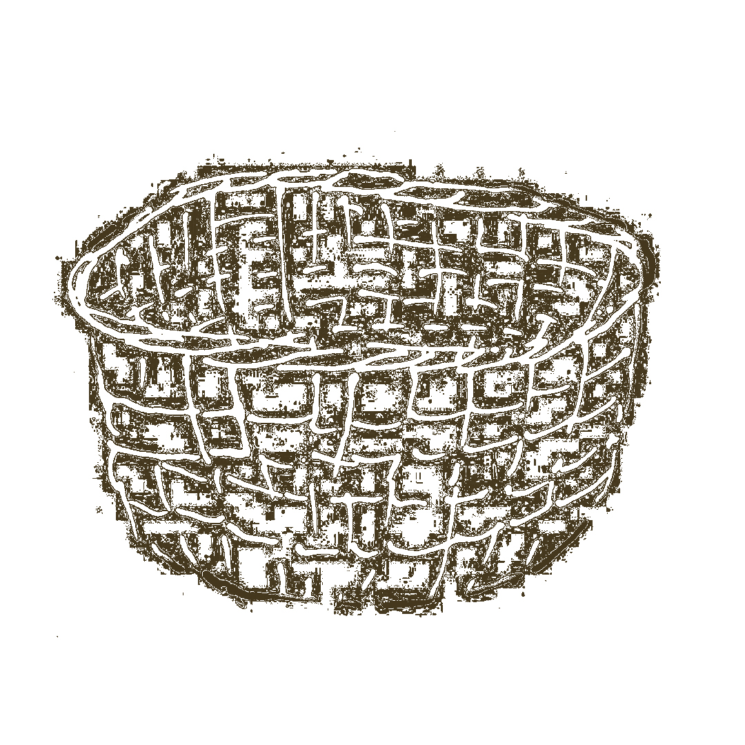
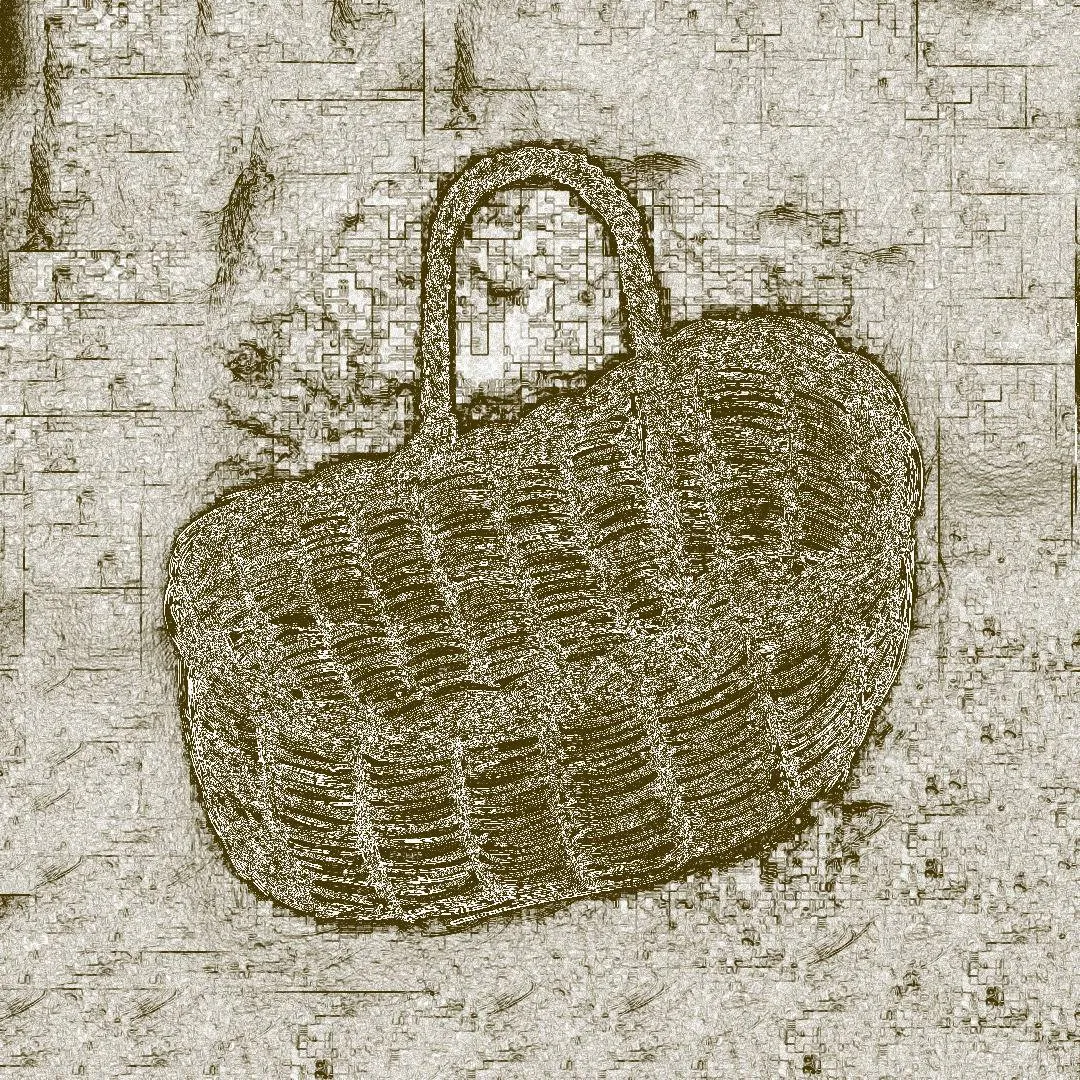
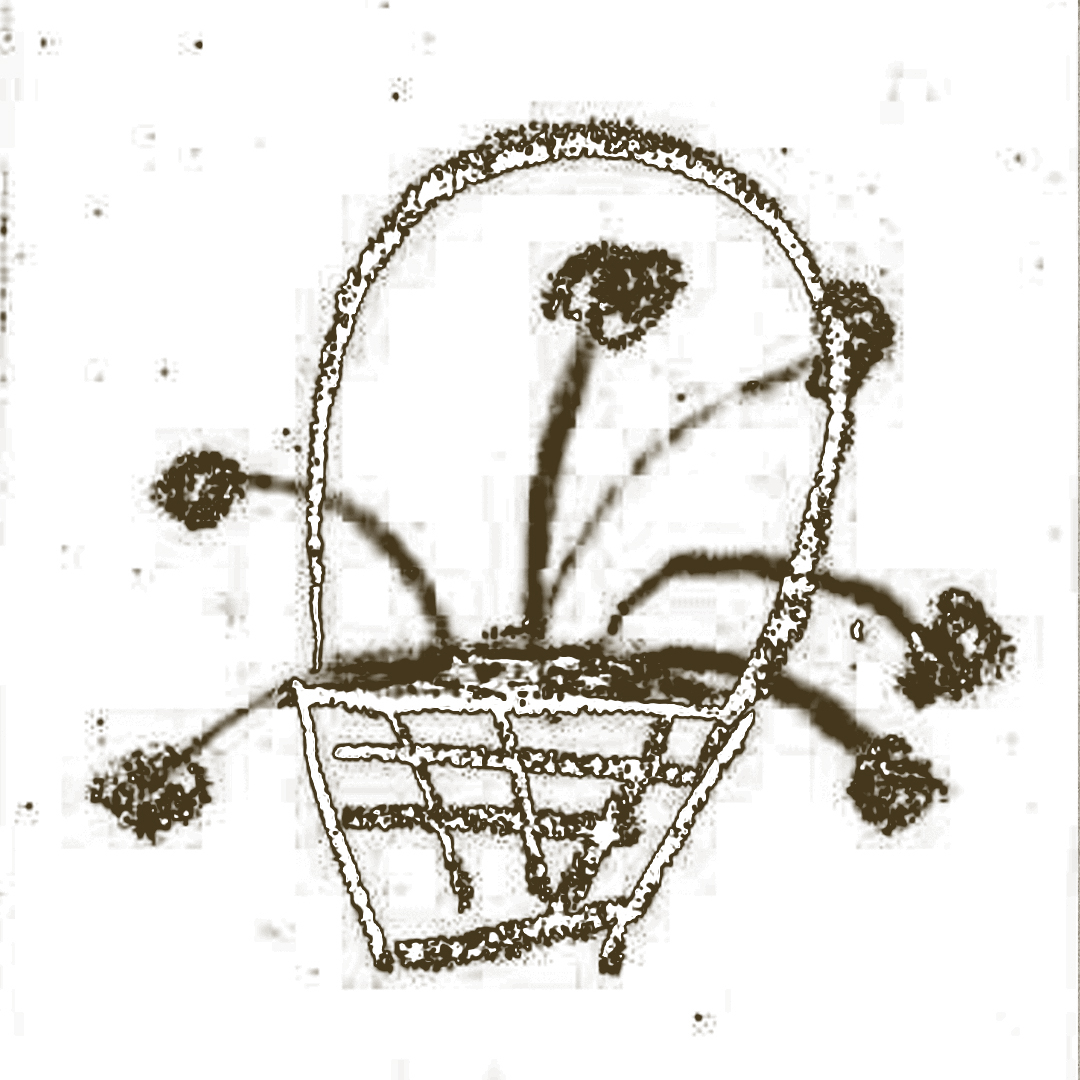
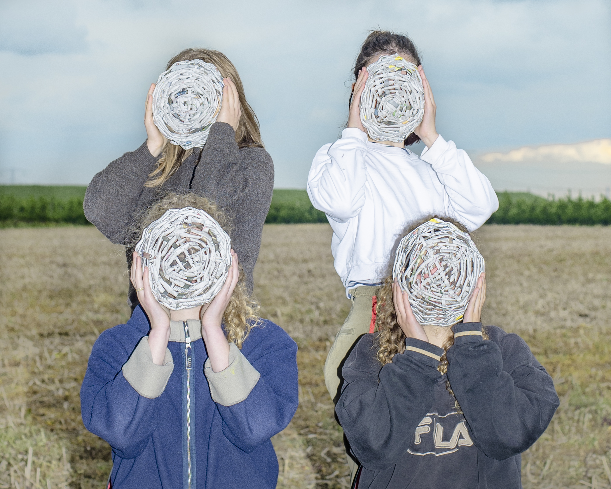
After every interview, the experts were asked to a draw a basket, a simple or as complex as they wished. The collected drawings, from both experts and other people who provided tem, created a valuable archive of what an idea of a basket looks like to different individuals. The interviewees’ basket drawings were later used as the covers of their podcast episodes on the basketology website.

VISUAL IDENTITY
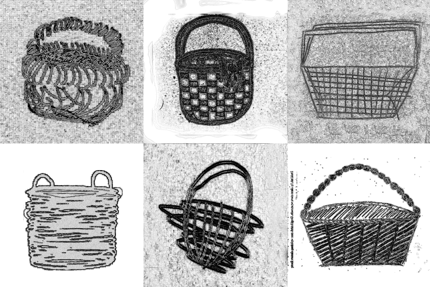
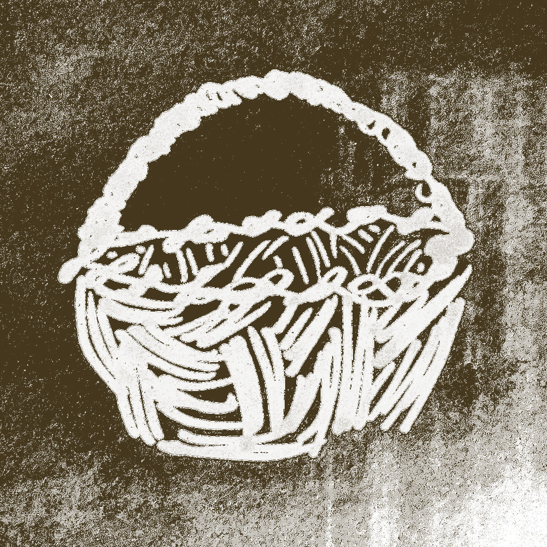
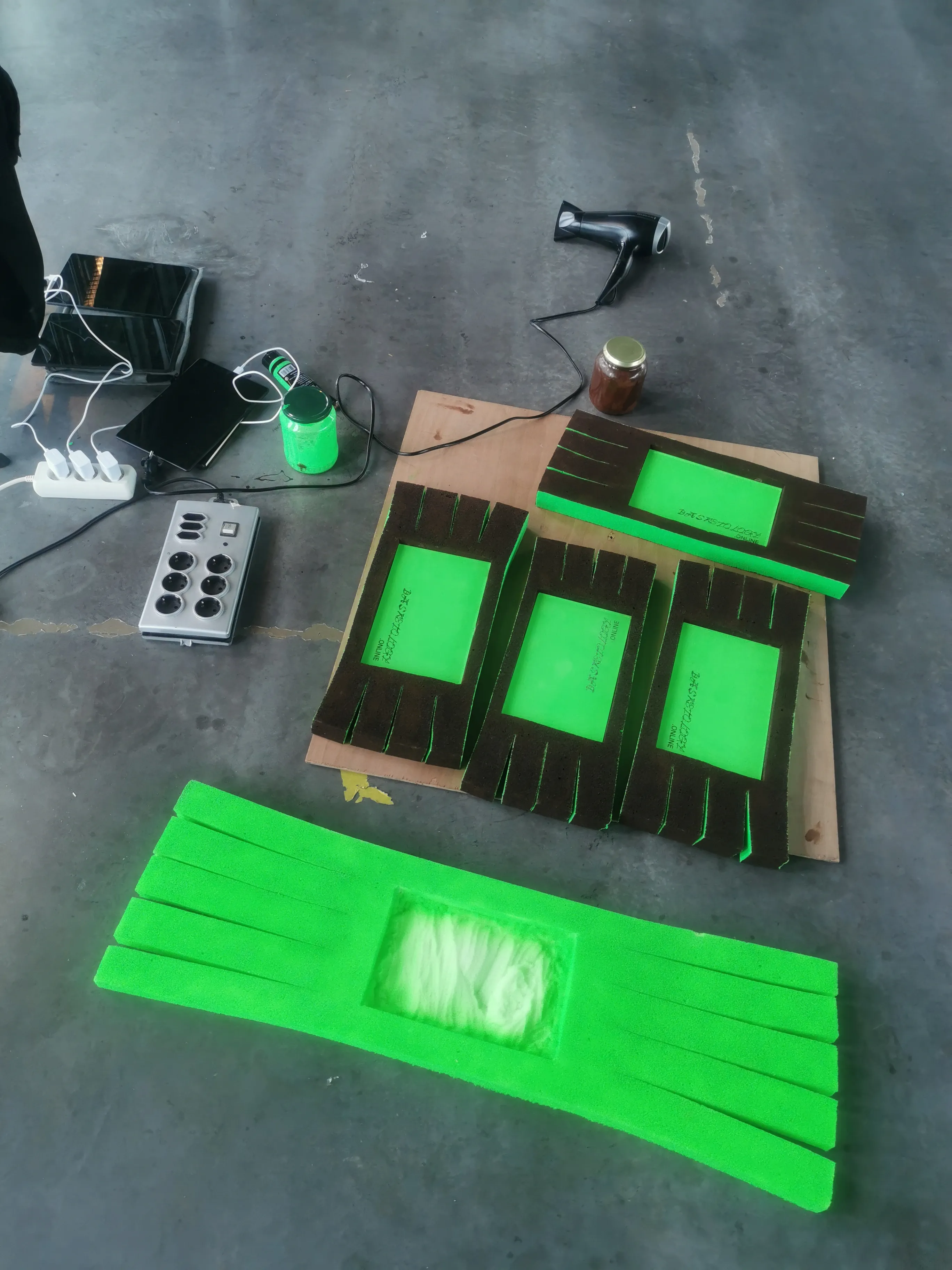
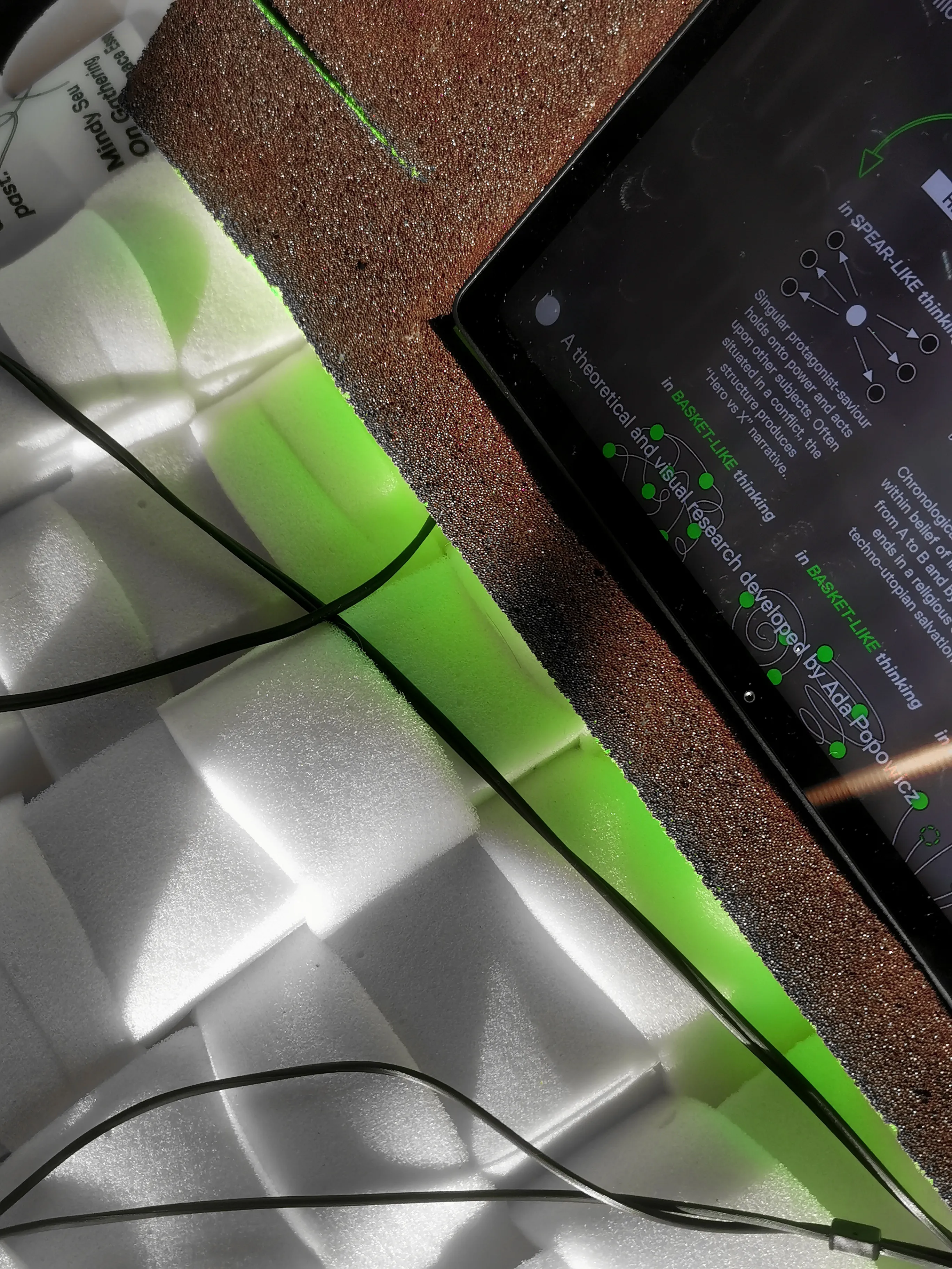
The visual direction of the identity was supposed to be reminiscent of an archival publication, filled with graphs and strange scientific illustrations, showing some ink bleeds and grainy quality. By heavily editing the images, I wanted to take them out of their original context and let them be tools explaining the concepts of the project, while giving them a recognizable, consistent look.
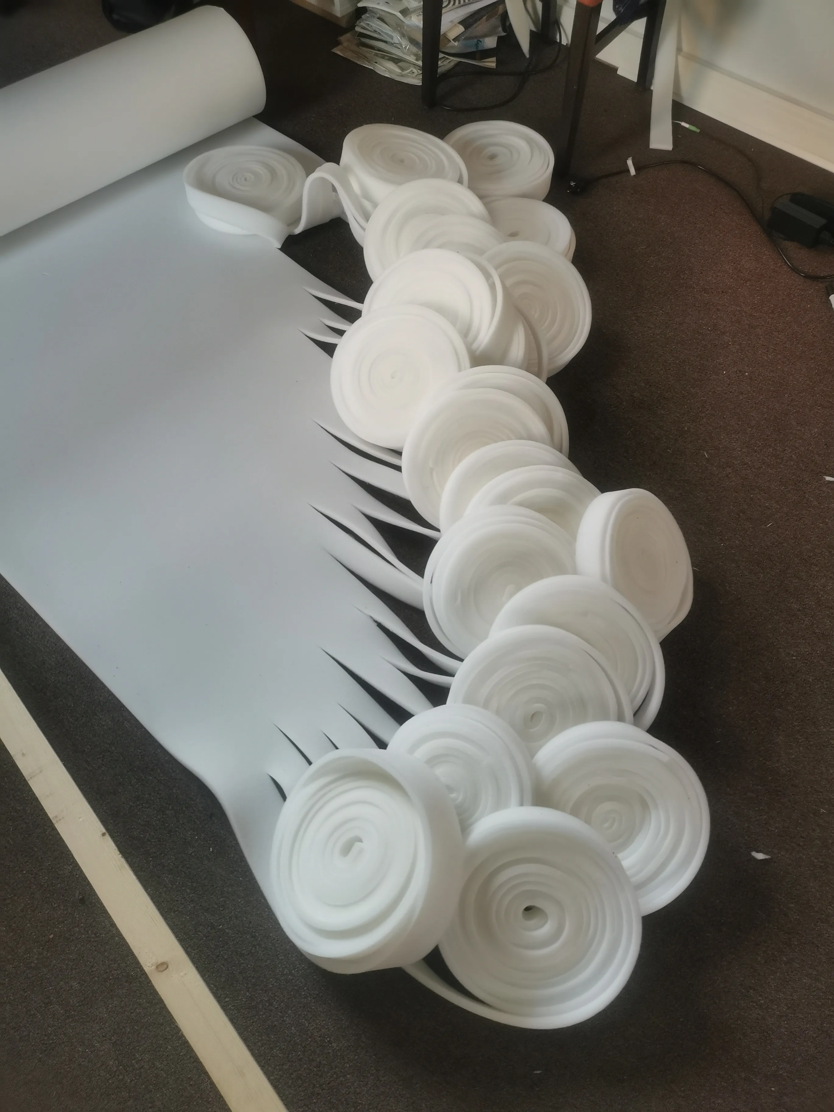
For the colour palette I decided to mix white and dark brown. Behind that choice was the idea of communicating, through colours, the natural materials traditionally used for basket or spear making: wood, stone, metal, straw. However, the palette is combined with a striking neon green, reminding one of highlighters used by students and communicating the idea of studying the images and texts of the project deeply, in a new context.

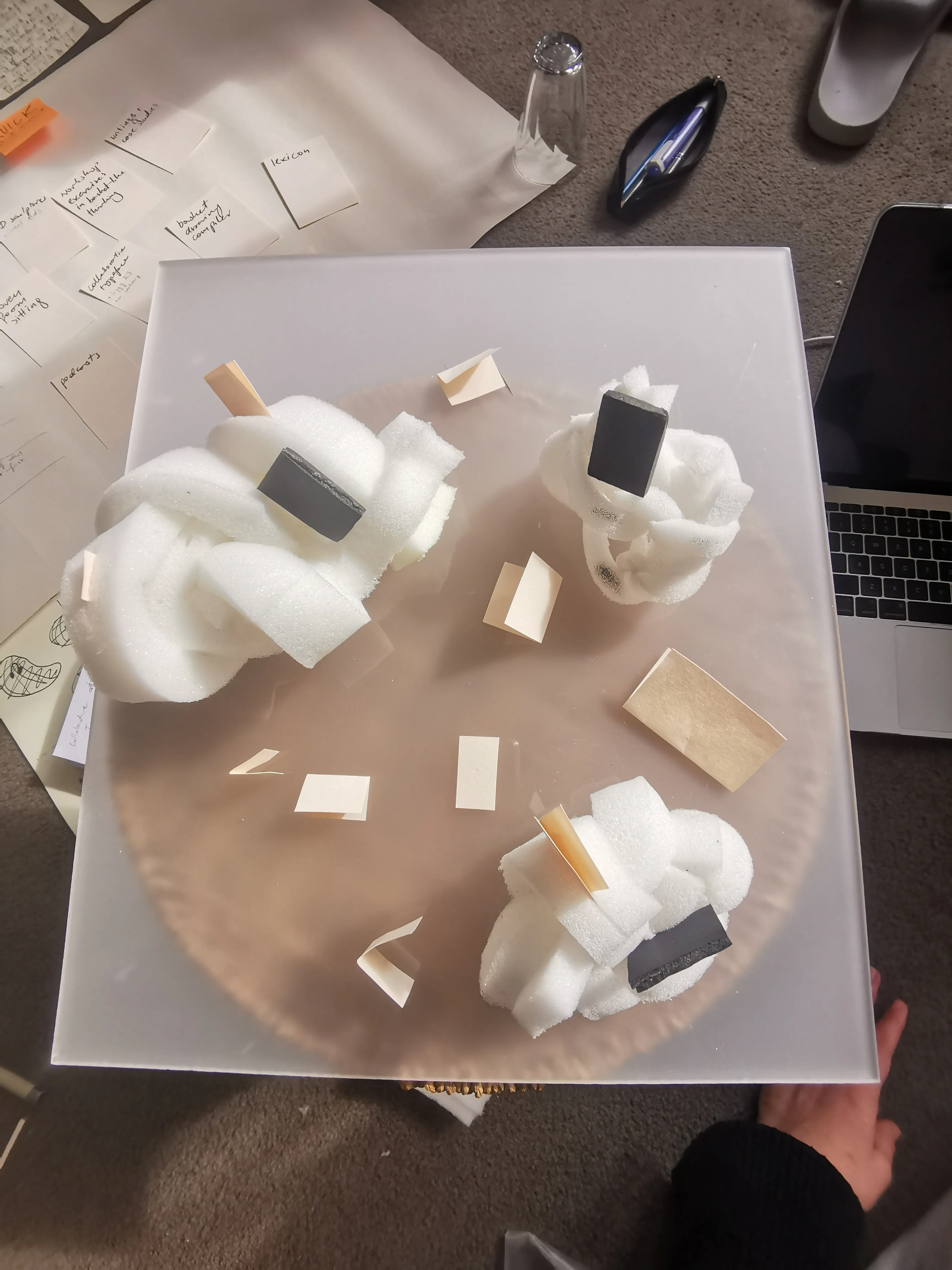
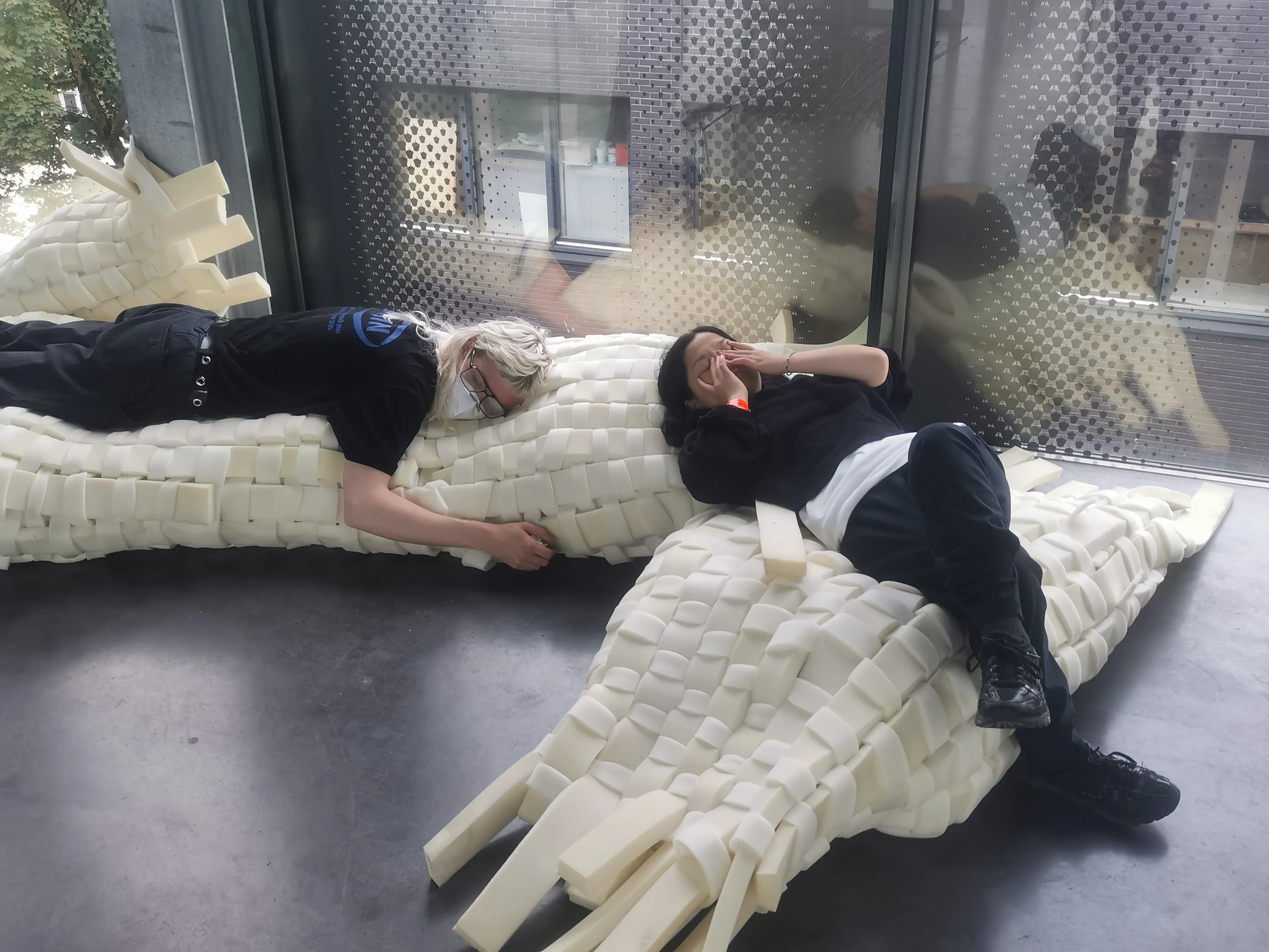
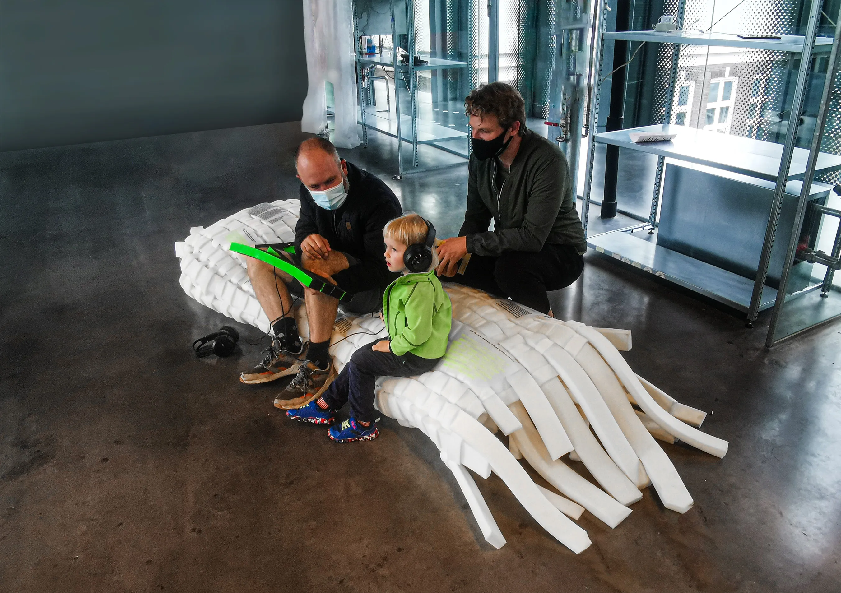
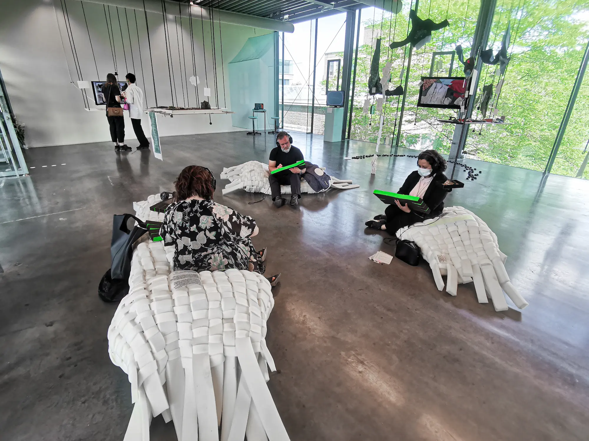
FURNITURE AND EXHIBITION
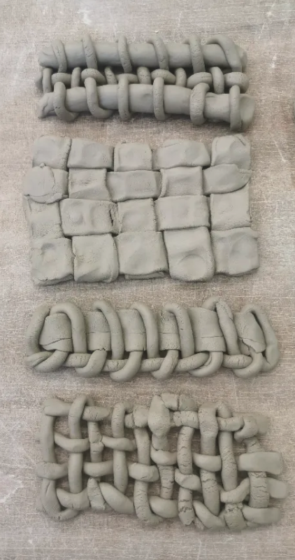
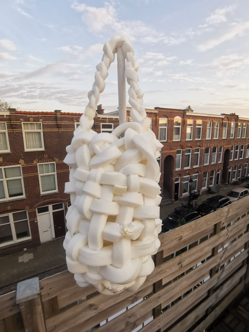
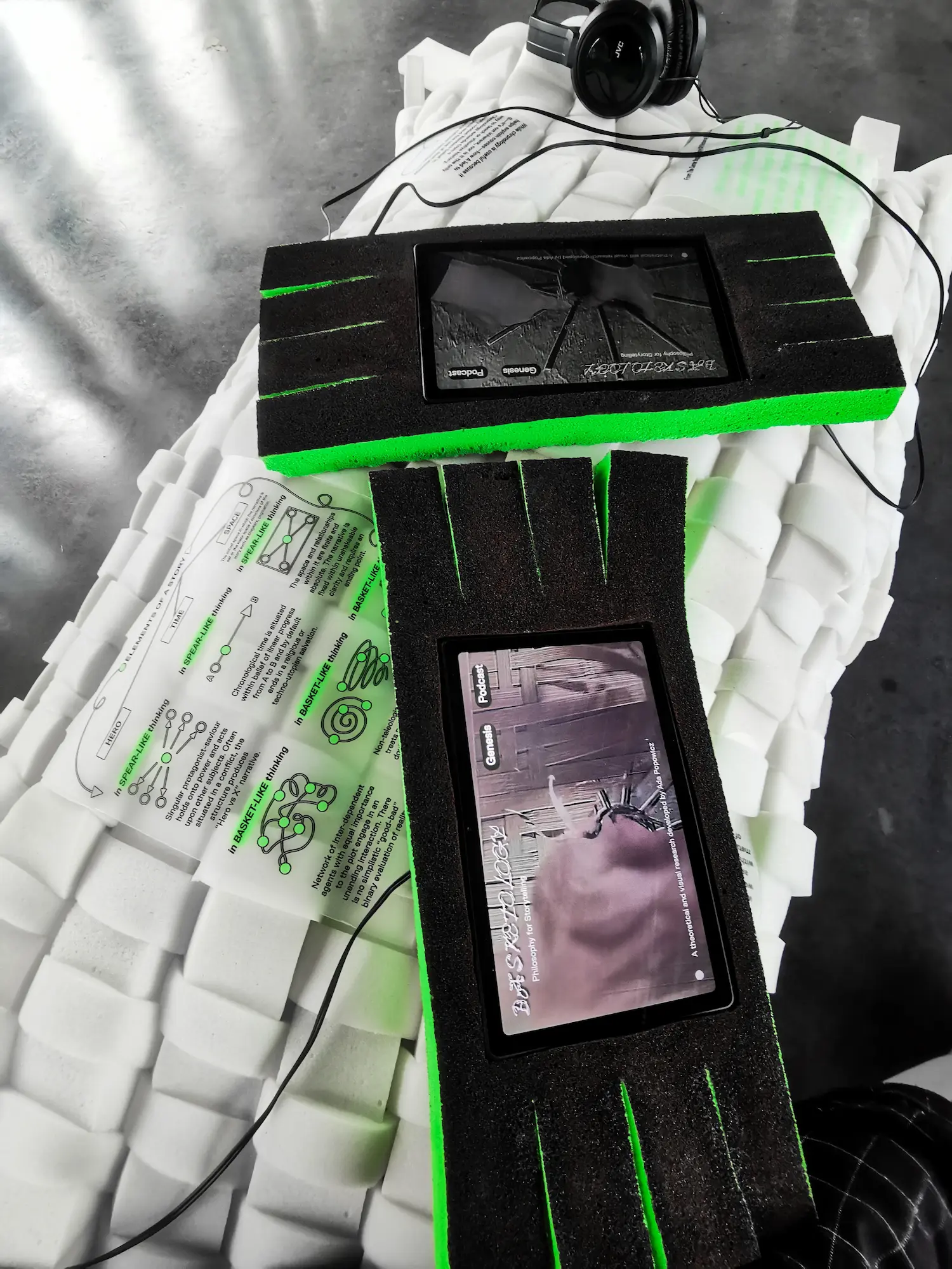
The project was originally created as a BA Graphic Design graduation project at The Royal Academy of Art. The project was displayed during the graduation festival. It took a form of an island with exploration stations, where the visitors could engage with Basketology by sitting on hand-woven furniture and exploring the project’s digital platform. The platform featured an essay about teh theoretical framework of the project, diagrams, imagery, and recordings of the interviews in a form of an 8-episode podcast.
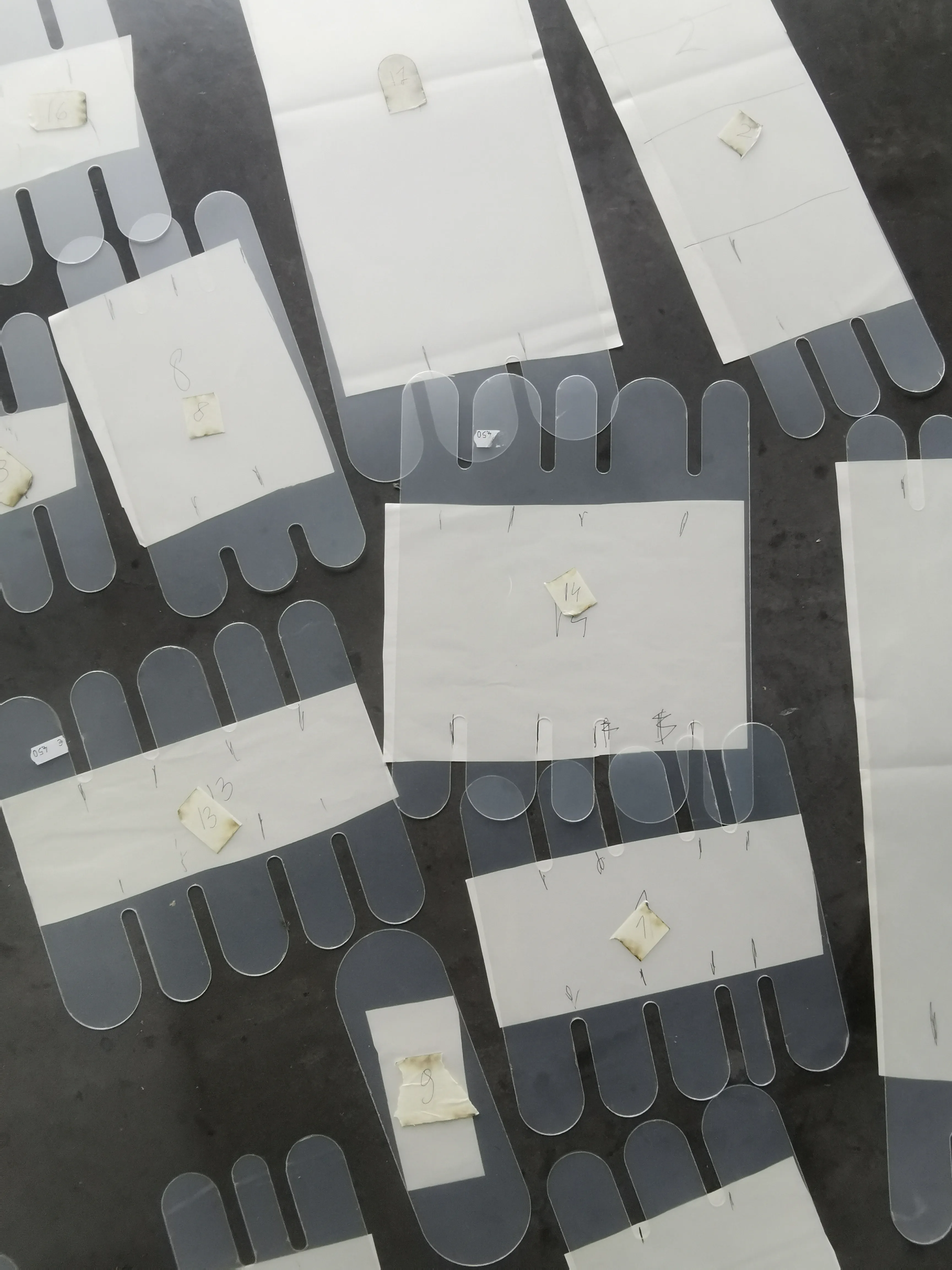
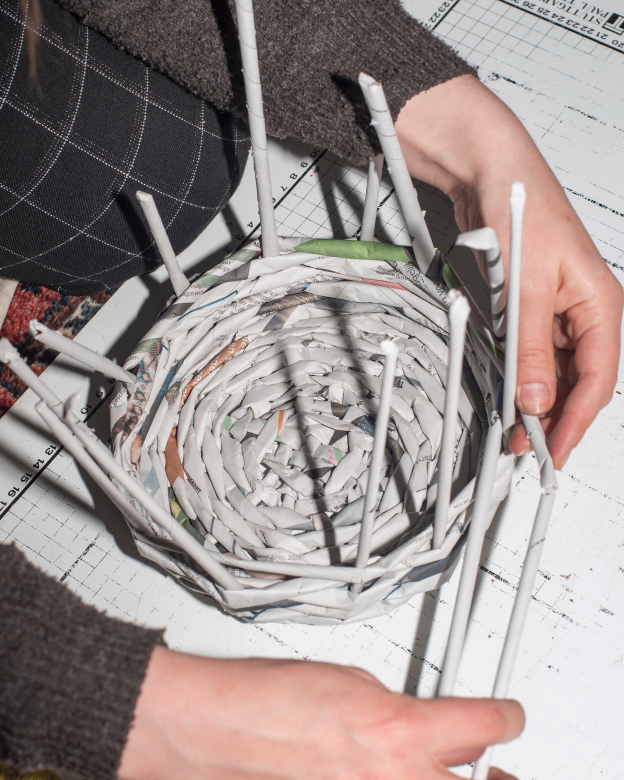
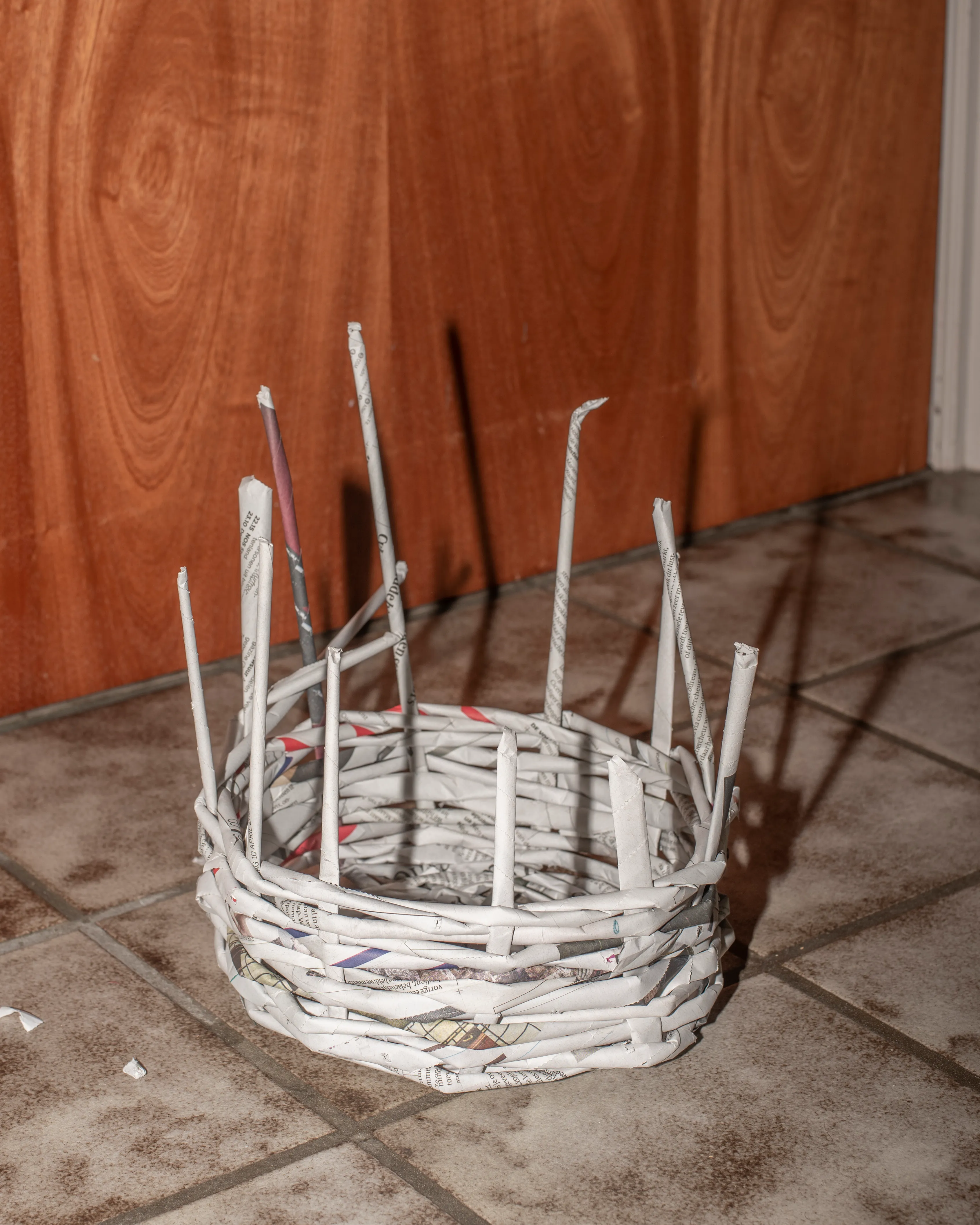
Each bag-like seat had a holder for a tablet, where the Basketology website was displayed. Headphones were attached for a comfortable listening experience. The tablet holders had cuts at the ends which allowed them to be easily woven into the furniture. Additionally, into the seats, I have woven quotes, diagrams and other elements of the project. Screen-printed on transparent sheets, they could be perfectly interconnected with the furniture and easily moved around.

LECTURES & APPEARANCES
Basketology was awarded the Waag Technology & Society Award and continues to develop through workshops and lectures (so far at Waag Institute, Royal Academy of Art, Post-Office, AHK Culture Club, Nieuwkomers, University of Amsterdam)


OTHER PROJECTS ↓

Strefy Czasowe
Full branding and art direction for a festival in the night of time change

ARIAS
Brand new look for research through arts & sciences in Amsterdam

Eye of Jeronimo
Branding for an independent kaleidoscope producer
Basketology
A philosophy for alternative storytelling
Lectorate: Touching
Visual campaign for a publication about research by touch

Anyone Want That?
A digital research into exchange of materials between art academy students
Building Second Brain
Moving poster for a lecture about memory outsourcing

Field App
Designing interfaces and interactions for the future of knowledge exploration