Eye of Jeronimo


COLOURS, FONT AND LOGO
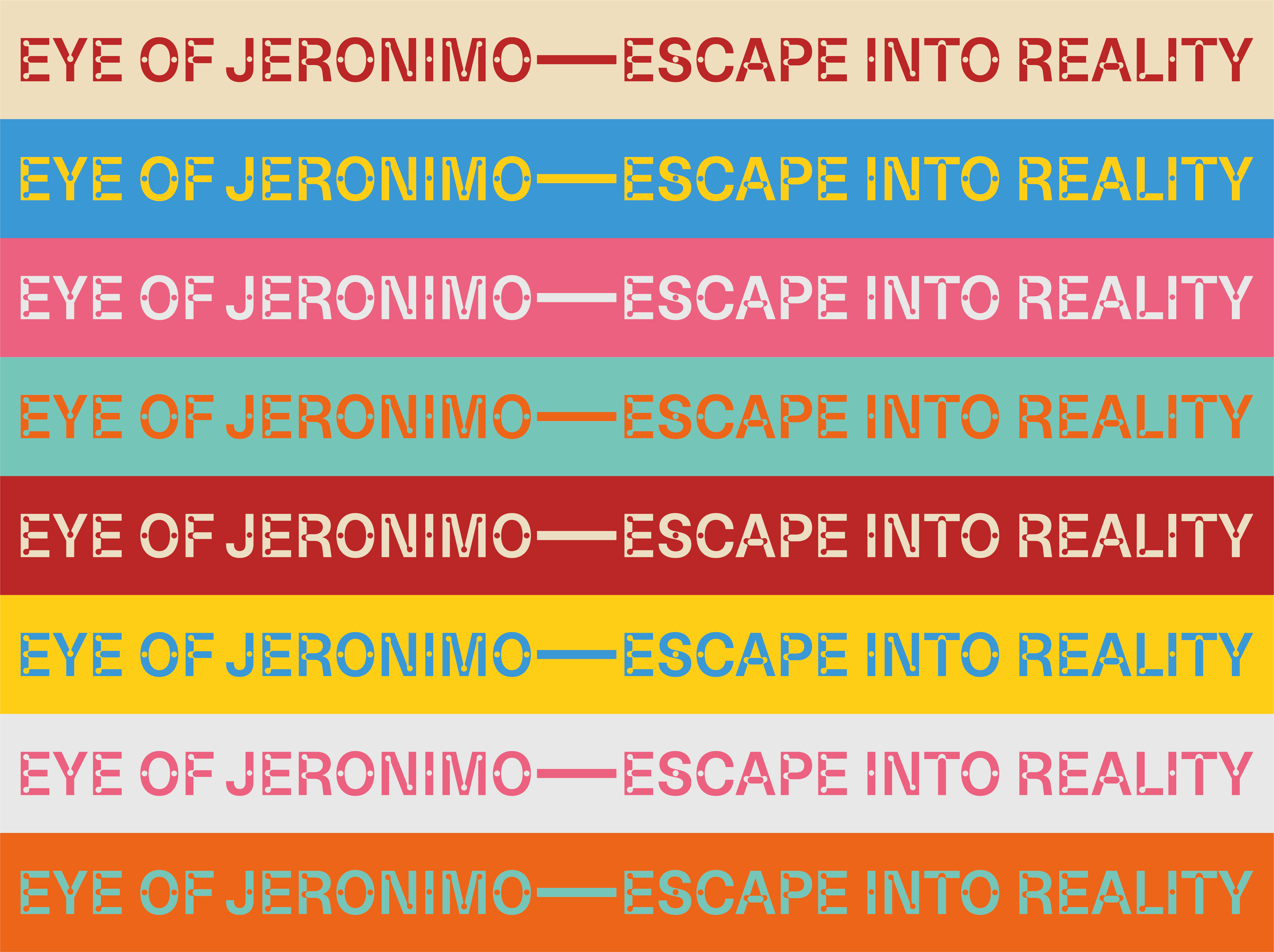
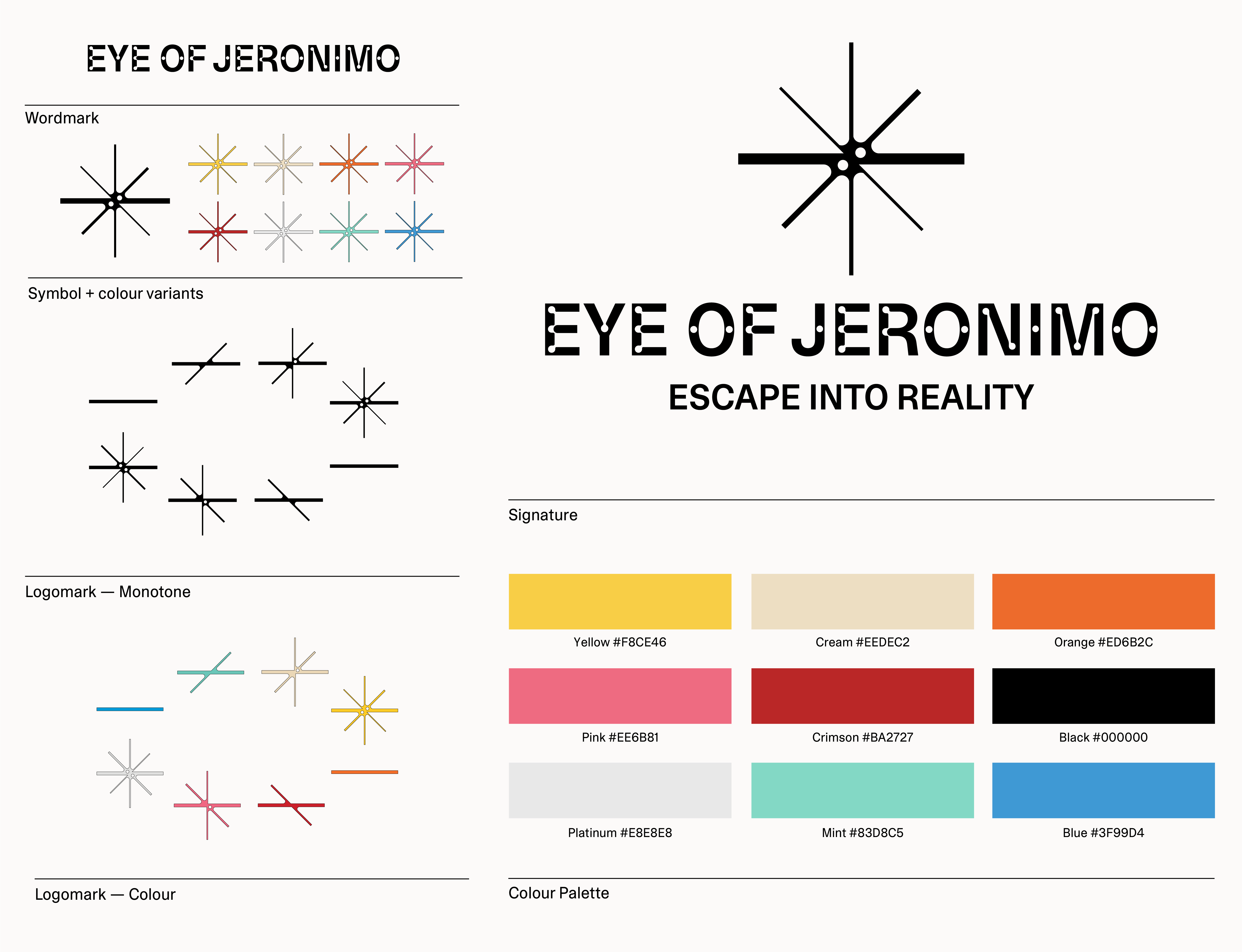
The brand’s colour palette came together quickly and intuitively. The kaleidoscopes were already made from a distinct set of plexiglass colours, which naturally became the foundation for the identity. Just like the scopes themselves, the colours could be freely mixed, matched, and adapted to different contexts—a system that reflected the spirit of playful experimentation at the heart of the brand.
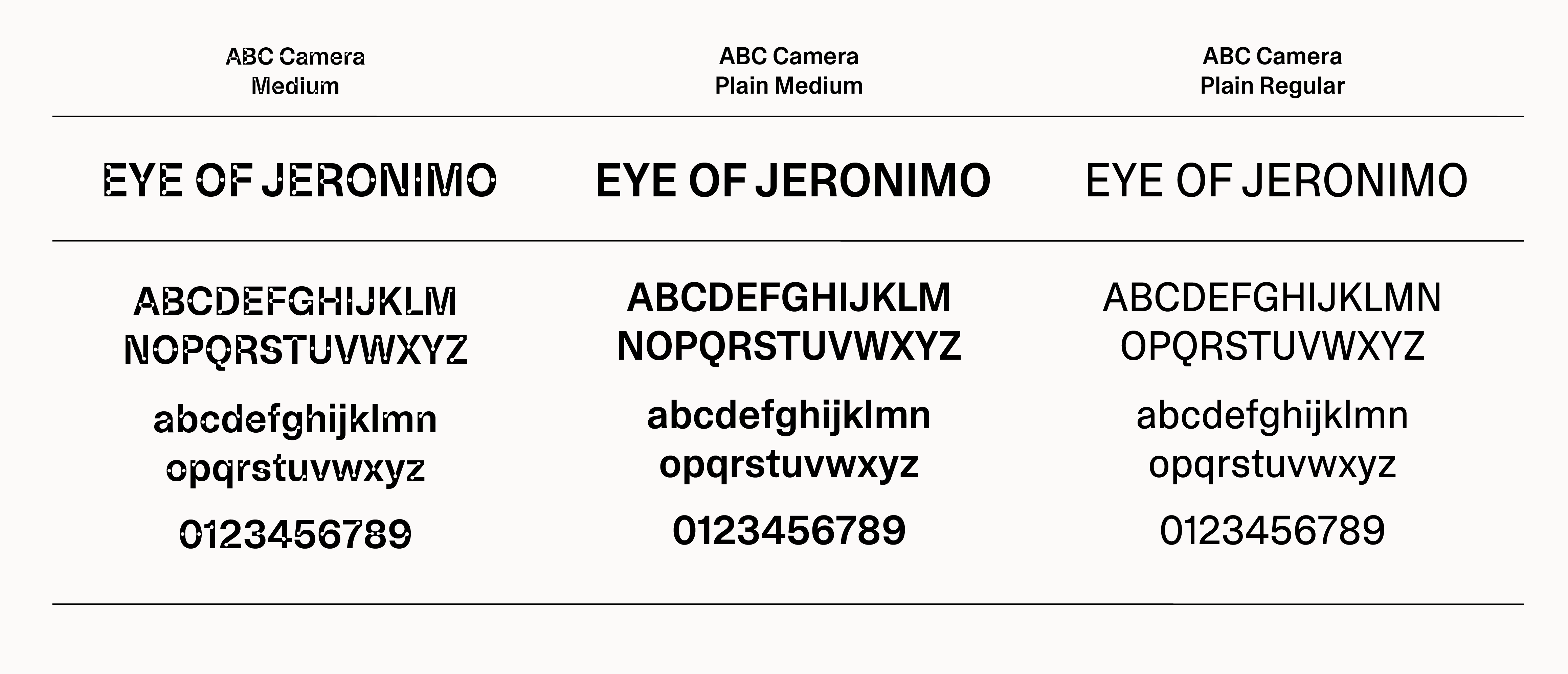
As for typography, I chose ABC Camera. Despite its popularity, it’s rarely used in a way that conceptually takes advantage of its defining feature—the subtle light traps. Since a kaleidoscope is, in essence, a reflective light trap, the connection felt immediate.
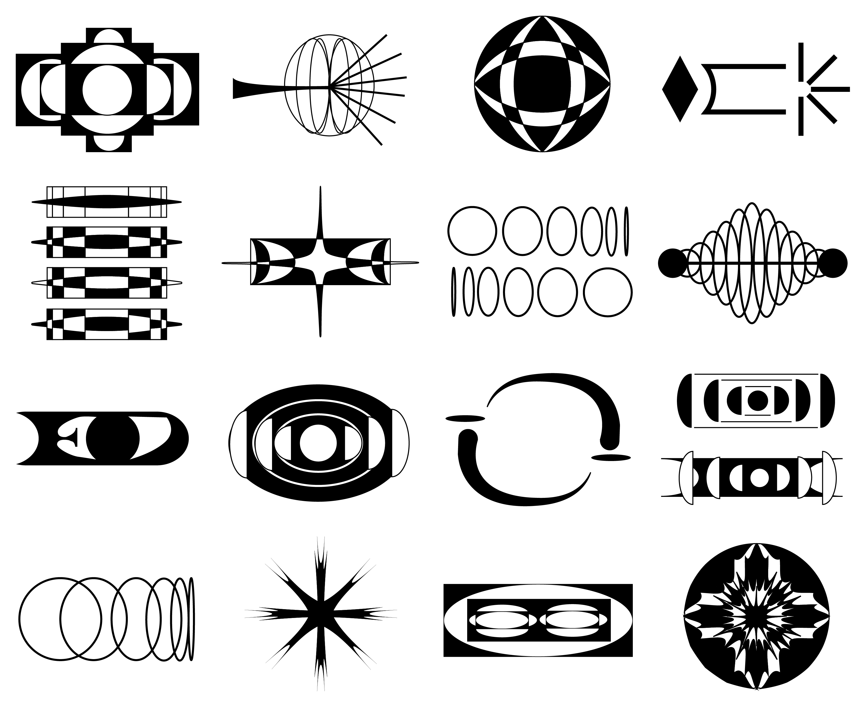
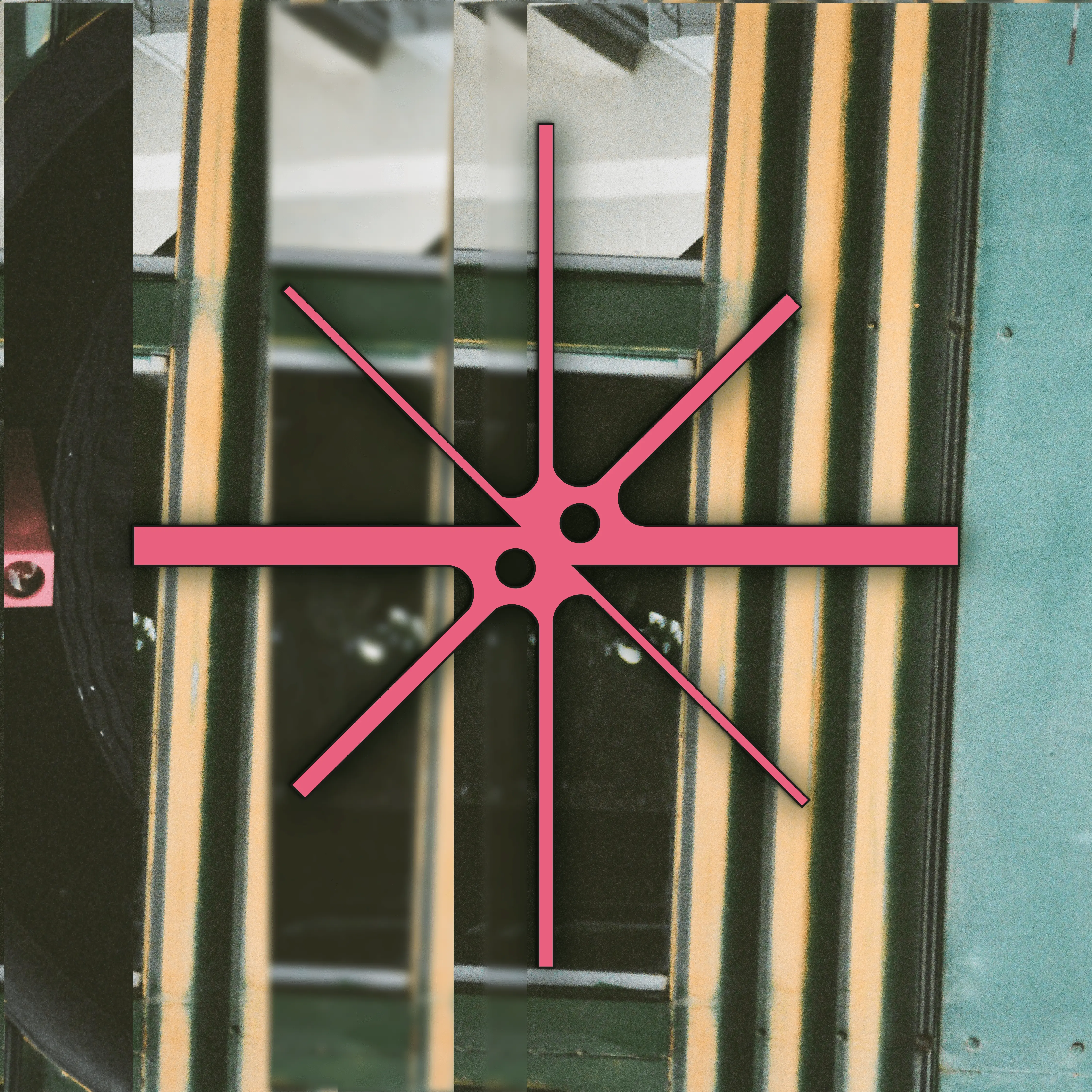
For the logo, I wanted to create a symbol that ties together reflection, light, and the vibrant nature of EOJ’s designs. The geometry of Camera inspired the inclusion of light traps within the logo’s fuller shapes, resulting in a bold, symmetrical mark that echoes the shifting symmetry and rhythm of a kaleidoscope’s view.
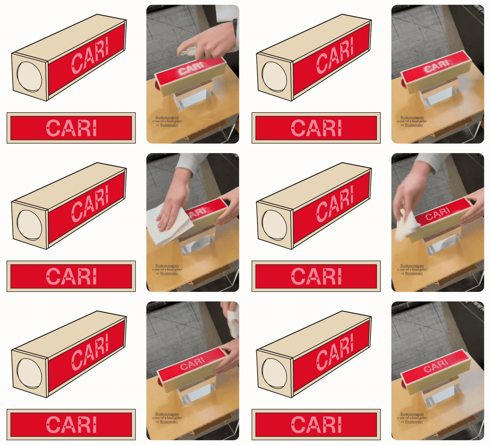
ILLUSTRATION
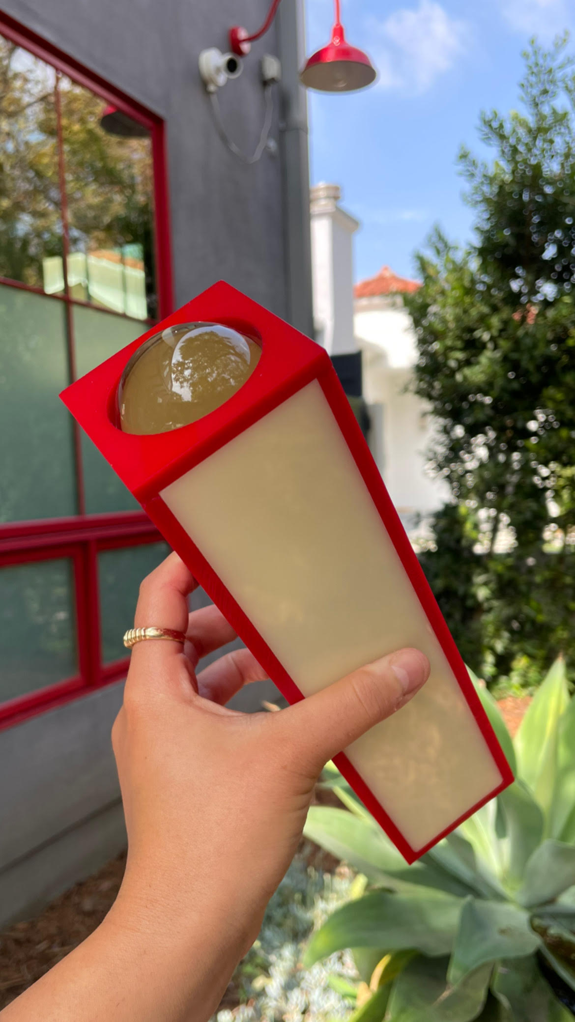
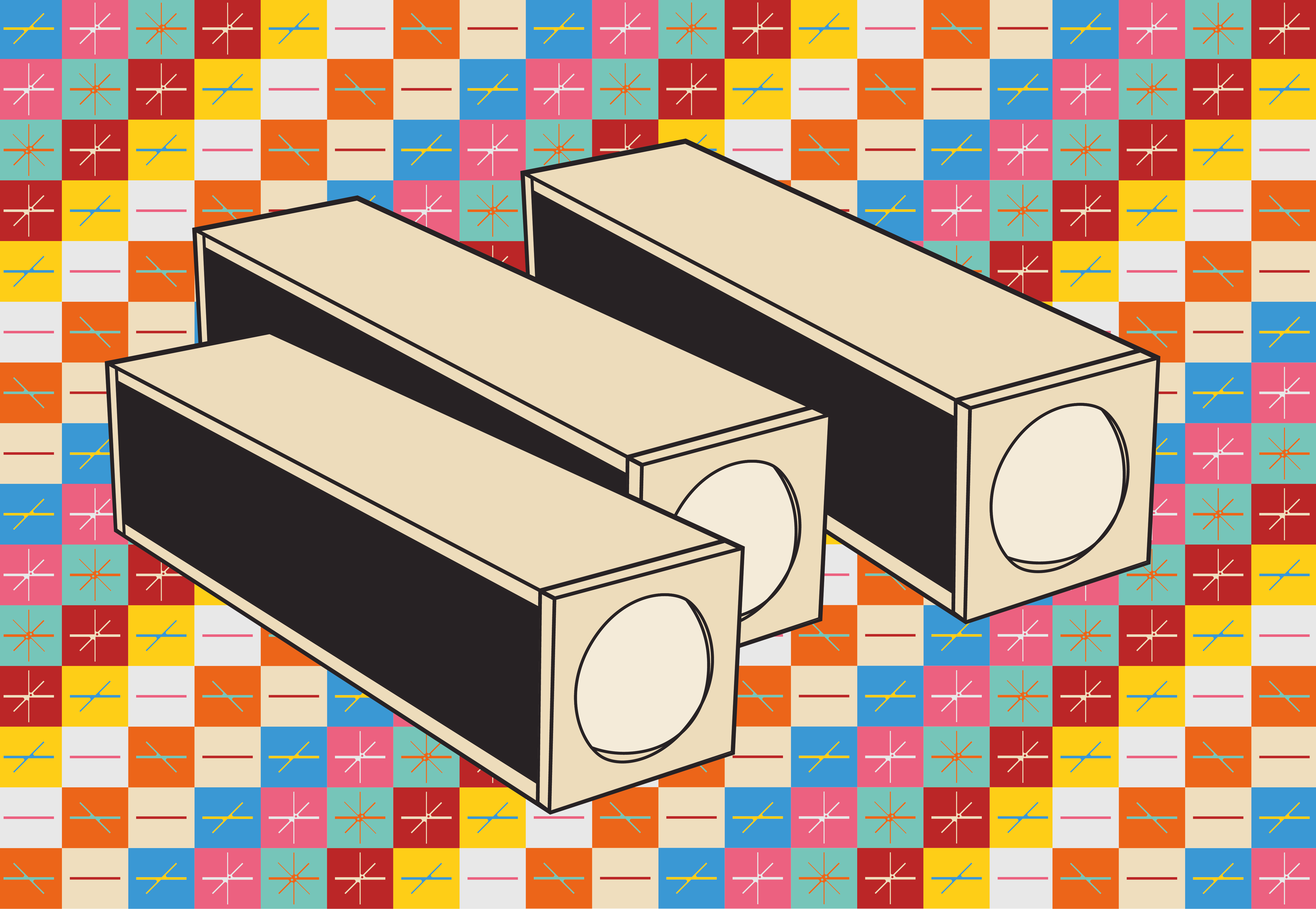
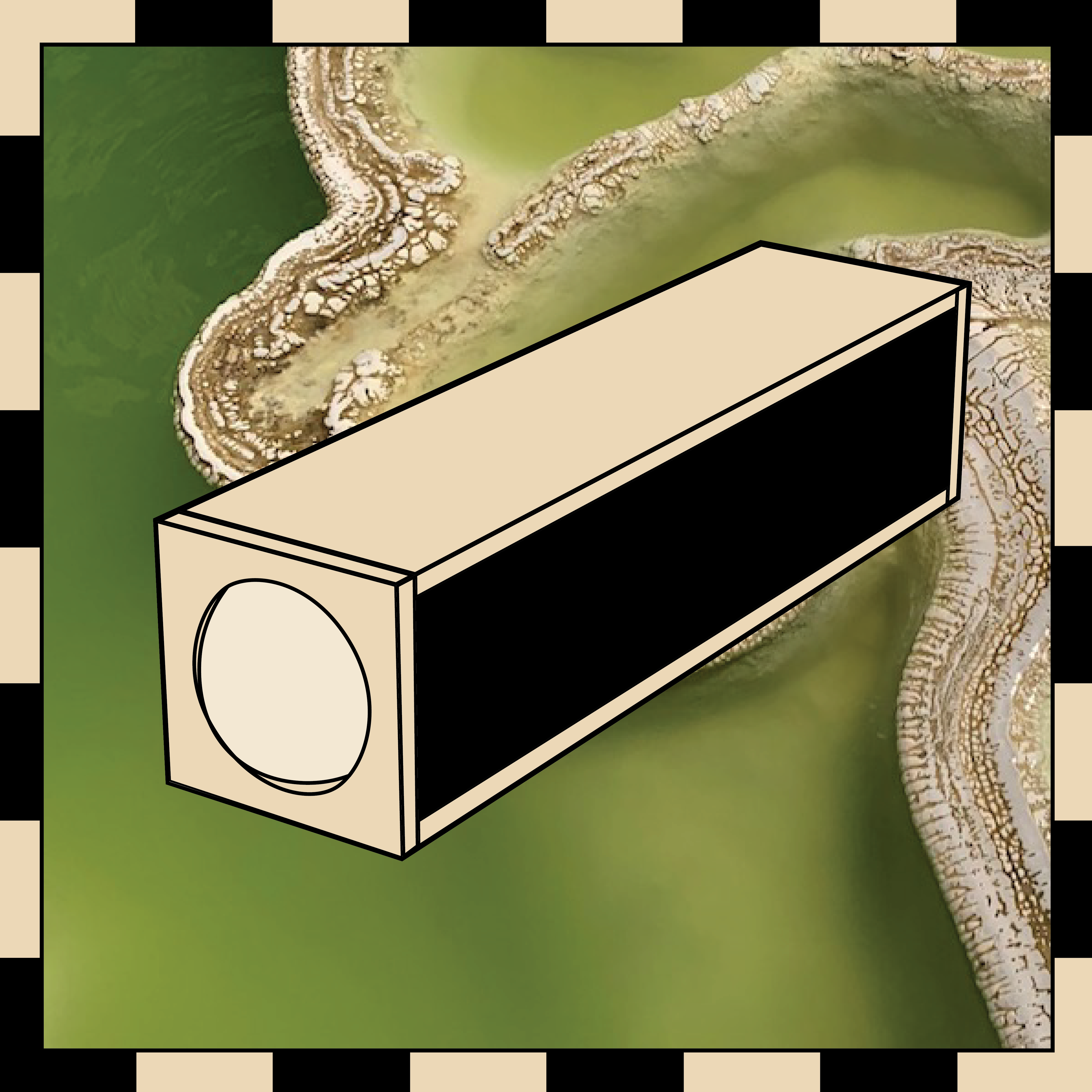
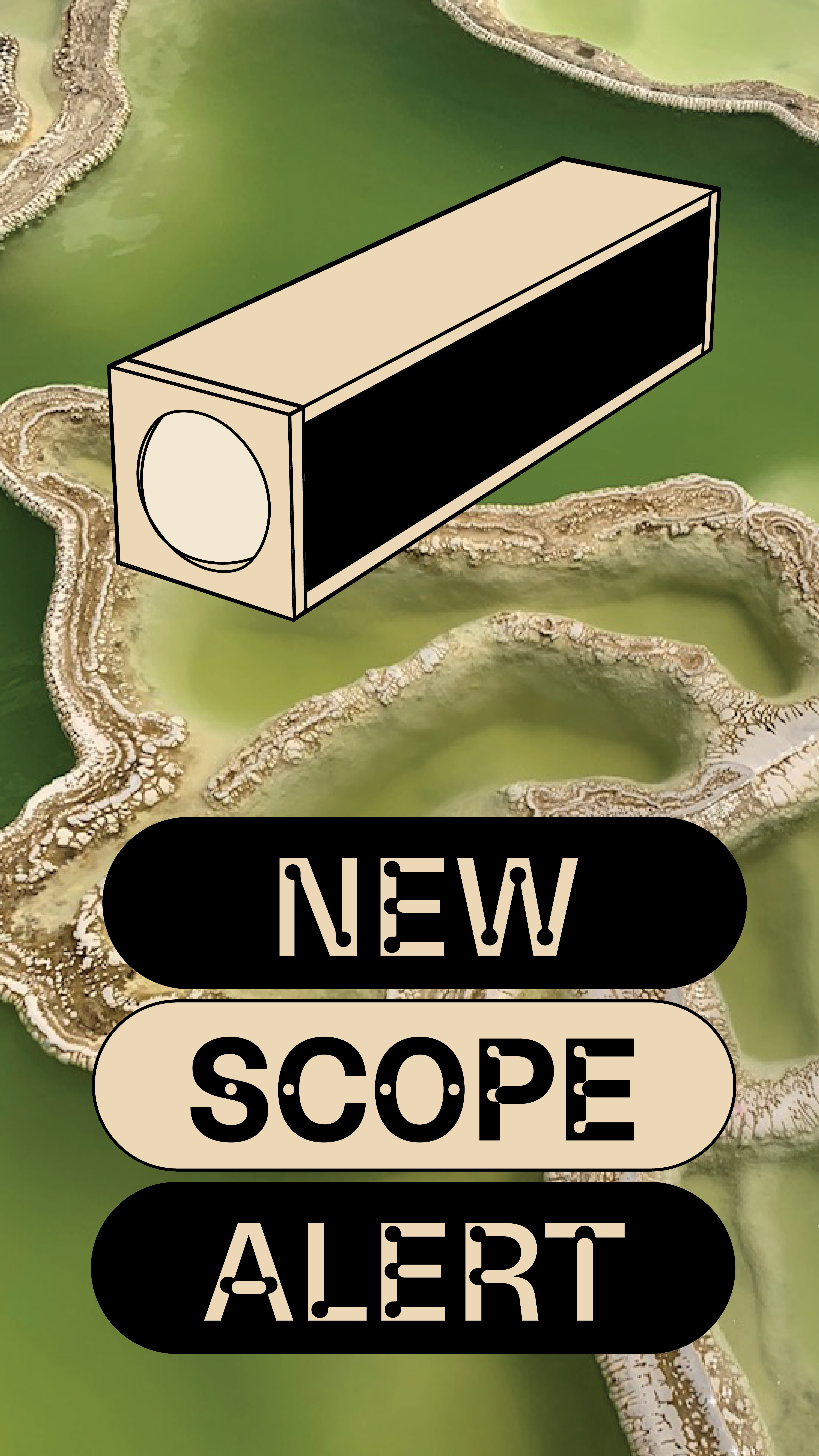
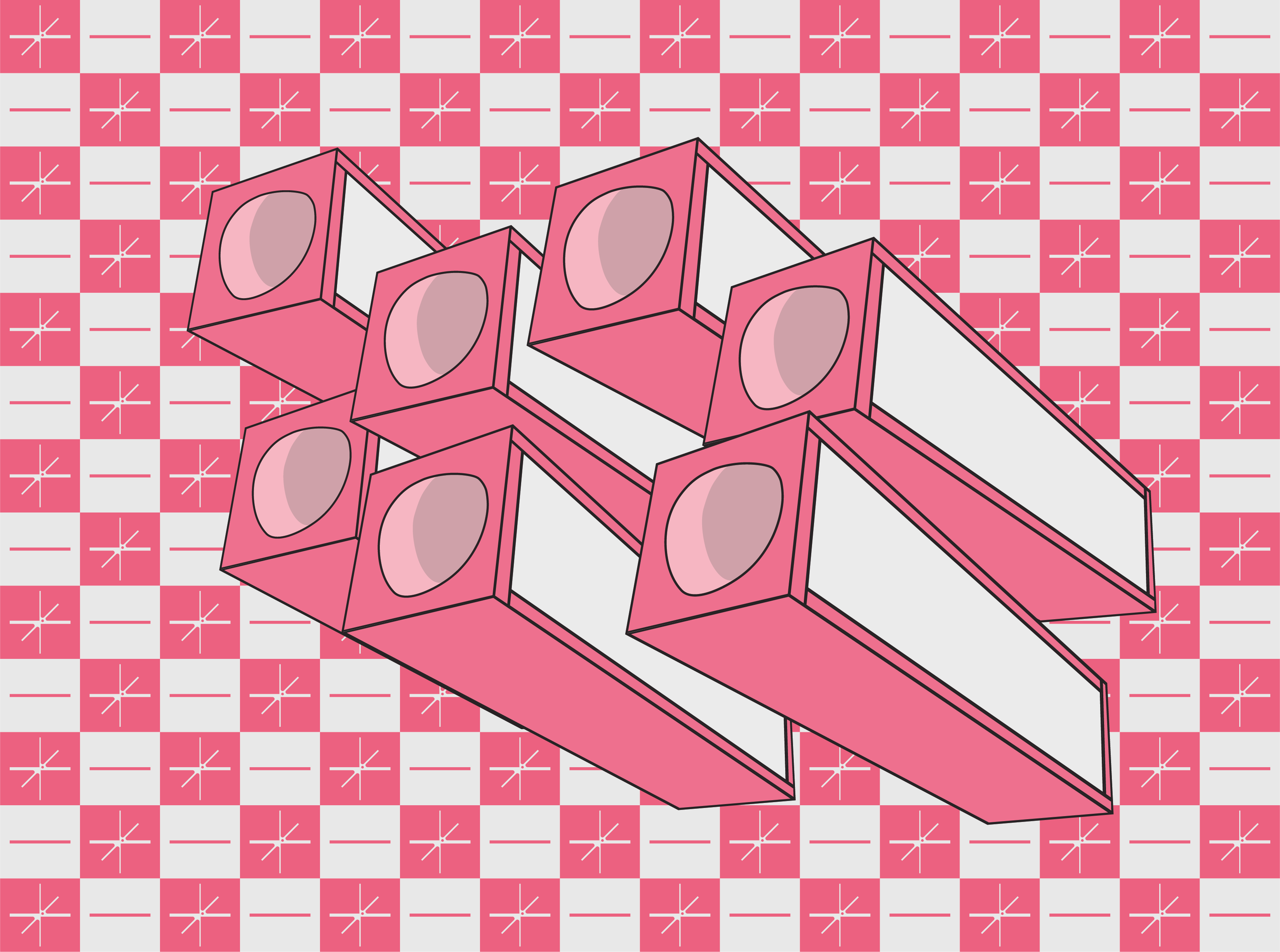
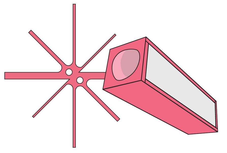
The simple yet distinctive form of EOJ’s kaleidoscopes translated beautifully into simple illustrations. These vectors could easily shift in colour and perspective—allowing each new release, colourway, or personalised edition to take on its own identity while remaining part of the same visual system.
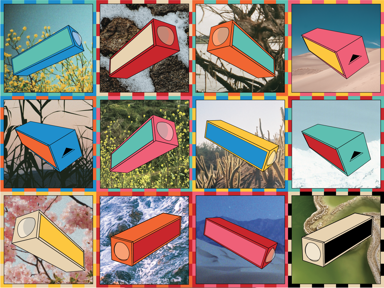
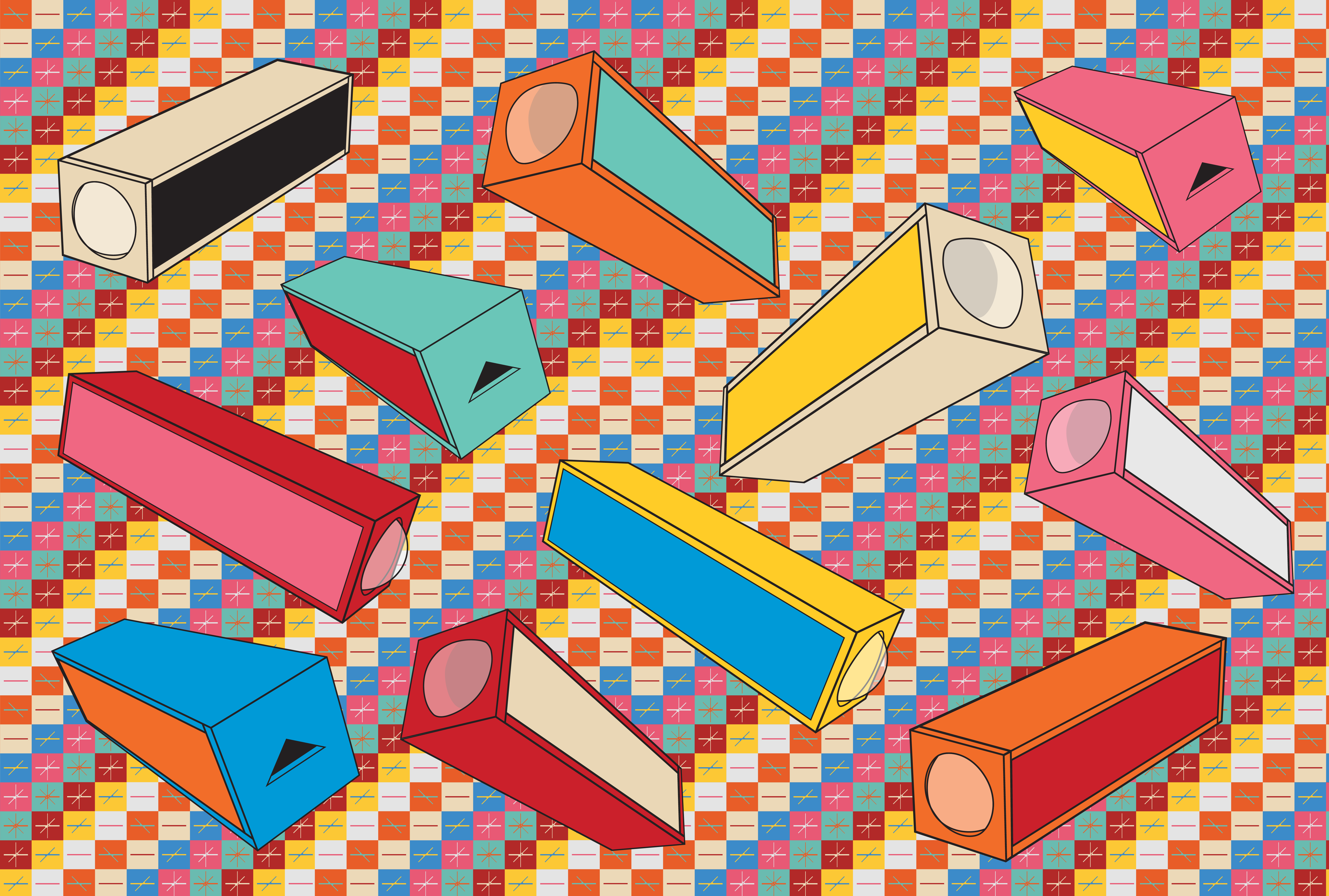
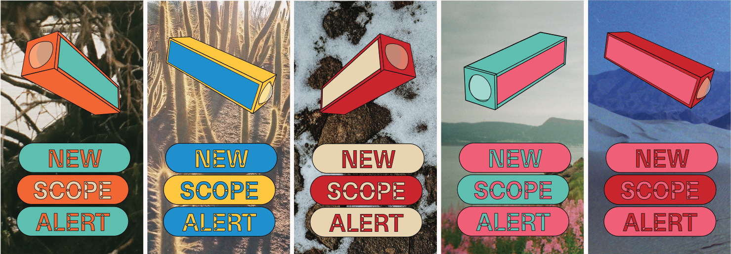
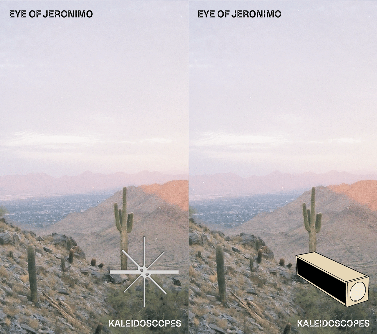
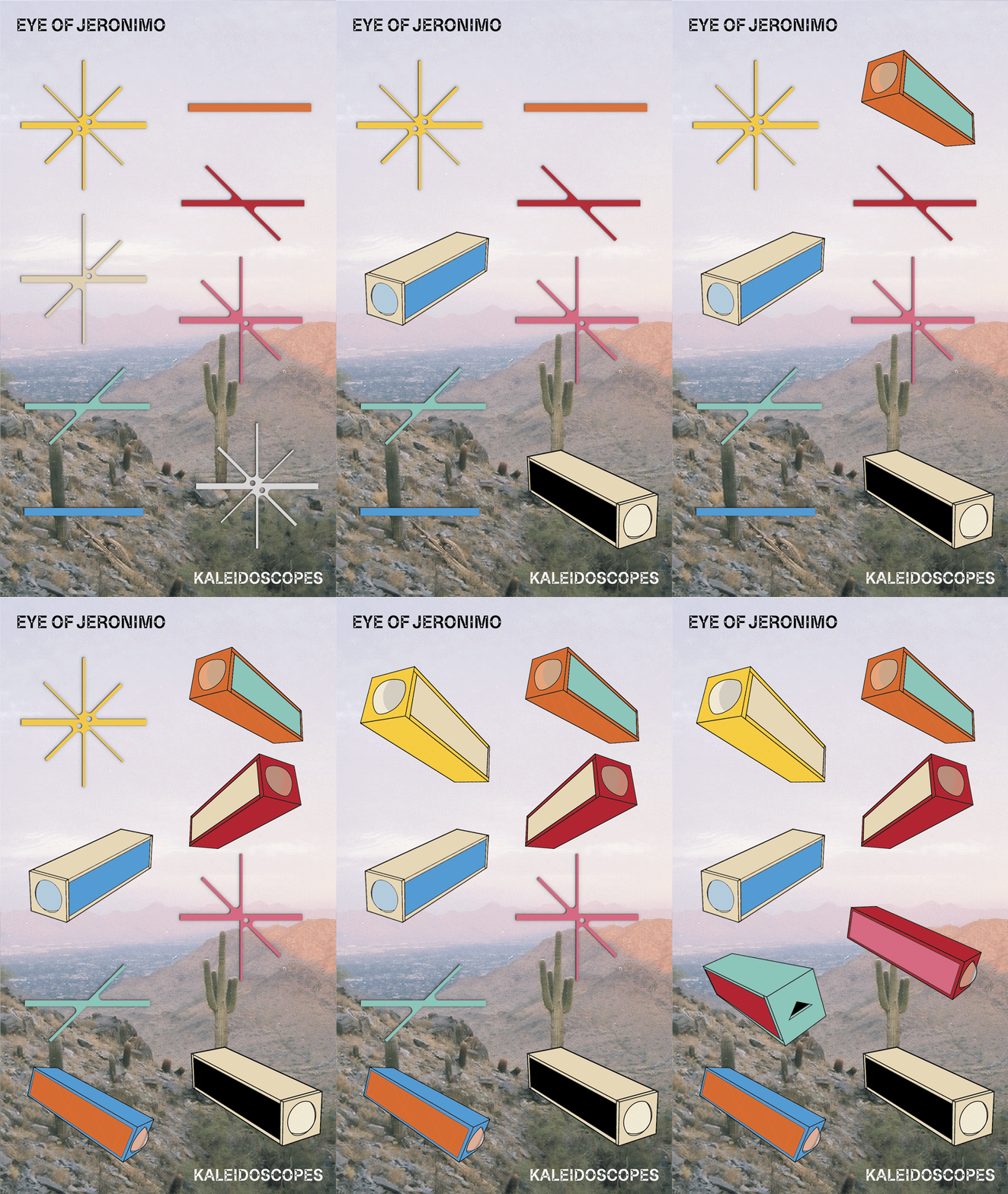
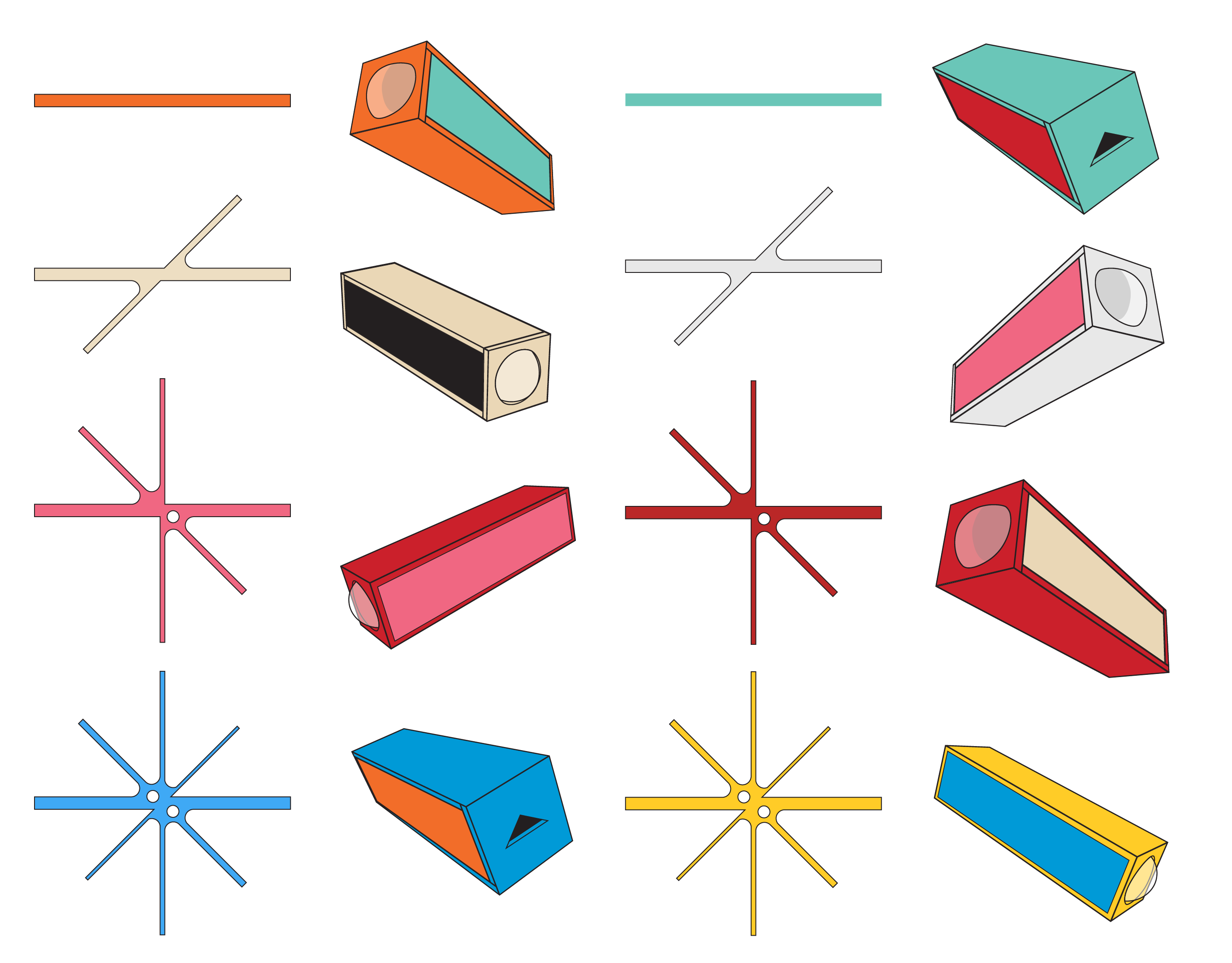
The dynamics of the identity create a relationship between the colorful star-shaped elements of the logo and the kaleidoscopes, allowing the scopes and stars to be exchanged with one another in interaction. A blue star shape matches a mostly blue kaleidoscope, a yellow one matches a mostly yellow scope and so on and on, creating vast possibilities for playing with the identity. The stars become not only elements of the logo, but symbols of the kaleidocopes themselves, adding a new layer of the identity.
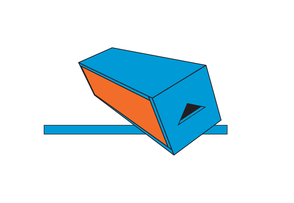
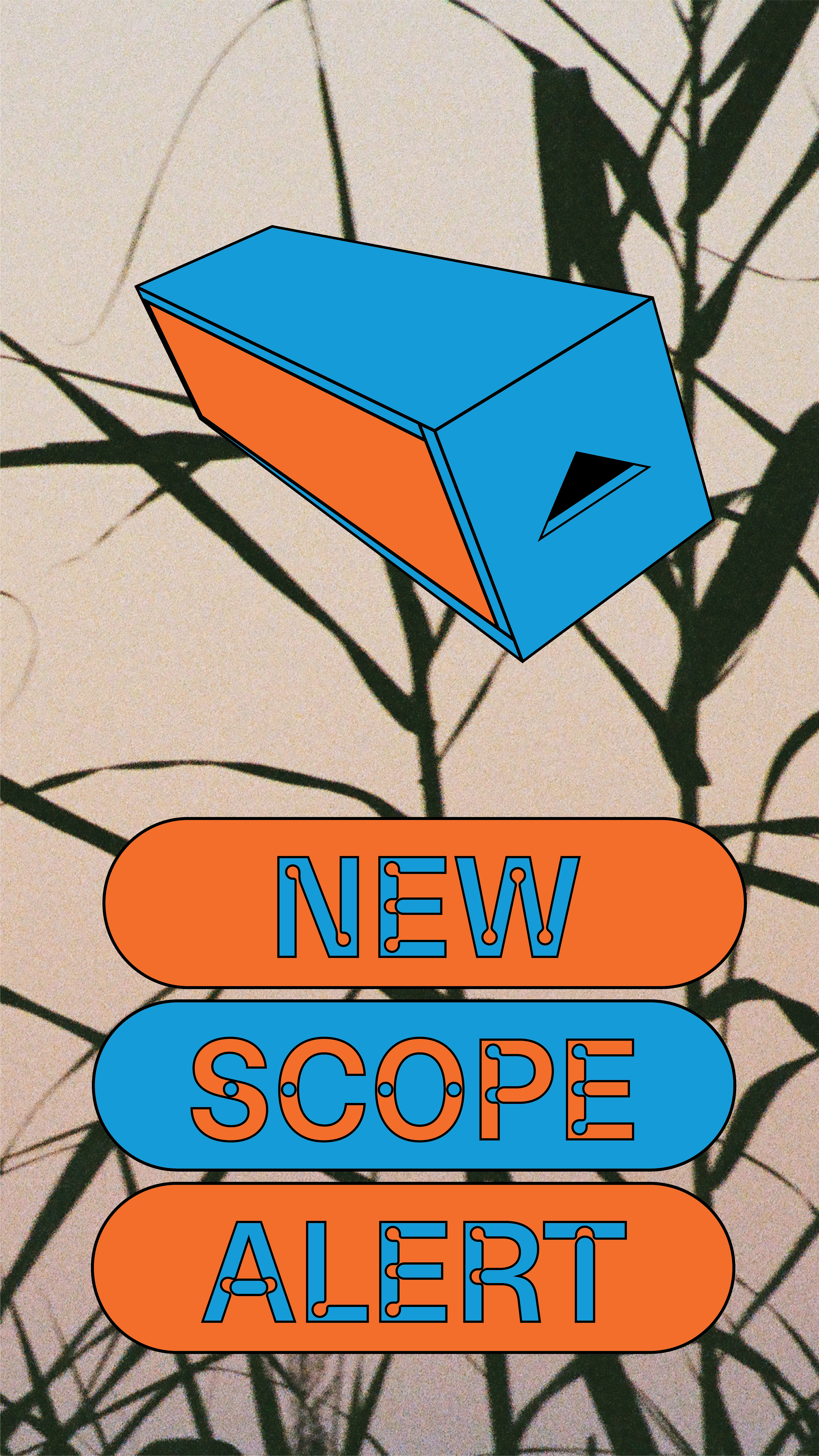
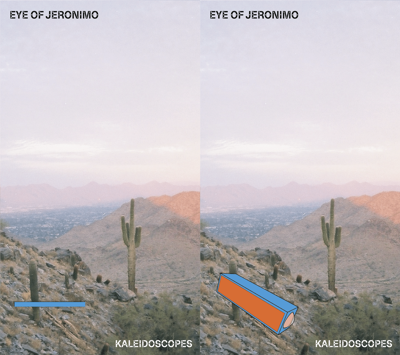
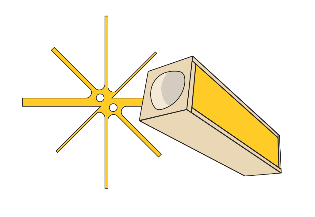
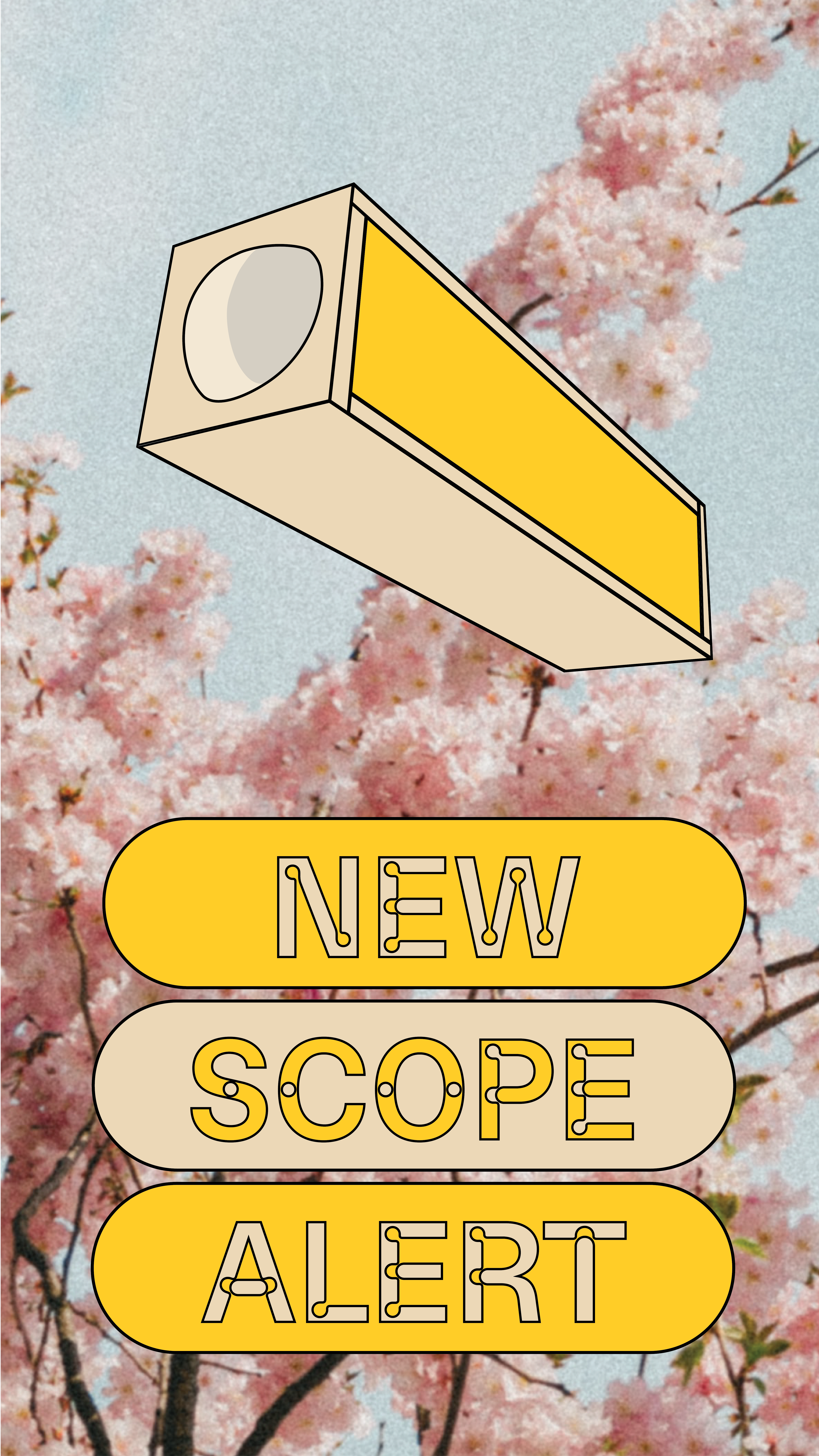
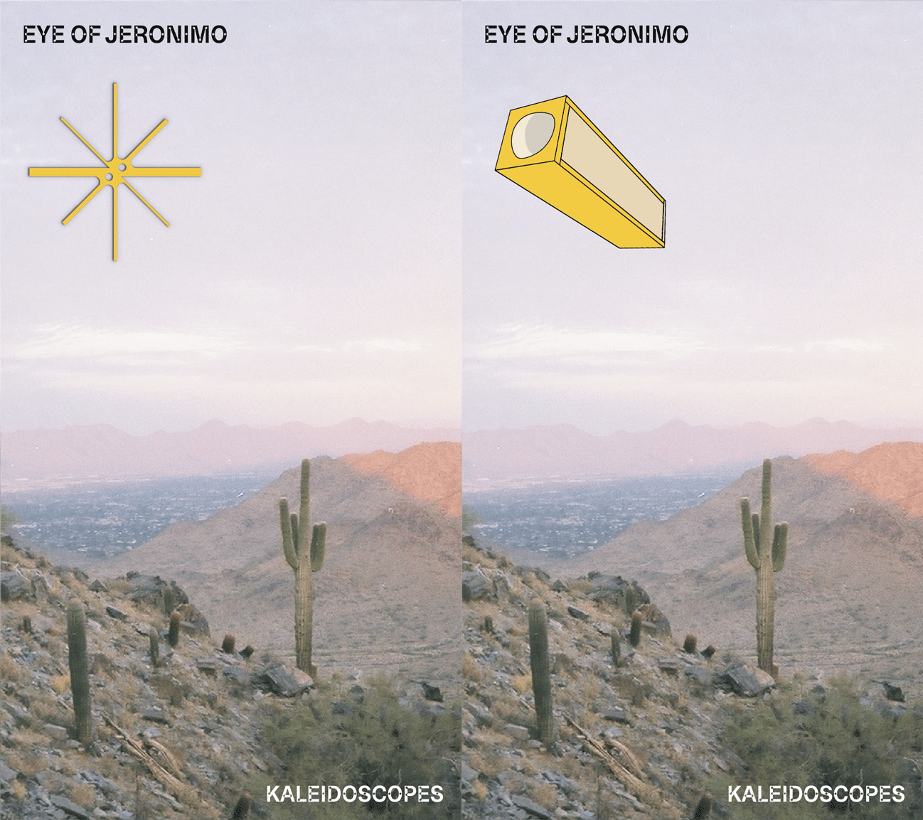

IMAGE STYLING
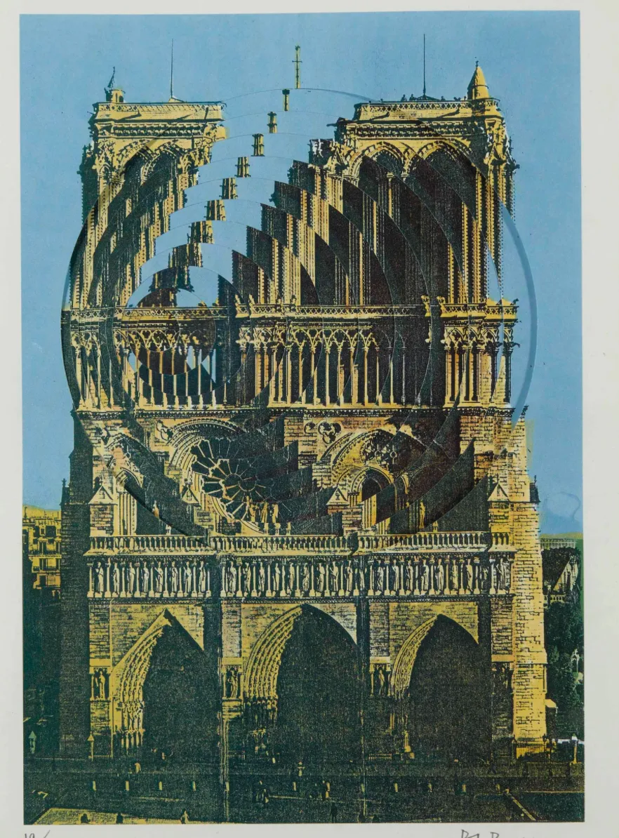
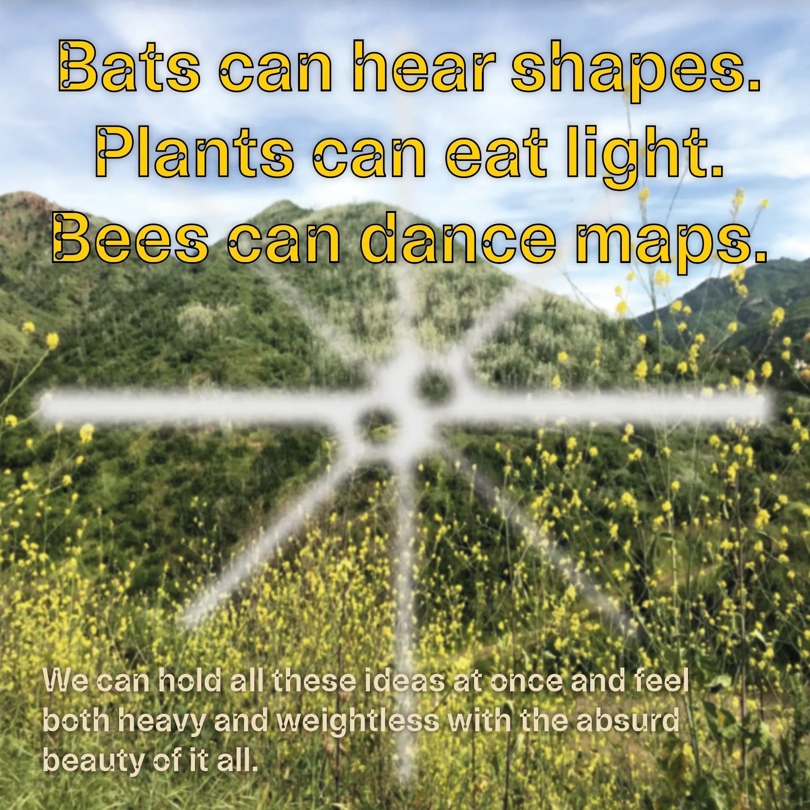
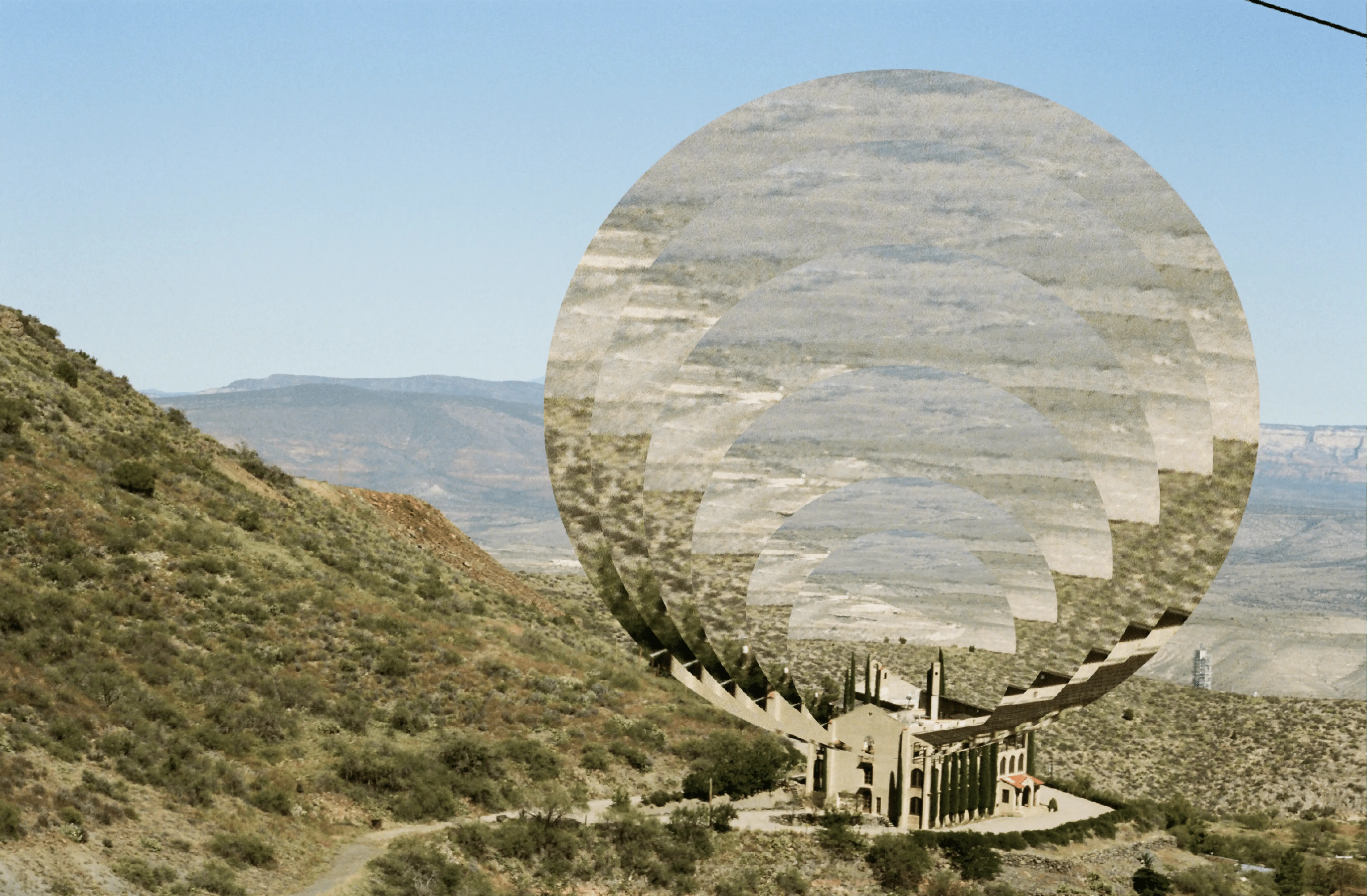
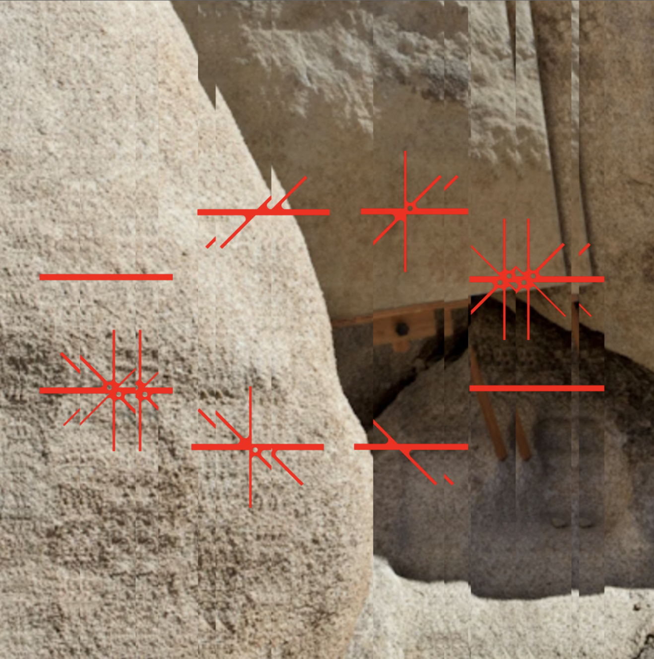
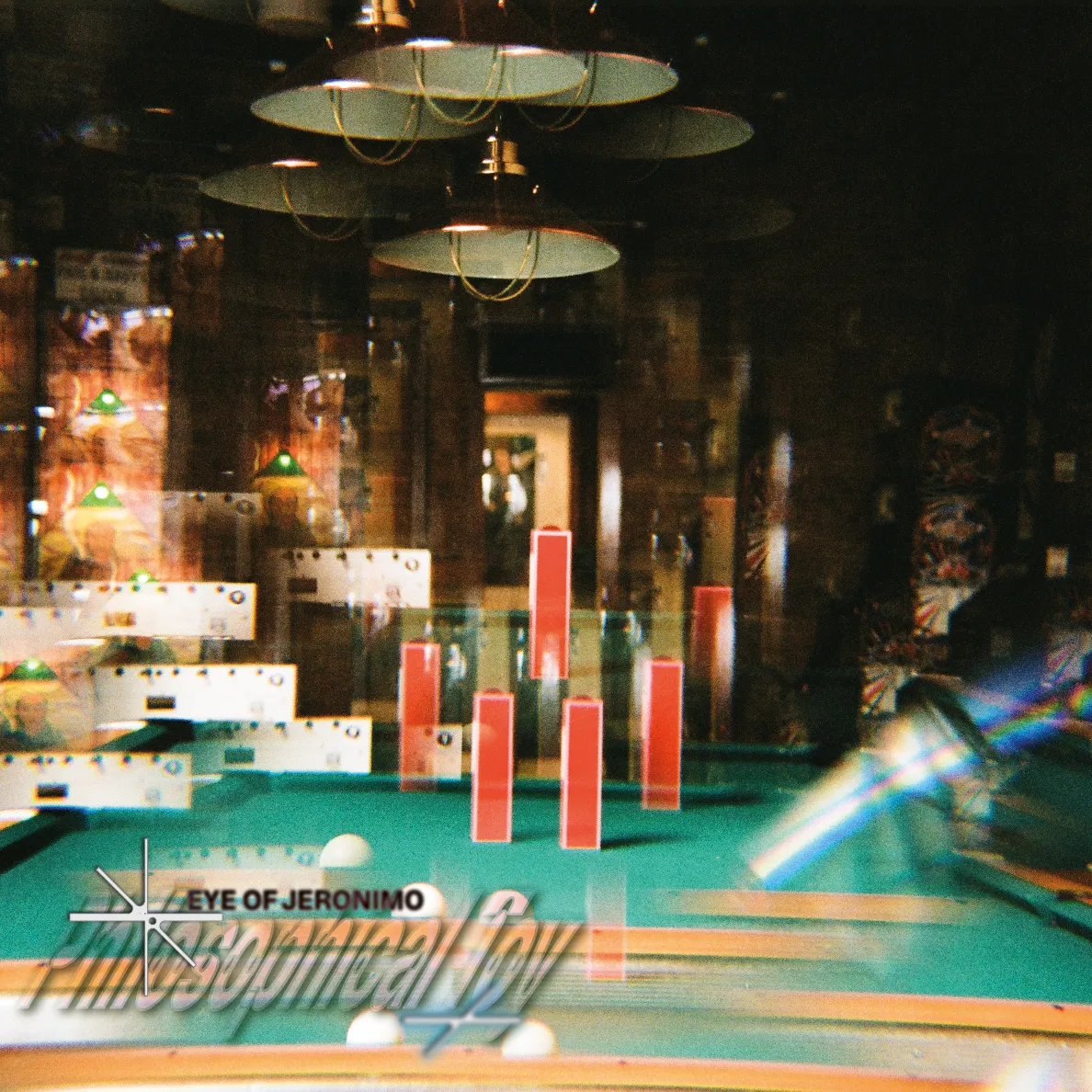
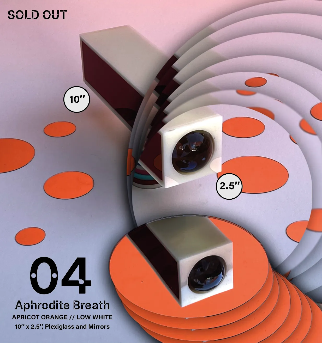
Because kaleidoscopes refract and fragment reality, it felt essential that the photography and image treatments echoed that same sense of visual transformation.. The leading inspiration for the image treatment were cinetisations created by Pol Bury—distorted images created by removing and reassembling their parts to modify the overall composition. Building on that idea, I experimented with techniques such as prism blending, chromatic aberration, fractal mirroring, and striped glass refraction. Each method allowed the images to take on the qualities of the scopes themselves—bending light, shifting focus, and revealing patterns that didn’t exist before. Through these distortions, the brand’s imagery found its own voice: reflective, kinetic, and quietly hypnotic.
OTHER PROJECTS ↓

Strefy Czasowe
Full branding and art direction for a festival in the night of time change

ARIAS
Brand new look for research through arts & sciences in Amsterdam

Eye of Jeronimo
Branding for an independent kaleidoscope producer
Basketology
A philosophy for alternative storytelling
Lectorate: Touching
Visual campaign for a publication about research by touch

Anyone Want That?
A digital research into exchange of materials between art academy students
Building Second Brain
Moving poster for a lecture about memory outsourcing

Field App
Designing interfaces and interactions for the future of knowledge exploration

